Choosing the right Van Decals Fonts and color combinations can make the difference between a van that gets noticed and one that gets ignored. For business owners, readable van graphics are not just a design preference. They are a practical branding tool that helps potential customers recognize your company name, services, and contact details in just a few seconds. This guide explains how font choice, contrast, sizing, and material all work together to improve legibility on moving vehicles. If you want your graphics to stay clear at a distance and in changing light, it helps to follow proven readability principles like those discussed in this vehicle wrap font and color guide.
Last updated: March 2026
Why readability matters for business van graphics
Business van graphics only work if people can read them quickly. A van is rarely viewed like a sign on a wall. It is parked at an angle, moving through traffic, partly blocked by other vehicles, or seen for just a few seconds at a stoplight. That means readability is not a design extra. It is the main job of the decal.
Clear lettering improves brand visibility
If your company name, service, and phone number are easy to read, your van becomes a mobile advertisement all day long. Good Van Decals Fonts help people identify your business from farther away and in less time. That increases the chance they remember your name or search for you later.
When lettering is too decorative, too thin, or too tightly spaced, the message breaks down. Even a great logo loses value if the average driver cannot make out the words before the van passes.
Readability builds trust
Clean, readable Vehicle Decals make a business look established and professional. Customers often judge credibility in seconds. If the graphics look cluttered or hard to understand, the brand can feel less reliable.
Readable graphics signal that a company pays attention to details. That matters for trades, delivery services, home services, and any business that wants to appear organized and dependable when arriving at a customer location.
Real-world conditions make readability harder
Van graphics have to perform in changing light and weather. Sun glare, shadows, rain, dirt, tinted glass, and body panel seams all reduce legibility. A design that looks sharp on a computer proof may become difficult to read once applied to curved panels or windows.
That is why high contrast, simple fonts, and smart sizing are so important. Best practices for high-impact vehicle wrap text and color choices consistently emphasize bold, simple lettering that reads well at a glance.
Good readability supports results
- More brand impressions during daily driving
- Better recall of your company name
- Higher chance of calls from local prospects
- Stronger professional appearance on job sites
- Better return from Van Decals, Vinyl Decals, or a full Vinyl Wrap
In short, readable van graphics do more than look good. They help your vehicle market your business in real traffic, real weather, and real viewing conditions.
Van Decals Fonts: the most readable styles for moving vehicles
When choosing Van Decals Fonts, the safest rule is simple: use fonts that can be understood instantly. On a moving vehicle, people do not study your message. They scan it. The best font is the one that stays clear at speed, at a distance, and from awkward angles.
What makes a font readable on a van
The easiest fonts to read usually share a few traits:
- Simple letter shapes
- Medium to bold stroke weight
- Wide openings in letters like a, e, s, and c
- Clear spacing between letters
- Upper and lowercase combinations for longer text
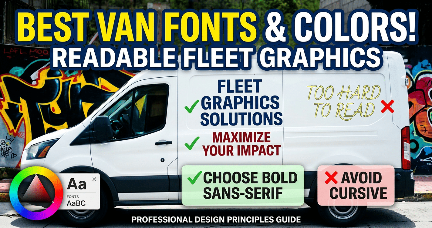
Fonts with extreme flourishes, compressed widths, thin lines, or novelty styling tend to perform poorly on Vehicle Wraps and Vehicle Decals. They may look stylish up close but lose clarity on the road. For practical decal use, readable sticker font characteristics generally favor clean sans serif and other simple display styles over decorative scripts.
Best font categories for business vans
Sans serif fonts are usually the top choice. They are clean, modern, and highly legible. Fonts in the style of Helvetica, Arial, Montserrat, Open Sans, and similar families work well for company names, services, and web addresses.
Slab serif fonts can also work when you want a slightly more traditional or rugged look. Their heavier strokes help with visibility, especially for short words. They are often a better option than classic serif fonts with thin details.
Script fonts are the riskiest choice. A simple script may work for a logo if the word is short and familiar, but it should not be used for contact details or service lists. The same goes for distressed, handwritten, and novelty fonts.
Quick comparison of font styles for van graphics
| Font style | Distance readability | Best use on vans | Main advantage | Main drawback |
|---|---|---|---|---|
| Sans serif | Excellent | Business name, phone, website, service list | Clean and fast to read | Can feel generic if not paired with strong branding |
| Bold sans serif | Excellent | Main company name and short headline text | Very strong visibility in traffic | Needs enough space to avoid looking heavy |
| Slab serif | Good | Trades, construction, heritage-style brands | Strong character with solid readability | Less clean than sans serif in smaller sizes |
| Traditional serif | Fair | Short brand names only | Classic, established feel | Thin details can disappear at distance |
| Script or cursive | Poor to fair | Accent logo use only | Stylish and distinctive | Hard to read quickly, especially in motion |
| Decorative or novelty | Poor | Rarely recommended | Unique appearance | Low legibility and weak real-world performance |
Best practice for mixing fonts
Most vans need only one or two fonts. Use a bold, readable primary font for the business name and a secondary font for supporting details. Too many styles create visual clutter and reduce impact.
If your logo uses a decorative typeface, keep the rest of the Vinyl Decals simple. Let the logo carry personality while the contact information stays easy to read.
Best font choice for most businesses
For most business owners, the most readable Van Decals Fonts are bold sans serif fonts with generous spacing and strong contrast against the vehicle color. They are the safest choice for side panels, rear doors, and partial Vinyl Wrap layouts because they remain legible where it matters most: on the road.
Best color combinations for high-contrast van decals
Color affects readability just as much as font choice. The best-looking design is not always the easiest to read in traffic. For Van Decals, high contrast between text and background is what helps people identify your message quickly in bright sun, deep shade, and poor weather.
Why contrast matters more than brand preference
Many businesses want to use their exact brand colors everywhere. That makes sense for consistency, but some brand combinations are too low-contrast for moving vehicles. Light gray on white, red on black, or dark blue on tinted glass may match a brand guide but still perform badly on the road.
When visibility is the goal, readability should come first. You can still use brand colors in logos, stripes, or accent areas while keeping the main text in a more visible combination.
Top high-contrast combinations for van graphics
- Black text on white
- White text on black
- Dark navy on white
- White on dark navy
- Yellow on black for short warning-style or headline text
- Black on yellow for bold service messaging
These pairings generally hold up well across daylight and overcast conditions. White on a dark solid panel is especially strong for rear doors and side panels. Black on white remains one of the most universally readable choices for Vinyl Decals and Vehicle Decals.
Combinations to use carefully
- Red on black
- Blue on red
- Gray on silver
- White on yellow
- Green on black
- Metallic text on reflective paint
These combinations often lose clarity because the value contrast is too weak. They may look attractive up close but can fade into the vehicle body or become hard to read in rain, fog, or shadow.
How weather and lighting change visibility
Bright sun can wash out light colors. Shade can flatten mid-tone colors. Rain and road grime reduce sharpness, especially on lower panels and rear doors. Tinted windows also darken colors and reduce readability on perforated window film.
That is why solid contrast usually outperforms subtle design choices. Vehicle lettering guidance for color visibility and contrast supports using bold, easy-to-distinguish text colors that stand apart from the vehicle surface.
Practical color tips for business owners
- Use the highest contrast for your company name and phone number.
- Avoid placing text over busy photos or patterned wrap areas.
- Test colors against the actual vehicle paint, not just a screen mockup.
- Consider dirt exposure on white vans and glare on glossy dark vans.
- Keep accent colors secondary to the main readable text.
The strongest color strategy for Van Decals is simple: make the most important words the easiest to see first, even from a moving car in less-than-perfect conditions.
How to size lettering for side panels, rear doors, and windows
Letter size has a direct impact on whether your van graphics get noticed or ignored. Even the best Van Decals Fonts become ineffective if the text is too small for real viewing distances. Sizing should be based on where the text sits on the vehicle, how quickly it will be seen, and what information matters most.
Prioritize by viewing distance
Side panels are often viewed from the next lane, across a parking lot, or from a sidewalk. Rear doors are commonly read in traffic at stoplights or while following behind. Window lettering is usually the hardest area because tint, reflections, and perforated material reduce clarity.
As a practical rule, your business name should be the largest element. Phone numbers, website addresses, and service lines can be smaller, but they still need to be readable without forcing someone to stare.
General sizing guidance by placement
- Side panels: Main company name often works best around 5 to 8 inches tall, depending on van size and panel space.
- Rear doors: Key text is often effective around 3 to 6 inches tall because following drivers have a narrower viewing angle.
- Windows: Keep text larger than you think you need, often 4 inches or more, because visibility drops on glass.
These are practical starting points, not rigid rules. A compact van, a long wheelbase van, and a full Vehicle Wrap all offer different usable space.
Match size to message importance
- Business name: largest and easiest to spot
- Main service or category: second largest
- Phone number or website: clear but slightly smaller
- License numbers, small disclaimers, or long taglines: only if space allows
If you try to include too much information, everything gets reduced and readability suffers. Fewer words at a larger size usually perform better than crowded text blocks.
Watch for layout obstacles
Door handles, panel seams, fuel doors, body curves, and window dividers can break up words and make letters harder to read. Keep important text away from these interruptions. On rear doors, split layouts can work, but avoid placing critical letters across panel gaps.
Best sizing approach for most vans
For most business owners, the best approach is to make the company name bold and large on the side panels, keep rear contact details simple and centered, and use windows only for short, high-contrast messaging. Whether you are using basic Van Decals, cut Vinyl Decals, or larger Vehicle Decals within a Vinyl Wrap design, readable sizing should always be tested from realistic street distances before production.
Design mistakes that make van decals harder to read
Even strong branding can fail on the road if the layout is hard to process at a glance. Business owners often focus on logo placement and style, but readability depends on how quickly a driver or pedestrian can recognize the message. Good Van Decals should still be clear when viewed from a distance, at an angle, or in motion.
Using fonts with thin strokes or decorative details
One of the most common mistakes is choosing lettering that looks elegant on a screen but disappears on a vehicle. Thin lines, script styles, and fonts with unusual shapes tend to break up visually once installed on a van. This is especially true when the vehicle is moving or dirty.
If your design relies on people figuring out each letter, it is too complex. As clear font selection advice for stickers and decals shows, simpler type styles are generally easier to recognize quickly.
Low contrast between text and background
Another frequent issue is poor contrast. If your lettering is too close in value to the van color or graphic background, the words fade into the design. This often happens with gray on silver, dark blue on black, or bright colors layered over photos.
High contrast helps important details stand out first, such as your company name, phone number, and service category.
Trying to say too much
Many Vehicle Decals become unreadable because they carry too much information. A van is not a brochure. Long service lists, multiple phone numbers, extra taglines, and crowded social icons force viewers to scan instead of instantly understand.
Most passing viewers should be able to get the essentials in seconds:
- Business name
- Main service
- Primary contact method
Placing text over busy backgrounds
Photos, patterns, gradients, and textured artwork can all reduce clarity. A background may look impressive in a design proof but interfere with the lettering once printed as Vinyl Decals or a full Vinyl Wrap. If the eye notices the background before the message, the layout needs work.
Ignoring spacing and panel breaks
Letters that are too close together, lines that are tightly stacked, or words placed across door seams can make reading harder. Handles, fuel doors, windows, and body contours also interrupt the design. Professional layouts account for the shape of the van, not just the flat digital mockup.
- Avoid thin or overly stylized lettering
- Keep strong contrast between text and background
- Limit copy to the most important points
- Use clean background areas behind key text
- Check how wording falls across doors and curves
How vinyl wrap material, finish, and installation affect readability
Readability is not only about design. The material you choose for Vehicle Wraps and Vinyl Decals also changes how your message looks in real conditions. Sunlight, glare, surface texture, and installation quality all affect how clearly people can read your van graphics.
Gloss vs. matte finishes
Gloss vinyl tends to make colors look more vibrant and can give graphics extra visual punch. The downside is glare. In bright daylight, reflected light can wash out letters or make parts of the design harder to read from certain angles.
Matte vinyl reduces glare and can improve consistency across the surface, especially for text-heavy layouts. However, matte finishes may make some colors appear slightly less vivid. If clarity is your top priority, matte can be a smart option for large text areas.
Reflective vinyl for low-light visibility
Reflective materials can help graphics stand out early in the morning, at night, or in poor weather. This can be useful for service vans that operate outside normal daylight hours. Some vehicle lettering material options include reflective choices for added visibility.
That said, reflective film should be used strategically. It works best for key details rather than every element in the layout.
Print quality and material performance
Low-grade vinyl or poor print resolution can soften edges, dull colors, and reduce legibility. Crisp letter edges matter, especially for smaller text. Premium Vinyl Wrap materials generally hold color better and maintain a cleaner appearance over time.
Why installation matters
Even a well-designed graphic can lose clarity if it is installed poorly. Bubbles, wrinkles, stretching, or misalignment can distort letters and logos. Text placed over deep curves or seams without proper planning may look warped after application.
Professional installation helps ensure:
- Straight, even placement
- Smoother surfaces with fewer distortions
- Better alignment across doors and panels
- Longer-lasting appearance
For business owners, readability should be evaluated after material and finish choices, not before. The same design can perform very differently depending on how it is produced and applied.
A simple checklist for choosing readable van graphics
Before approving artwork for Van Decals, Vinyl Decals, or a full Vinyl Wrap, use a quick review process. This helps you catch problems before production and avoids paying for graphics that look good in a mockup but underperform on the road.
Readability checklist
-
Can someone understand the message in a few seconds?
Your company name, service, and contact detail should be obvious without effort. -
Is the font simple and easy to recognize?
Avoid decorative styles, thin strokes, and scripts for core business information. Some vehicle wrap font and color best practices emphasize bold, clean letterforms for stronger impact. -
Is there strong contrast between text and background?
If the words do not stand out immediately, adjust the color pairing or simplify the background. -
Is the layout free of clutter?
Remove extra copy, repeated information, and small design elements that compete with the main message. -
Will the text stay readable across doors, seams, and curves?
Check the actual vehicle template, not just a flat design file. -
Have you reviewed it at realistic size?
Zoomed-in proofs can hide spacing and clarity problems. View the design at scale whenever possible. -
Have you tested it from a distance?
Step back from the proof or print a sample. If key information is hard to read, revise before production. -
Does the material and finish support clarity?
Consider whether gloss, matte, or reflective vinyl will improve or reduce visibility in your normal driving conditions.
Quick approval rule
If a first-time viewer cannot tell who you are, what you do, and how to contact you almost instantly, the design is not ready yet. The best Vehicle Decals are not the busiest or most artistic. They are the easiest to read.
Readable van decals come down to a few smart decisions: use clear fonts, create strong contrast, size lettering for real viewing distances, and avoid clutter that competes with your message. Before you approve a layout, step back and ask whether someone can understand it in a few seconds from the road. If you want better results from your vehicle branding, it may be worth having a wrap professional review your design before production.
Helpful External Resources
These sources provide supporting background and additional context.
What are the best Van Decals Fonts for service vehicles?
Choose clean, bold Van Decals Fonts like sans serif styles such as Arial, Helvetica, Franklin Gothic, or Futura. These fonts stay readable at a glance, even when a van is moving. Avoid decorative, script, or very thin fonts because they can be hard to read from a distance.
Which colors make van lettering easiest to read?
Use high-contrast color pairings for the best readability, such as white on dark blue, black on white, or yellow on black. The goal is to create strong contrast between the lettering and the van surface so the text stands out in daylight, low light, and traffic.
How big should van decal text be for good visibility?
For strong visibility, keep the main business name large enough to read quickly from several feet away. As a general rule, important text should be at least 2 to 3 inches tall for close viewing, with larger lettering needed for phone numbers, websites, and long-distance visibility.
Should I use Vinyl Decals or a full Vinyl Wrap for my business van?
Use Vinyl Decals if you want a simple, budget-friendly option with just your logo, phone number, or service details. Choose a full Vinyl Wrap if you want maximum branding space, more design impact, and better coverage for the entire van. Decals work well for minimal messaging, while wraps are better for full advertising.
What design choices improve readability on van decals?
Keep the layout simple, use plenty of empty space, and limit the number of fonts to one or two. Make sure the most important details are easy to scan first, and avoid busy backgrounds or effects that reduce contrast. Clear spacing and straightforward wording help your message stand out fast.
Get a Free Quote Today
Contact us at +1-(416) 288-8661 or Email us at info@Brandingcentres.com and let's get started.