In the digital age, where LinkedIn connections happen with a click and emails are deleted with a swipe, the physical business card remains a fascinating anomaly. It is the only marketing tool that is physically transferred from one person’s hand to another’s. It is a tactile moment of connection – a “micro-interaction” that sets the tone for the entire professional relationship that follows.
For business owners in Toronto, Etobicoke, and the GTA, the challenge isn’t just getting cards printed; it’s decoding the complex menu of options available. You are faced with a barrage of terminology: 14pt, 16pt, 18pt, UV, AQ, Laminated, Uncoated, Spot Gloss. What do these terms actually mean for your brand?
At Branding Centres, we believe that your print collateral should be an asset, not an afterthought. Whether you choose a cost-effective standard card or a high-end luxury substrate, the decision should be strategic.
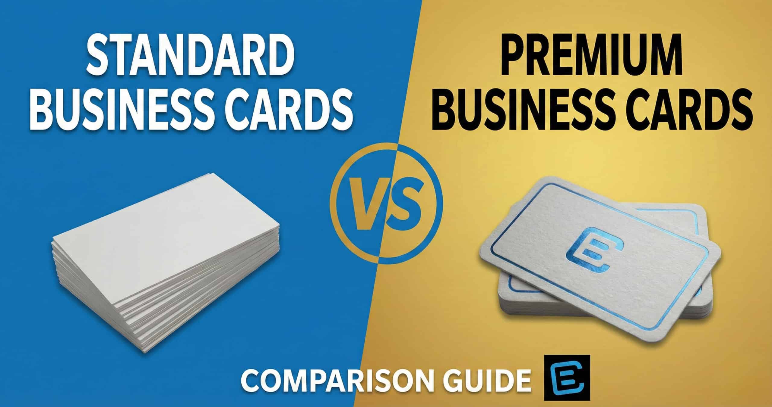
This ultimate guide explores the physics, psychology, and practical applications of Standard vs. Premium Business Cards. We will dismantle the jargon and help you engineer the perfect introduction for your business.
Part 1: The Anatomy of a Business Card
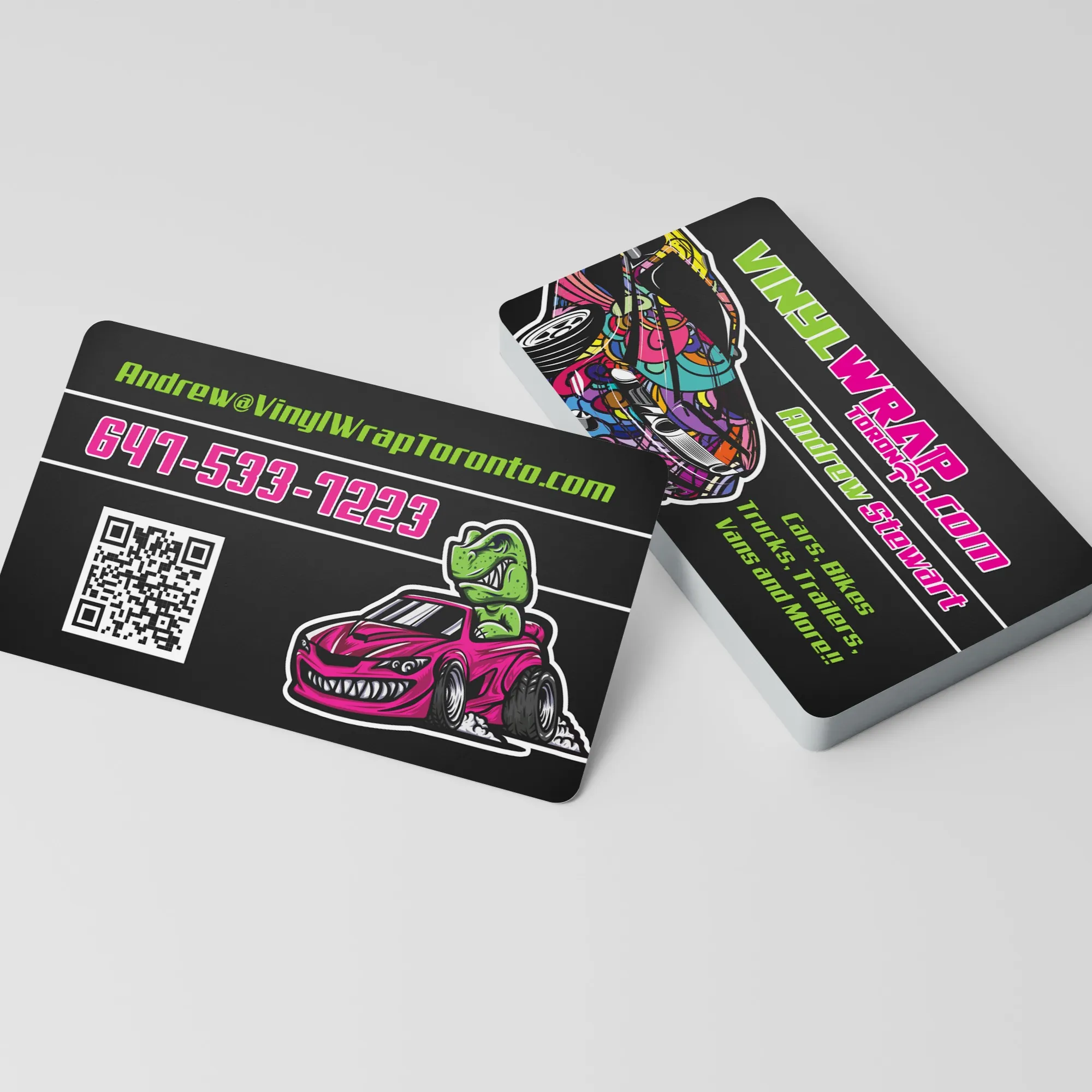
To truly understand the difference between “Standard” and “Premium,” we must first understand the raw materials. A business card is defined by three primary characteristics: Caliper (Thickness), Substrate (Paper Type), and Finish (Coating/Lamination).
1. Caliper: Measuring the “Thud” Factor
In North America, paper thickness is measured in “points” (pt). One point equals one-thousandth of an inch (0.001″).\
- 14pt: This is the global standard. It is flexible but holds its shape. Think of a standard greeting card. It fits easily into wallets and rolodexes without adding bulk.
- 16pt: This represents the entry-level premium. It is approximately 15% thicker than 14pt. While the number seems small, the tactile difference is noticeable. It has a “snap” when flicked and resists bending significantly better.
- 18pt – 32pt+: This is the heavyweights division. These cards are often created by bonding layers of cardstock together or applying thick laminates. They are rigid, durable, and command attention.
2. Substrate: Beyond Basic Wood Pulp
Not all paper is created equal.
- Coated Stock: The paper is treated with a clay or polymer layer to seal the fibers. This prevents ink absorption, resulting in sharper images and brighter colors.
- Uncoated Stock: The fibers are left exposed. This gives the card a natural, organic texture and makes it writable.
- Synthetic/Plastic: Made from PVC or polypropylene, these substrates are waterproof and tear-proof.
3. Finish: The Protective Shield
This is where the battle between Standard and Premium is often fought.
- Coatings (Liquid): UV (Ultra Violet) and AQ (Aqueous) are liquid varnishes applied during printing. They protect the ink but add minimal thickness.
- Laminations (Film): Silk, Matte, and Soft Touch laminations are physical layers of plastic film bonded to the paper. They add significant structural integrity and distinct textures.
Part 2: The Standard Suite – Efficiency and Professionalism
Standard Business Cards are the backbone of corporate communication. They are designed for volume, clarity, and cost-efficiency. However, “Standard” at Branding Centres does not mean “Generic.” Our standard options are calibrated for high-definition color reproduction and professional durability.
The “Best Value” & UV Gloss Option
For businesses that rely on high-volume distribution – real estate open houses, trade shows, or retail counters – the UV Business Card is the undisputed champion.
- The Science: A liquid coating is applied over the ink and cured instantly with ultraviolet light. This creates a hard, high-gloss shell.
- Visual Impact: The gloss reflects light, maximizing color saturation. Reds look redder; blacks look deeper. Photographic elements appear sharp and vibrant.
- Durability: The UV coating resists friction, meaning these cards can slide in and out of a wallet without the ink rubbing off.
The Matte Finish (14pt & 16pt)
If high gloss feels too “loud” for your brand, Matte Finish offers a sophisticated alternative.
- The Look: Smooth, non-reflective, and elegant. Under bright office lights, matte cards are easier to read because they don’t produce glare.
- The Texture: It feels like smooth, polished paper. It provides a tactile friction that feels more “organic” than the slippery feel of UV gloss.
- The Upgrade: Choosing the 16pt Matte option adds that critical extra stiffness, bridging the gap between a standard handout and a premium asset.
The AQ (Aqueous) Coating
AQ Business Cards sit comfortably in the middle ground. Aqueous coating is water-based and eco-friendly. It provides a subtle semi-gloss sheen – shiny enough to protect the ink and enhance colors, but not so shiny that it feels like plastic. It is the preferred choice for corporate stationery and conservative industries like law and finance.
Part 3: The Premium & Luxury Suite – Sensory Marketing
When you move into the Premium tier, you are no longer just paying for ink on paper; you are paying for texture and technology. These cards utilize advanced finishing processes to trigger a psychological response known as Haptic Engagement.
The Lamination Revolution: Gloss vs. Silk
Unlike standard coatings, Laminated Business Cards feature a thin layer of plastic film thermally bonded to the 18pt stock.
- Gloss Lamination: Imagine the shine of UV, but with the durability of a credit card. It is waterproof, tear-resistant, and incredibly rigid.
- Matte / Silk Lamination: This is modern luxury. The laminate has a “silky” feel that is cool to the touch. It softens the contrast of the design, giving it a muted, high-end aesthetic. It suggests sophistication and understated power.
Soft Touch (Velvet) Business Cards
If you want a card that people literally cannot stop touching, this is it. Soft Touch (often called Velvet or Suede) uses a specialized laminate that mimics the feel of short-nap velvet or peach skin.
- The Psychology: Soft textures are subconsciously associated with comfort and luxury. Handing someone a Soft Touch card creates a moment of pause. They look at the card, then look at you. That split-second of cognitive disruption is where brand memory is formed.
Foil Accents and Spot UV
These techniques use contrast to guide the viewer’s eye.
- Foil Business Cards: We use heat and pressure to stamp metallic film (Gold, Silver, Copper) onto the card. Unlike metallic ink, which looks flat, foil reflects light dynamically. It signals wealth, prestige, and high value.
- Spot UV: This technique applies a high-gloss clear coat only to specific areas of a matte card (like your logo). It creates a “ghosted” texture. The logo isn’t just visible; it’s tangible.
The Heavyweights: Painted Edge and Ultra Smooth
- Painted Edge: Printed on ultra-thick 32pt stock (double the standard thickness), these cards are so thick we can paint the sides of the card. When stacked, they create a solid block of brand color.
- Ultra Smooth: For minimalists, our Ultra Smooth 16pt uncoated stock offers a pristine, stark white canvas with absolutely zero texture or grain. It is the Apple Store of business cards – clean, precise, and modern.
Part 4: Special Use Cases – Durability and Function
Sometimes, a business card is a tool. It needs to survive a job site, or it needs to be written on.
The Indestructible: Plastic and Durable Stocks
For industries like construction, plumbing, HVAC, or landscaping, paper is a liability. It absorbs moisture and crumbles.
- Durable Business Cards: Printed on a synthetic 16pt stock that mimics paper but is waterproof and tear-proof.
- PVC / Plastic Cards: Solid plastic cards (available in various thicknesses like 30mil) that feel exactly like a credit card or ID badge. These are often used for membership cards, VIP passes, or high-end fleet services. They are virtually indestructible.
The Functional: Writable Cards
A common mistake is ordering High Gloss UV cards for appointment reminders. You cannot write on UV coating with a standard ballpoint pen – the ink will smear instantly.
- Linen Uncoated: A textured stock that mimics woven fabric. It adds a classic, “old money” feel and is perfectly writable.
- Enviro Uncoated: Made from recycled content, this stock has a visible natural grain. It is perfect for eco-conscious brands and takes ink beautifully.
- C1S (Coated One Side): The hybrid solution. The front is fully coated and glossy for branding impact, while the back is uncoated for writing notes or appointment times.
Part 5: The Strategic Comparison – How to Choose?
Choosing between Standard and Premium isn’t about “cheap” vs. “expensive.” It is about ROI (Return on Investment) and Brand Alignment.
Scenario A: The Trade Show Blitz
Goal: Distribute 1,000 cards in 48 hours.
Recommendation: Standard UV or Best Value.
Why: In a high-volume environment, the cost-per-contact matters. A vibrant UV card stands out visually in a fishbowl of other cards but keeps your overhead low.
Scenario B: The Consultant / Real Estate Agent
Goal: Close high-ticket deals with a select group of clients.
Recommendation: Soft Touch or Foil.
Why: The lifetime value of one client is high. If a $2.00 card helps seal a $50,000 deal by projecting competence and attention to detail, the ROI is astronomical. The tactile experience builds trust before you even speak.
Scenario C: The Medical / Dental Practice
Goal: Functionality and scheduling.
Recommendation: C1S Writable or Matte Finish.
Why: You need the back of the card to function as an appointment reminder. A glossy card here would be a functional failure.
Scenario D: The Creative Agency
Goal: Show, don’t just tell.
Recommendation: Spot UV or Painted Edge.
Why: Your card is a portfolio piece. It demonstrates your understanding of design principles, negative space, and production quality. A standard card implies a lack of creativity.
Part 6: Design Considerations for Different Stocks
Your design file must be optimized for the substrate you choose. A design that looks great on a screen might fail on the wrong paper.
- Blacks on Uncoated Stock: Uncoated paper absorbs ink like a sponge. This leads to “dot gain,” where ink spreads slightly. Avoid heavy black backgrounds on uncoated stock, as they can look muddy or charcoal grey rather than jet black. Use Rich Black values (e.g., C=60 M=40 Y=40 K=100) for coated stocks to ensure depth.
- Minimalism on Premium: If you choose a Pearl or Linen stock, let the paper do the work. Don’t cover the beautiful texture with a full-bleed background image. Use whitespace to highlight the material quality.
- Bleed and Safe Zones: For Painted Edge or Die-Cut cards, precision is key. Ensure your design extends 0.125″ beyond the trim line (bleed) so that slight shifts in the cutting blade don’t result in white slivers on the edge.
Conclusion: Invest in Your Introduction
Your business card is the silent ambassador of your brand. It remains on the desk long after you have left the room. Does it curl at the edges? Is the ink chipping? Or does it sit flat, reflect the light, and feel substantial?
In the competitive markets of Toronto and the GTA, differentiating yourself is critical. Whether you need the high-volume efficiency of our Best Value line or the executive dominance of Matte Laminated Foil, the choice you make sends a signal.
At Branding Centres, we don’t just print cards; we engineer first impressions. We use premium stocks, precise cutting technology, and color-calibrated presses to ensure that whatever tier you choose, the result is professional.
Don’t let your first impression be your last. Choose the card that fits your future.
Ready to feel the difference? Visit our Etobicoke showroom to touch our sample kit, or contact our design team at info@brandingcentres.com or call us at +1-(416) 288-8661 to start your project today.
Frequently Asked Questions (FAQ)
-
What is the actual difference between 14pt and 16pt cardstock?
While the numerical difference (2 points, or 0.002 inches) seems negligible, the physical difference is structural. 16pt cardstock is denser and more rigid. It has a higher “snap” factor when bent. 14pt is the industry standard and perfectly adequate, but 16pt is universally perceived as a “premium” upgrade that conveys more stability.
-
Can I write on a glossy business card?
Generally, no. UV High Gloss and Gloss Lamination are non-porous surfaces. Ballpoint ink will smear, and pencil will not mark. If you need to write on your cards (e.g., for appointments), you must choose Uncoated, Matte, or specific Writable options like C1S (Coated One Side).
-
What is the difference between “Coating” and “Lamination”?
A coating (like AQ or UV) is a liquid varnish applied during the printing process. It creates a finish but adds negligible thickness. Lamination (like Silk or Soft Touch) is a physical plastic film thermally bonded to the paper after printing. Lamination adds significant thickness, tear resistance, and water resistance to the card.
-
Why do colors look different on Uncoated vs. Coated paper?
This is due to ink absorption. On coated paper (Gloss/Matte), the ink sits on top of the surface, reflecting light and appearing vibrant. On uncoated paper (Linen/Enviro), the ink soaks into the fibers. This diffuses the light, making colors appear slightly darker and more muted. Designers must adjust CMYK values to compensate for this “dot gain.”
-
Are plastic cards eco-friendly?
Standard PVC cards are not biodegradable. However, we offer Durable Business Cards made from synthetic materials that are often recyclable, as well as Kraft Paper and Enviro Uncoated cards made from recycled content for brands prioritizing sustainability.
-
What is “Bleed” and why is it required?
Bleed is the area of your design that extends beyond the final cut line (usually 0.125 inches). Since print cutting machines have a tiny margin of error, extending your background color or image into the bleed area ensures you don’t end up with an ugly white hairline strip on the edge of your finished card.