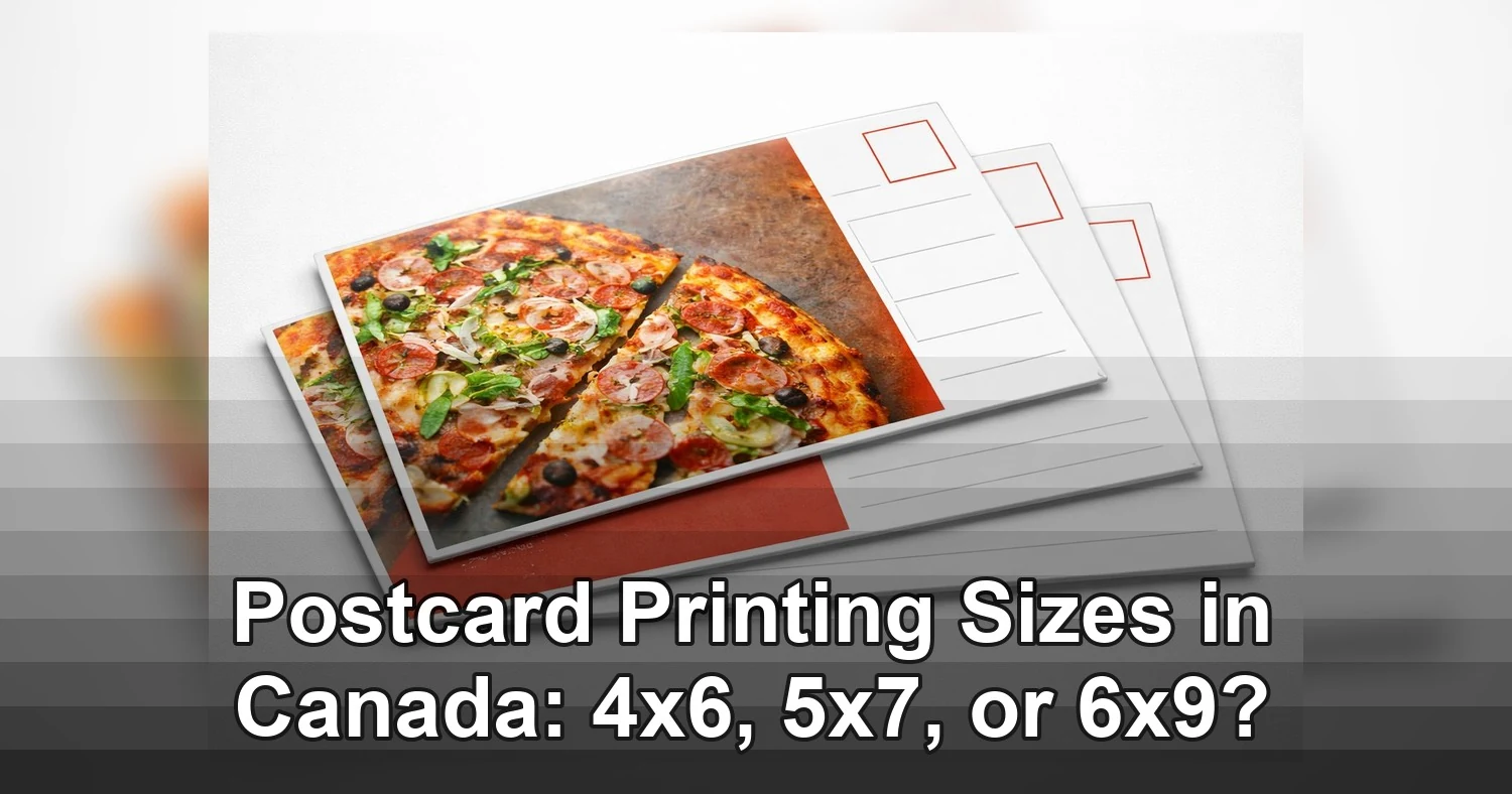
A lot of businesses pick the largest postcard first and hope it does the heavy lifting. In practice, postcard printing sizes work best when they fit the offer, the audience, and the mailing rules. For campaigns in Etobicoke, Toronto, and across the GTA, the best format is usually the one that gives you enough room to sell without adding avoidable print and postage costs.
Last updated: August 2026
Ready to print postcard printing?
Send your artwork, quantity, and deadline to Branding Centres. We will help confirm specs, turnaround, and the best production option.
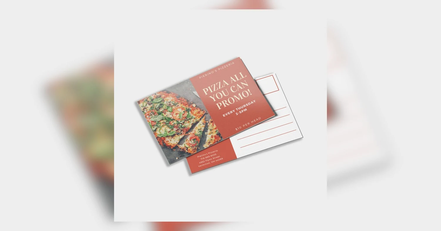
For most direct mail campaigns, 4×6 is the budget-friendly workhorse, 5×7 is the most balanced choice, and 6×9 is the attention-grabber when your offer, visuals, and budget can support it. If you are still comparing paper and finishes at the same time, review these custom postcard printing options. For a quick reference on common North American dimensions, this standard postcard size overview is also useful.
Postcard printing sizes: what actually changes from 4×6 to 6×9?
The main differences are how fast the card is noticed, how much room you have for the message, and what the campaign costs in the end. A larger card can catch the eye sooner in a mailbox, but it also costs more to print and may need a closer look at mailing specs. The best size makes the offer easier to understand, not just bigger.
That matters in local campaigns because postcard mailers often have only a few seconds to earn attention. A homeowner sorting bills may notice a 6×9 piece before a 4×6 card, but the bigger format only helps if the message is strong enough to justify the extra space. If the offer is simple, the smaller card can be the smarter choice.
Visual impact and message room
A 4×6 postcard is compact, familiar, and efficient. It works well for simple messages such as a coupon, a reminder, a grand opening announcement, or a short local promotion. A 6×9 postcard gives you far more room for a headline, image, offer details, testimonial, logo, and call to action without crowding the layout.
That extra room is especially helpful for service businesses. A realtor in Etobicoke can fit a large property photo, open house details, agent branding, and a QR code on 6×9 without squeezing the design. A dental clinic can show treatment highlights, introductory pricing, and trust signals more clearly. When your message needs explanation, the larger format often improves readability and makes the offer feel more polished.
Mailbox visibility and attention
In a stack of flyers, bills, and community mail, a larger card usually stands out faster. That can help direct mail postcards Canada campaigns that depend on quick visual recognition. A 6×9 piece has more presence than 4×6, and a strong visual hierarchy can make it feel more premium at first glance.
Still, size alone does not guarantee response. If the creative is weak, the offer is vague, or the audience is poorly chosen, a bigger postcard just becomes a more expensive weak message. The best campaigns use the size to support the offer, not replace it.
Budget and production tradeoffs
The jump from 4×6 to 6×9 can affect three parts of the budget:
- Paper and printing cost per piece
- Postage, depending on final size, stock, and mailing method
- Design time, if the extra space needs to be used well
For short-run postcard printing Toronto jobs, 4×6 keeps spend low and design simple. For premium neighborhood targeting in the GTA, 6×9 often justifies the higher unit cost because it gives the message more weight and can improve the chance of being noticed. The middle choice, 5×7, is often the best compromise when you need more room than 4×6 but do not want the full cost of 6×9.
4×6 postcard printing vs 5×7 and 6×9: side-by-side comparison
If you need to decide quickly, think of 4×6 as economical, 5×7 as balanced, and 6×9 as high-impact. These are the most common postcard printing sizes because they fit different marketing goals and different levels of message complexity.
| Size | Best use case | Design space | Main pros | Main limits | Response potential |
|---|---|---|---|---|---|
| 4×6 | Coupons, appointment reminders, event promos, simple local offers | Tight. Best for one image, one message, one call to action | Lowest print cost, easy to mail, fast to design | Can feel crowded quickly, less dominant in a mailbox | Strong when the audience already knows you or the offer is very clear |
| 5×7 | Retail promotions, restaurant offers, seasonal campaigns, service introductions | Moderate. Enough room for headline, image, offer, and key details | Good balance of cost and visibility, easier layout than 4×6 | Less dramatic than 6×9 for premium or multi-message campaigns | Often the best all-around choice for small businesses in Toronto |
| 6×9 | Real estate farming, home services, premium offers, high-value customer acquisition | Generous. Supports multiple sections without feeling cramped | High mailbox presence, strong brand impact, room for proof points | Higher print and mailing cost, needs careful spec review | Best when each lead has higher value and the message needs more persuasion |
A practical rule for GTA campaigns is simple. Use 4×6 when you need volume at the lowest possible cost. Use 5×7 when 4×6 feels tight but you still want good efficiency. Use 6×9 when every mailed piece needs to work harder and the offer can justify a more premium presentation.
If you are comparing coatings, stock, and format together, reviewing full postcard product options can help you match size to finish and budget before artwork is finalized.
Canada Post basics to check before you mail a postcard campaign
Before you print thousands of cards, confirm that your postcard is still easy to mail. In direct mail, size is only one part of the spec. Address layout, thickness, weight, and the final trimmed dimensions can affect whether the piece qualifies smoothly for mailing and what it may cost.
1. Keep the address side clean and readable
The most common mistake is treating both sides like full ad space. The address side should be organized, uncluttered, and easy to scan. Leave enough room for the recipient address, return address, postage area, and any mailing marks or indicia required by the mailing method.
If you are mailing to condo towers in downtown Toronto or apartment routes in North York, formatting matters even more. A crowded address block or poorly placed graphic can reduce delivery quality and make the piece harder to process.
2. Check thickness, weight, and coating before approval
A postcard can feel premium in hand and still cause issues if it is too thick, too heavy, or too slick for the intended mailing category. Heavier stocks and stronger coatings add durability, but they also change the final physical spec of the piece. Always review the finished stock, not just the flat size.
For many campaigns, AQ finish postcards offer a practical balance of protection and handling, especially when you want a coated surface without making the production process more complicated.
3. Understand why dimensions affect eligibility
The standard postcard size Canada Post category is not only about length and width. A 4×6, 5×7, or 6×9 card may fall into different mailing conditions once stock and weight are added. That is why a format that works well on one paper choice may need a different postage review on another.
- Print one live sample at actual size
- Confirm final trimmed dimensions
- Verify stock thickness and total weight
- Proof the address side separately from the marketing side
- Ask for a mailing check before the full run is released
For small business mailers in Etobicoke and across the GTA, this preflight step can prevent reprints, postage surprises, and delayed campaign drops.

Which postcard printing size works best for Etobicoke, Toronto, and GTA campaigns?
For most local campaigns, 5×7 is the best all-round choice, 4×6 is the budget workhorse, and 6×9 is the attention-grabber for higher-value offers. The right pick depends less on the printer and more on what you are promoting, how much copy you need, and whether you are mailing dense condo routes or detached-home neighborhoods.
Best fit by business type
- Real estate open houses: 6×9 usually performs best. It gives you room for a large hero photo, property address, open house time, agent headshot, and a strong call to action without looking cramped. In Etobicoke neighborhoods like The Kingsway, Princess-Rosethorn, or Long Branch, that larger format can also feel more premium.
- Restaurant offers: 5×7 is often the sweet spot. It fits a featured dish photo, map, coupon code, and expiry date clearly. For pizza, shawarma, brunch, and takeout promos across The Queensway, Mimico, or downtown condo clusters, 5×7 usually balances cost and visibility well.
- Retail promotions: 5×7 works well for seasonal sales, new arrivals, and grand openings. If the message is simple, such as a weekend discount, 4×6 can still do the job at a lower cost.
- Service-area mail drops: 4×6 is ideal for repeat distribution. Plumbers, cleaners, HVAC companies, electricians, and landscapers often get better value by mailing more often into the same routes instead of paying for a larger card once.
How neighborhood type changes the choice
In condo-heavy parts of Toronto, smaller cards are easier to keep simple and quick to read. In suburban GTA routes such as Mississauga, Vaughan, or Brampton, a 5×7 or 6×9 can help you stand out in a stack of community mail.
If you are unsure, start with the offer first. A one-message promotion can live comfortably on a 4×6. A campaign with photos, testimonials, map details, and multiple service categories usually needs 5×7 or 6×9. Many businesses compare postcard options for local campaigns after narrowing down the message length. It also helps to remember that 4×6, 5×7, and 6×9 are among the most common postcard formats, so choosing among them keeps design and print planning straightforward.
Design rules that keep postcard printing Toronto files readable
The biggest rule is simple: build the postcard for print readability, not for screen viewing. A layout that looks fine on a laptop can turn crowded and hard to scan once it is reduced to a postcard, especially at 4×6.
Set up bleed and safe zones properly
Use a 0.125 inch bleed on all sides if any color, photo, or background reaches the edge. Keep important text, logos, phone numbers, and QR codes inside a safe zone of at least 0.125 inch, and closer to 0.25 inch on a 4×6 where space gets tight quickly.
A common mistake in postcard printing Toronto files is placing a headline or logo too close to trim. It may look centered on screen but feel off once cut. Small shifts are normal in print, so critical content needs breathing room.
Use readable type and a clear hierarchy
For body text, 8 pt is usually the practical minimum, but 9 pt to 11 pt is safer for local direct mail postcards Canada campaigns aimed at a broad audience. Reverse text, light text on dark backgrounds, or script fonts should be larger because they lose clarity more quickly.
- Keep one dominant headline.
- Use one main photo, not a collage of tiny images.
- Make the offer and deadline visible in the top half of the card.
- Do not place fine text over busy photography.
Make QR codes and calls to action easy to use
QR codes should usually be at least 0.75 inch square, with 1 inch being more forgiving, especially if the postcard may be viewed in lobby lighting, on a kitchen counter, or in a car before someone scans it. Leave white space around the code, and always pair it with a plain-text URL or phone number.
On smaller cards, every element must earn its space. If you need to show services, testimonial copy, a map, and a coupon all at once, it is often a sign the layout needs a larger size rather than a tighter design.
What drives price, turnaround, and finish choice?
Price is driven mostly by quantity, paper choice, and finish. Turnaround is driven by how press-ready your file is, whether you need standard or rush production, and whether any extra steps such as variable data, addressing, or bundling need to happen after printing.
Quantity and stock thickness
Unit cost drops as quantity rises, which is why a 2,500-piece neighborhood drop often costs much less per card than a 250-piece test run. For small businesses in Etobicoke and the GTA, that means the cheapest campaign is not always the smallest one. If you know the offer will run in multiple routes or over several weeks, a larger batch often improves the math.
Stock thickness also matters. A standard 14pt card is a common balance of stiffness, mailing practicality, and price. Moving thicker can create a more premium feel, but it usually raises cost and may not improve response enough for everyday promos like cleaning, takeout, or retail sale cards.
Matte, UV, and AQ finishes
Finish changes both appearance and usability. 14pt matte finish postcards are a strong fit when you want easy readability, a softer look, and a surface that is easier to write on for appointment reminders or personal notes. UV coating gives photos more shine and color pop, which is why restaurants, salons, and fashion retailers often use it for image-heavy mailers.
AQ finish postcards sit in the practical middle. They offer a clean coated feel with good visual appeal and are often chosen when businesses want a polished result without adding complexity to production.
Rush timing and production speed
If you need cards quickly for an open house, weekend promo, or event launch, rush timing can increase cost and limit your finish or quantity options. Files with low-resolution photos, missing bleed, RGB artwork, or last-minute edits also slow production because they need correction before printing.
For the smoothest turnaround, send a press-ready file, confirm the final quantity early, and choose a finish that matches both the campaign goal and the delivery deadline. That is usually where small business postcard jobs win or lose time.
Common postcard size mistakes that hurt response and waste budget
The biggest postcard printing sizes mistake is choosing a card that does not match the message, the mailing method, or the time you have to proof it. That is how Toronto and GTA campaigns end up with cramped layouts, weak offers, mailing headaches, and expensive reprints.
Among the most common postcard sizes used in direct mail are 4×6, 5×7, and 6×9, but the right choice depends on what you need the card to do, not just what seems cheapest at first glance.
Trying to fit too much into a small format
A 4×6 card can work well for a simple promo, appointment reminder, or short restaurant offer. It usually fails when businesses try to cram in a headline, product list, map, coupon, testimonial, QR code, and multiple calls to action.
- Tiny type gets skipped, especially by older audiences
- Busy artwork weakens the main offer
- Important details like expiry dates or promo codes become hard to find
If the message needs more breathing room, move up in size instead of shrinking the font. Pairing a cleaner layout with 14pt matte finish postcards can also improve readability when you have more copy-heavy content.
Choosing the size by habit instead of by offer
Many local businesses automatically reorder the same size every time. That often creates a mismatch between the offer and the format. A high-value real estate just-listed card, a grand opening announcement, or a multi-service home campaign may need more visual impact than a basic 4×6 can provide. On the other hand, using 6×9 for a very simple discount message can raise print and postage costs without improving response enough to justify it.
Before ordering, ask what matters most: lowest unit cost, strongest visibility in the mailbox, or room for details. Reviewing your postcard stock and size options first usually prevents this mistake.
Ignoring mailing rules and skipping final proofs
Even a strong design can fail if the address side is not planned properly. Common problems include placing text or graphics where postage, addressing, or mail processing marks need clear space, and forgetting that trim shifts can clip borders, QR codes, or legal copy.
Always proof for:
- final trim, bleed, and safe margins
- address block and postage placement
- readability at actual printed size
- image quality and color shifts on the chosen finish
This matters even more on glossy pieces such as 14pt UV finish postcards, where glare can affect fine text. One last printed proof check is much cheaper than discovering 5,000 cards arrived in Etobicoke or Scarborough with a cut-off phone number or an unreadable offer.
Before you place the order, match the size to the offer, then confirm mailing specs, quantity, and finish with your print shop. For many GTA campaigns, a simple A/B test of 5×7 versus 6×9 in one route gives clearer answers than guessing. If you want a safer rollout, ask for a proof and a postage check first so your postcard lands cleanly, reads fast, and earns its budget.
Related Products and Services
If you are planning a similar project, these related options may help.
Helpful External Resources
These sources provide supporting background and additional context.
-
What postcard size is best for direct mail in Canada?
For most direct mail campaigns, 4×6 postcards are the most practical choice because they are affordable, easy to mail, and simple to design. Choose 5×7 or 6×9 if you need more space for photos, offer details, or a stronger mailbox presence.
-
Is 4×6 postcard printing always the cheapest option?
Not always. 4×6 is often the lowest-cost size per piece, but total pricing also depends on paper stock, quantity, coating, addressing, and mailing requirements. In some campaigns, a larger postcard can be more effective even if the unit price is higher.
-
When should I choose 5×7 or 6×9 postcards instead of 4×6?
Choose 5×7 or 6×9 when your message needs more room for images, testimonials, service lists, maps, or multiple calls to action. These sizes also work well for premium branding, real estate marketing, and offers that need stronger visual impact.
-
What should I check before sending postcards through Canada Post?
Check the final size, stock thickness, total weight, address placement, postage area, bleed, and safe margins. Also make sure your artwork is built for the exact finished postcard size so nothing is trimmed or blocked during mailing.
-
What file specs should I use for postcard printing sizes?
Use a print-ready PDF at full size with 300 DPI images, CMYK color mode, and bleed included if the artwork goes to the edge. Keep text and important elements inside the safe area so they remain readable after trimming.
Get a Free Quote Today
Contact us at +1-(416) 288-8661 or Email us at info@Brandingcentres.com and let's get started.