Choosing the right Paper Stocks for business cards is one of the quickest ways to improve first impressions, print quality, and the overall professionalism of your brand. The best stock is not simply the thickest one. It is the option that fits your brand image, holds up during everyday handling, and supports practical needs like sharp color, readable text, or space for handwritten notes.
Last updated: April 2026
This guide compares the most common business card stocks, explains what thickness and finish actually mean, and shows how to match each option to real business uses such as networking, appointments, retail counters, and premium client meetings. Most business cards are printed on cardstock that is much thicker than standard office paper, and the coating or finish can significantly affect durability, texture, and writability, as explained in this guide to business card paper types.
Why Paper Stocks Matter for Business Cards
The stock you choose shapes how your card feels in the hand, how long it lasts, and what people assume about your business in the first few seconds. That matters because a business card is often a small but direct piece of Business Branding that can reinforce trust, quality, and professionalism before anyone visits your website or reads your proposal.
Heavier or specialty Paper Stocks usually feel more substantial, which can make a new contact assume your business is established and detail-oriented. Lighter stocks can feel flimsy, crease faster, and signal a budget-first approach, even when the design itself is strong. That tactile impression is especially important at networking events, trade shows, and client meetings where your card may be the only physical reminder of your brand.
Stock also affects print quality. Smooth, coated surfaces tend to hold sharp text, rich color, and fine logos more cleanly, while textured or uncoated stocks can soften the look and absorb ink differently. If your design uses bold photography, gradients, or high-contrast color, the wrong stock can make it look dull. If your card relies on a handwritten note or appointment details, a stock that takes pen well is more practical.
Durability is another factor business owners should not overlook. A card that bends easily, scuffs, or loses its finish quickly will not stay in circulation long. That means fewer chances for follow-up and weaker Advertising value from each card you hand out. By contrast, a durable card is more likely to survive in a wallet, on a desk, or pinned to a board until someone is ready to act.
There is also a perception issue. Luxury finishes can suggest premium service, while natural or recycled stocks can communicate eco-conscious values. In a recent overview of common stock types, Printivity’s guide to business card paper highlights how finish and thickness influence both appearance and handling. The takeaway is simple: your stock choice is not just a printing detail, it is part of the message your card sends.
Paper Stocks for Business Cards: A Side-by-Side Comparison
The best Business Card Paper Stocks depend on how you want the card to feel, how it will be used, and what kind of brand image you want to project. Use the comparison below to narrow the field quickly.
| Stock Type | Feel and Finish | Writability and Durability | Branding Style | Relative Cost |
|---|---|---|---|---|
| Matte card stock | Smooth, non-reflective, clean and modern | Writes well with pen; good everyday durability | Professional, minimal, versatile | Moderate |
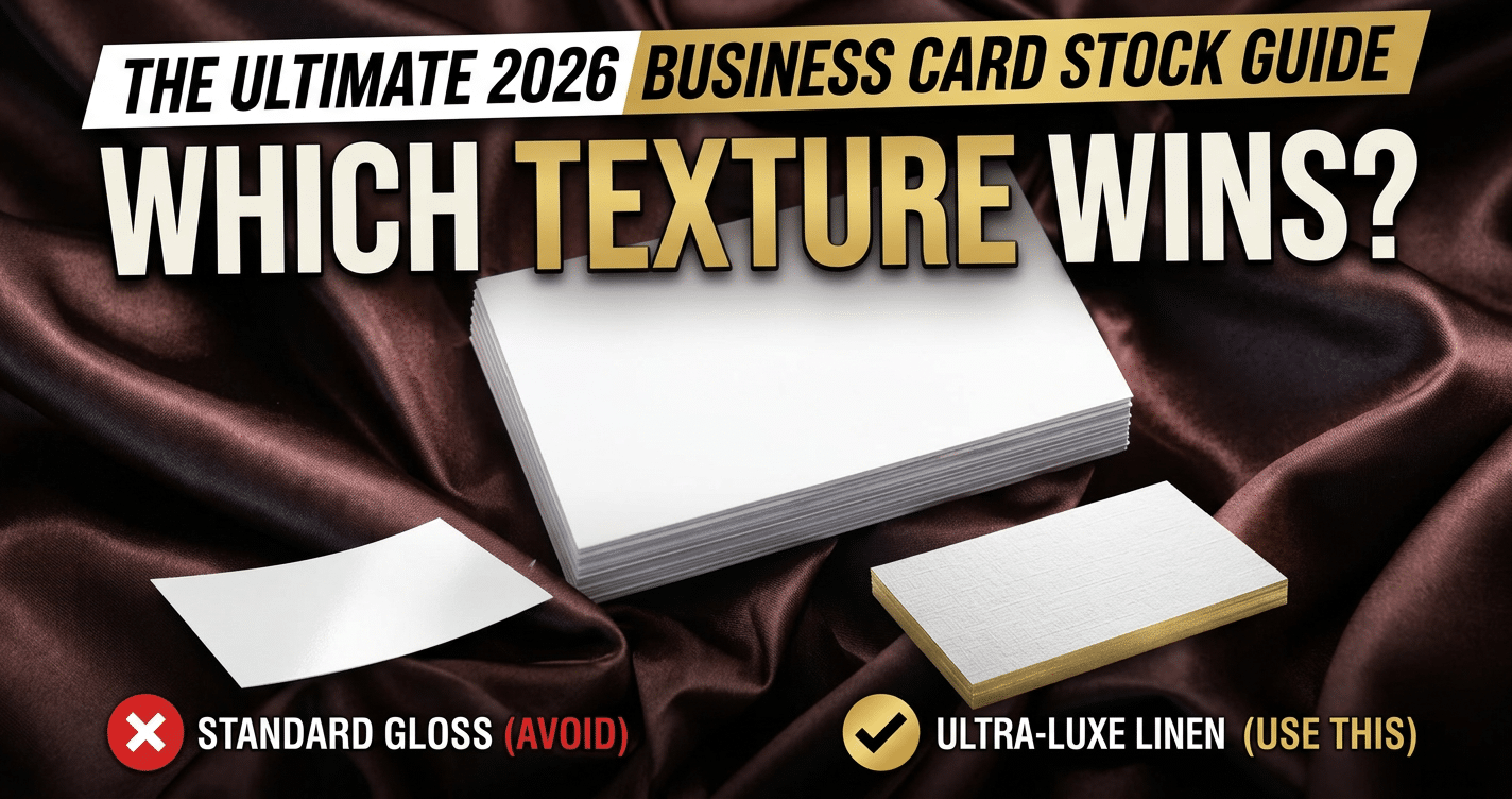
| Gloss laminated stock | Shiny, vibrant, polished | Poor for writing; very scuff-resistant | Bold, promotional, high-impact | Moderate to higher |
| Uncoated stock | Natural, soft, slightly textured | Excellent for handwritten notes; less resistant to wear | Friendly, simple, service-oriented | Lower to moderate |
| Kraft paper stock | Brown, earthy, rustic texture | Writes well; can show scuffs sooner than coated options | Eco-conscious, artisanal, handmade | Moderate |
| Pearl or shimmer stock | Subtle metallic sheen, premium feel | Usually best for printed graphics, not heavy writing | Luxury, beauty, upscale services | Higher |
| Painted edge stock | Thick, premium body with colored edge detail | Highly durable; edge detail can wear if handled roughly | Luxury, design-forward, memorable | Higher |
How the main options compare in practice
Matte stock is the safest all-purpose choice. It gives clean printing, feels professional, and stays easy to read under office lighting or at events. If your card needs to look polished without being flashy, matte is a strong default.
Gloss laminated business cards are better when color impact matters more than writing space. They are useful for marketing-heavy designs, but the shiny surface can reflect light and resist ink from pens or markers.
Uncoated stock is ideal when your card needs to double as a note-taking tool. It is common for consultants, real estate agents, and appointment-based businesses that want contacts to jot down follow-up details immediately.
Kraft paper business cards work well for brands that want a natural, handmade, or eco-friendly look. The tradeoff is that the rustic texture will not support every design style, especially highly detailed photography or bright color gradients.
Pearl paper business cards are better suited to premium branding, beauty services, weddings, or luxury retail. They elevate presentation, but they should be used when the design can benefit from shine rather than when you need maximum writability.
If you want a dramatic premium cue, painted edge business cards can stand out instantly. They are memorable, but they usually make the most sense when your brand already leans upscale and your budget supports a higher per-card cost.
How to Choose the Right Stock for Your Brand and Use Case
Choose the stock that matches both your brand personality and how the card will actually be used. The best option is not always the thickest or the most decorative. It is the one that supports your message, your workflow, and your budget.
Match the stock to your industry
Service businesses often do best with matte or uncoated stock because those finishes feel approachable and professional. If you are a consultant, accountant, coach, or contractor, a clear, easy-to-read card can matter more than a flashy effect. Creative industries, beauty brands, luxury retailers, and event businesses can benefit from pearl, painted edge, or other specialty paper stocks that immediately signal premium positioning.
Match the stock to your design style
If your design is minimal with strong typography, a smooth matte or uncoated finish will keep the look clean. If your layout uses bright color blocks, photography, or a bold logo, coated or gloss laminated stock helps preserve contrast and sharpness. If your brand leans natural or sustainable, a kraft stock can reinforce that message without needing extra explanation.
Match the stock to the real use case
Think about where the card will travel. Trade show handouts, walk-in promotions, and high-volume distribution usually call for durable, cost-conscious stock that can be reordered easily. Cards meant for VIP clients, proposals, or premium packaging inserts can justify a thicker, more distinctive choice. For teams handing out cards in fast-paced settings, consistency and readability should outrank novelty.
Use a simple decision checklist
- Will someone write on the card by hand?
- Does the design need bright color or a luxury finish?
- Will the card be carried in wallets, folders, or product packaging?
- Does the stock reflect your pricing and market position?
- Does the turnaround time fit your event or launch date?
If you need a card that is practical and versatile, start with matte. If you need maximum polish for premium Business Cards, choose a specialty stock. And if you are ordering for a specific campaign, ask whether the card is meant to inform, impress, or convert. That answer usually points to the right stock more quickly than paper samples alone.
Thickness, Coatings, and Finishes Explained Without the Jargon
The main thing to understand is that thickness affects how sturdy a card feels, while coating and finish affect how it looks, feels, and holds up in a pocket or wallet.
Paper weight and rigidity
Business card paper is usually described by weight or thickness, and both influence first impressions. A thicker stock feels more premium and resists bending, while a lighter stock is more flexible and budget-friendly. If your cards need to project confidence, a heavier feel usually works better. If you hand out large volumes at events, a slightly lighter stock can still perform well without driving up cost.
Rigidity matters just as much as the number on the spec sheet. A card that feels stiff and smooth often reads as more professional than one that curls or bends easily. That is why many business owners compare stock samples by touch before ordering.
Coated, uncoated, and specialty finishes
Coating changes how ink sits on the surface and how the card reflects light. A coated card has a protected surface that helps colors pop and keeps printing crisp. An uncoated card has a more natural, writable feel and is often chosen for a warmer, more approachable look. For a polished, high-contrast option, many brands choose gloss laminated business cards, especially when vibrant graphics or product photography are part of the design.
Specialty finishes can make a card feel more memorable. Soft-touch gives a velvety, matte-like texture that feels upscale and modern. Pearl or metallic stocks add shimmer and are often used when the goal is a luxury look, while textured kraft paper can support a more handmade or eco-conscious identity. If your brand leans premium, a finish from pearl paper business cards can create a noticeable effect without needing a busy design.
Lamination and edge treatments
Lamination adds a protective layer over the printed surface. It can help cards resist scuffing, moisture, and fingerprints, which is useful if cards are carried around often. Matte lamination gives a softer, understated look, while gloss lamination adds shine and depth.
Edge treatments are another detail that changes the feel of the card. Painted edges, for example, create a strong color accent that makes thicker stock look custom and deliberate. That works well when you want your painted edge business cards to stand out the moment someone picks them up.
What Changes the Price and Turnaround of Business Card Printing
The biggest pricing drivers are stock choice, quantity, specialty finishes, proofing, and how fast you need the order completed.
Stock upgrades raise the base price
Standard paper stocks are usually the most affordable option because they are widely available and easy to produce. Once you move into thicker boards, soft-touch coatings, pearl finishes, kraft textures, or custom edge treatments, the cost goes up. That increase comes from both the material itself and the extra production steps needed to create the effect.
For Business Cards used in sales, networking, or Business Branding, the upgrade is often worth it when the card is part of the pitch. But if the card is only for basic contact exchange, a simpler stock may be the smarter budget choice.
Quantity changes the cost per card
Ordering more cards usually lowers the price per unit. Setup costs, plate preparation, and press time are spread across the whole run, so 1,000 cards will almost always cost less per piece than 250. This is one of the most important budget decisions for Advertising and marketing use cases.
The catch is that larger quantities only help if your information will stay current. If your team changes titles, phone numbers, or addresses frequently, a smaller run can prevent waste.
Specialty finishes add time and complexity
Premium details can extend production time. Soft-touch lamination, foil accents, painted edges, and multi-layer construction often require extra curing, drying, or finishing steps. If your order includes a complex look, expect the turnaround to be longer than a standard print job.
As this overview of business card paper options shows, different stocks and finishes can change both appearance and production requirements, which is why a premium look usually costs more and takes longer to complete.
Proofs can prevent expensive mistakes
Digital proofs are usually inexpensive or included, but physical proofs may add cost. Even so, a proof can save money by catching issues with color, bleed, legibility, or finish choice before a full run is printed. If your design uses fine type or dark backgrounds, proofing is especially useful.
Rush production carries a premium
Faster turnaround often means higher labor and scheduling costs. Rush orders may also limit your finish choices because not every stock or coating can be produced on short notice. If you need cards for an event, trade show, or local meeting, build in enough time for printing, finishing, and shipping so you do not pay extra for speed.
A simple budgeting checklist
- Choose the stock that matches your brand, not just the lowest price.
- Estimate quantity based on realistic usage over the next few months.
- Decide whether specialty finishes are worth the added cost.
- Budget for proofs if color accuracy matters.
- Leave room for rush fees if your deadline is tight.
Common Paper Stock Mistakes That Make Cards Look Cheap
The fastest way to make a card look low quality is to choose a stock or finish that works against the design instead of supporting it.
Picking the wrong finish for the brand
A glossy card can make photos and bright colors look sharp, but it can also feel too flashy for a law office, accounting firm, or minimalist brand. A soft-touch or matte finish may look more refined in those cases. On the other hand, a plain uncoated stock can feel unfinished if your brand needs a polished, high-impact presentation.
If your visual identity is natural, textured options such as kraft paper business cards may fit better than a slick coated stock. The mistake is not the finish itself, but using a finish that sends the wrong message.
Ignoring readability
Dark paper with low-contrast ink, tiny fonts, or crowded layouts can make even a premium stock look amateur. Before approving a design, check whether the name, role, phone number, and email are easy to read at arm’s length. A beautiful finish cannot compensate for bad contrast.
Skipping samples
Paper stocks can look very different online than they do in person. A sample helps you feel thickness, compare coatings, and see how colors print on the actual surface. This is especially important if you are choosing between matte, gloss, soft-touch, or textured options.
Matching the stock to the wrong use case
A heavy specialty card may be perfect for a luxury consultant but excessive for a team handing out hundreds of cards at a community event. Likewise, a very light stock may save money but can undermine a premium service brand. The best choice is the one that fits how the card will actually be used.
Overlooking edge quality and consistency
Cheap-looking cards often show rough edges, uneven trimming, or visible wear after a short time. If you want a more finished appearance, pay attention to the cut quality and consider treatments that make the edges part of the design rather than an afterthought.
Quick mistakes to avoid
- Choosing shine when the brand needs softness or restraint.
- Using textured stock with a layout that already has too much detail.
- Ordering without checking a sample first.
- Selecting a stock that bends too easily for everyday carrying.
- Forgetting that the paper choice should support the brand message.
A Final Checklist Before You Order Business Cards
The safest way to order Business Cards is to verify five things before you hit submit: samples, file setup, stock choice, finish choice, and whether a specialty card option fits your brand or budget.
1) Compare real samples, not just screen previews
Paper Stocks can look very different in person than they do on a monitor. Ask for printed samples or swatches so you can feel the weight, see how colors sit on the surface, and check whether the card feels sturdy enough for your Business Branding. This is especially important if your design uses dark backgrounds, fine type, or a logo with subtle gradients.
If you are torn between a classic coated card and a premium texture, compare a standard option with a specialty finish. For example, a glossy card can make color pop, while a tactile stock like kraft paper business cards can signal a more natural or handmade brand direction.
2) Double-check your file setup before upload
Prepress mistakes can delay turnaround and add avoidable reprint costs. Set your artwork up with the correct size, bleed, and safe area, and make sure raster images are high resolution. Most printers recommend 300 dpi for print files, which helps avoid soft edges or pixelation on the final card, as noted in this overview of business card paper and print setup.
- Use the exact trim size your printer specifies.
- Include bleed on all sides so edge-to-edge designs do not cut short.
- Keep important text away from trim edges.
- Convert colors to the requested print format before exporting.
- Proof names, phone numbers, emails, and URLs line by line.
3) Match the stock to the way the card will be used
Choose a stock that fits both your design and how often the card will be handled. If your cards need to survive pockets, wallets, and repeat handing at events, a heavier stock with a protective coating is usually the better business move. For sales teams, a durable finish can help the card hold up through long marketing cycles.
If your brand calls for a premium look, specialty options may be worth the extra cost. Pearl paper business cards work well for elegant, high-end presentations, while painted edge business cards add a small but memorable detail that can elevate a simple layout.
4) Choose the finish based on readability and brand style
Finish affects both feel and readability, so do not treat it as an afterthought. Gloss can brighten color-heavy designs, matte can reduce glare for text-forward cards, and soft-touch or coated finishes can give a more premium first impression. If your card has a lot of photography or saturated color, a finish that protects ink and improves contrast is often worth considering.
For brands that want a polished look with everyday durability, gloss laminated business cards can be a strong option because the coating helps protect the surface while keeping colors vivid.
5) Confirm the production details before you order
Before checkout, confirm quantity, turnaround time, proof approval, and whether your chosen stock is in line with your budget. If you need cards for an event, order early enough to allow for proof changes and shipping. A specialty stock may need a little more planning than a standard one, especially if you want a custom look without risking a rush fee.
- Review the proof on a large screen, not only a phone.
- Check whether the printer offers a digital or hard-copy sample.
- Confirm the stock thickness and finish in the final quote.
- Ask whether specialty options affect production time.
- Order extras if you attend networking events or trade shows regularly.
Before you order, narrow your choice to the stock that best matches how your business cards will actually be used, then confirm the finish supports your design and brand tone. If you want a more premium look after choosing the right base stock, options like painted edge business cards can add impact without guessing on the fundamentals. A quick sample check now can save money, avoid reprints, and help you order cards you will feel confident handing out.
Related Products and Services
If you are planning a similar project, these related options may help.
Helpful External Resources
These sources provide supporting background and additional context.
What are the best Paper Stocks for business cards?
The best Paper Stocks for business cards are usually matte, uncoated, gloss laminated, or specialty stocks depending on the goal. Matte is the safest all-purpose choice, uncoated is best for writing, gloss works well for bright graphics, and premium options like pearl or painted edge stocks help luxury brands stand out.
Which Paper Stocks work best for writable business cards?
Uncoated and matte Paper Stocks are the best choices if you want to write on business cards. They accept pen, pencil, and stamps more easily than gloss or heavily coated options. If you need appointment notes or handwritten follow-up details, avoid high-gloss finishes.
How thick should business card Paper Stocks be?
A strong business card stock is usually around 14 pt to 16 pt, with 16 pt often feeling more premium. Thicker stocks resist bending and create a better tactile impression, while thinner options can work for high-volume, budget-conscious orders.
Do premium Paper Stocks improve branding and marketing results?
Yes, premium Paper Stocks can improve brand perception because they make a business card feel more professional and memorable. A thicker or specialty stock can help your card stand out, support your brand image, and encourage people to keep it longer. The best result comes from matching the paper choice to your audience, design, and use case.
Get a Free Quote Today
Contact us at +1-(416) 288-8661 or Email us at info@Brandingcentres.com and let's get started.