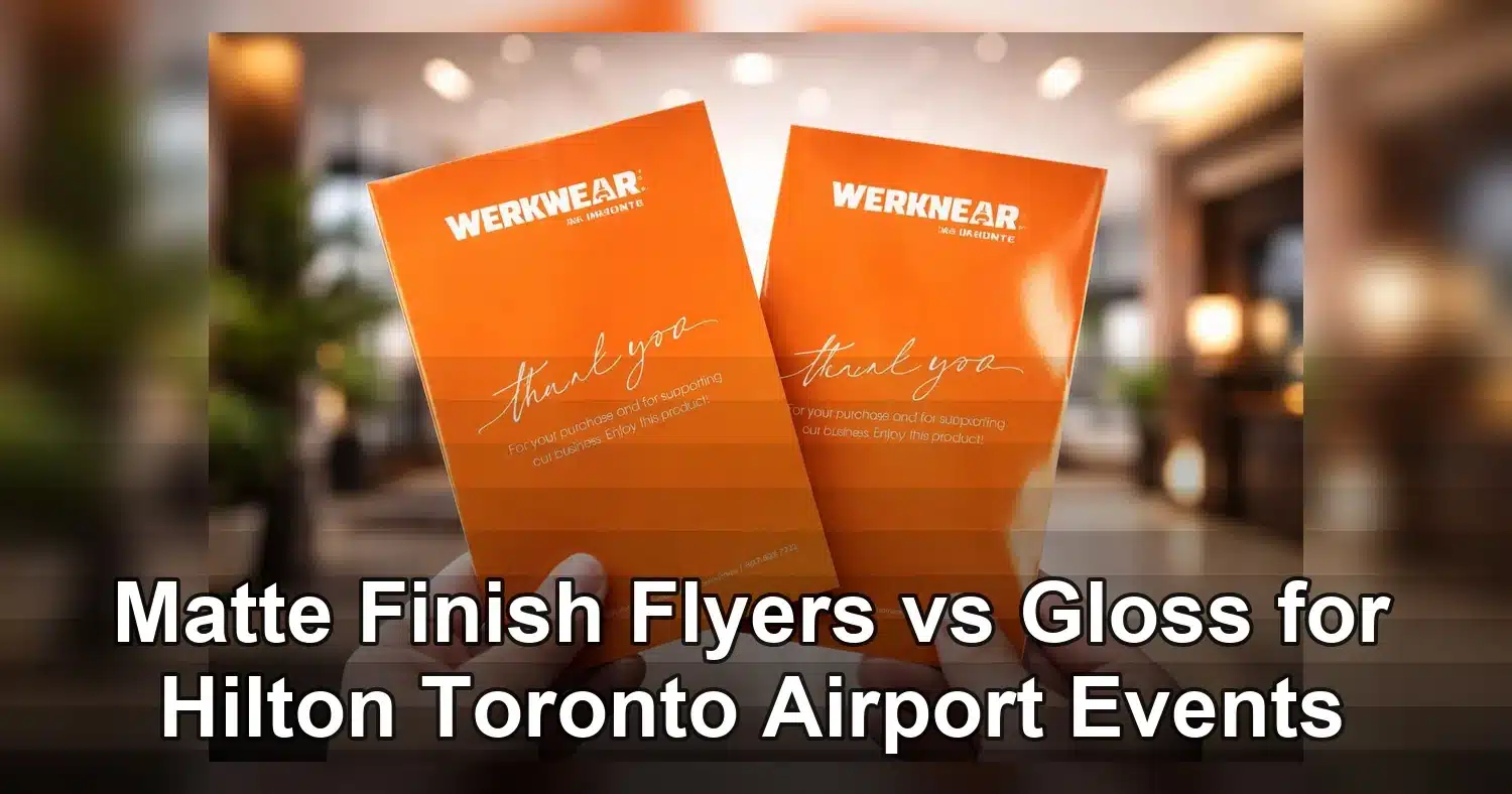
For event planners and hotel marketers comparing flyer finishes for events near Hilton Toronto Airport Hotel & Suites, matte finish flyers are usually the smarter choice when readability, easy handling, and a polished brand look matter most. In busy airport-hotel settings with overhead lighting, quick check-in traffic, and handouts viewed at arm’s length, matte reduces glare and keeps text easier to scan. Gloss can still be the better option for image-led promotions, but for agendas, sponsor sheets, room-drop inserts, and registration packet materials, matte finish flyers often deliver the best day-of-event performance.
Last updated: April 2026
Ready to print flyer printing?
Send your artwork, quantity, and deadline to Branding Centres. We will help confirm specs, turnaround, and the best production option.
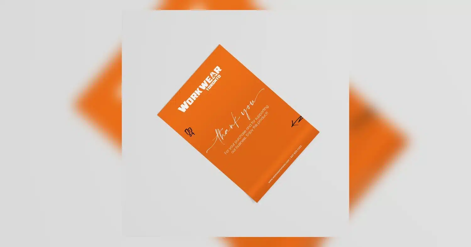
The finish decision is not just aesthetic. At a venue like Hilton Toronto Airport Hotel & Suites, flyers may be read in the lobby, outside ballrooms, at check-in tables, and inside meeting rooms with mixed natural and artificial light. That means reflections, smudging, writing needs, and viewing distance all affect results. Industry guidance commonly notes that matte surfaces are easier to read under bright light, while gloss tends to make photos and saturated colors pop more, as explained in this comparison of glossy and matte flyers. The right choice depends on whether your event handout needs to inform quickly, impress visually, or do both.
Why finish matters for Hilton Toronto Airport Hotel & Suites flyers
Finish matters because airport-hotel flyers are read in fast-moving, mixed-light environments where people make decisions in seconds. At Hilton Toronto Airport Hotel & Suites, that often means checking registration tables, walking past lobby displays, or grabbing event handouts on the way to a shuttle, breakout room, or banquet entrance. The wrong finish can make a flyer look washed out under bright lobby lighting or hard to read in a dim pre-function area.
For event planners and hotel marketers, the finish also affects how well flyers hold up in circulation. In a busy hotel lobby, materials get handled by attendees, front desk staff, sponsors, and volunteers. A finish that reduces glare and fingerprints helps keep the piece looking polished longer, especially when flyers are stacked beside signage or inserted into welcome packets. That is one reason many planners compare matte finish flyers against gloss before placing a print order.
Distance from the viewer matters too. Flyers used at check-in or inside a packet are usually read up close, so subtle texture and strong typography can outperform heavy shine. By contrast, a glossy finish may work better when the goal is to catch attention from across a lobby or display table. At airport-hotel events, the best choice depends on whether the flyer is meant to inform, attract, or stay in a guest’s hand for the full day.
Local event conditions that change flyer performance
- Lobby lighting: reflective surfaces can create glare under downlights, windows, and digital signage.
- High foot traffic: flyers need a finish that stays clean and readable after frequent handling.
- On-site distribution: welcome packets, sponsor tables, and shuttle handouts often need different visual emphasis.
- Brand image: a soft, upscale finish can feel more executive, while gloss can feel more energetic and promotional.
For event teams working near the airport corridor, finish is not just a design preference. It is a practical decision that affects readability, durability, and how professionally your flyer fits the hotel environment.
Matte finish flyers vs gloss: which finish fits each event use case
The right finish depends on what the flyer needs to do. Matte finish flyers are usually the better fit for readability, note-taking, and a refined brand image, while Gloss Text Flyers are stronger when you want richer color, more shine, and higher visual punch on image-heavy pieces.
| Use case | Best finish | Why it fits | Watch-outs |
|---|---|---|---|
| Registration packets | Matte finish flyers | Easy to read quickly, low glare, and a more polished presentation for schedules and instructions | Heavy photo panels can look less vivid than gloss |
| Sponsor sheets | Gloss | Improves color pop and helps logos, images, and sponsor blocks stand out on the table | Can reflect lobby or ballroom lighting and make small text harder to scan |
| Promo handouts | Gloss or matte, depending on goal | Gloss drives attention for offers and launches; matte feels more premium for executive or B2B events | Gloss can fingerprint easily during heavy foot traffic |
| Agenda inserts | Matte finish flyers | Better for writing notes, checking off sessions, and reading under mixed indoor light | Less reflective impact if the piece is meant to attract from across the room |
| Hotel lobby display pieces | Gloss | High shine draws attention from a distance and boosts photo-heavy branding | Glare can reduce readability near windows, chandeliers, or LED screens |
Readability is the biggest advantage of matte. The surface diffuses light, so type stays clearer in packet inserts and event schedules. Gloss, on the other hand, gives deeper contrast to photography and bold color blocks, which can be valuable for sponsor-driven promotions or product launches. Independent print guidance often recommends choosing matte for text-heavy pieces and gloss for vibrant image-led materials, such as in this flyer finish comparison.
Handling is also different. Matte hides fingerprints better and feels more understated, which is useful for formal events and repeat touchpoints. Gloss feels slick and attention-grabbing, but it can show smudges faster when flyers are passed out at check-in desks or sponsor tables.
How to design matte finish flyers so they read better in real hotel conditions
Not every flyer improves just because the finish changes. Matte finish flyers perform best when the layout supports quick reading, strong hierarchy, and practical use during an event. In a hotel setting, people are often scanning while standing, walking, or balancing coffee and luggage, so design has to do real work fast.
Use typography that survives mixed lighting
Choose fonts with strong character shapes and enough weight to stay readable at a glance. Thin scripts and delicate light fonts can disappear in small sizes, especially when the flyer is printed on a soft matte surface. For schedules, directions, and callouts, a clean sans serif or a highly legible serif usually works best.
- Keep body text at 10 pt minimum, and 11 to 12 pt when the page is dense.
- Use larger type for room numbers, session times, and RSVP details.
- Keep line spacing open enough that the page does not feel crowded.
Build a layout that helps guests act quickly
A flyer near the airport hotel should not make readers hunt for the main point. Put the event name, date, location, and next action near the top. If the flyer has multiple purposes, separate them visually with headings, spacing, or boxes so guests can find the right detail fast.
- For registration packets, put the most time-sensitive instructions first.
- For sponsor sheets, lead with the logo or offer, then supporting details.
- For agenda inserts, group sessions by time and room to reduce scanning effort.
Use color with restraint
Matte finish flyers usually look strongest when the palette is controlled. Deep navy, charcoal, white, and muted accent colors often feel premium and stay legible. Light gray type over a busy image is a risk on any finish, but it is especially easy to lose on a soft surface if contrast is too low. When in doubt, test whether the design still reads from several feet away and at arm’s length.
Plan for QR codes and note-taking
Event flyers often need to do more than advertise. They may need to send guests to a mobile agenda, registration form, sponsor page, or session map. Matte finish flyers are especially useful when QR codes need to be scanned under hotel lighting without a bright reflection in the way. They are also easier to annotate, which helps when attendees are marking room changes, selecting breakout sessions, or jotting down contact details.
- Keep QR codes away from folds and edge trim.
- Leave enough white space around the code for reliable scanning.
- Place notes-friendly content in a clear lower section or side panel.
If your event collateral includes other tactile pieces, a related format like 14pt matte finish postcards can create the same refined look in a smaller, sturdier format.
Which paper specs matter most before you order
The most important specs are paper weight, print coverage, size, sidedness, and coating. Those choices affect how the flyer feels in hand, how it prints under event lighting, and whether it looks premium enough for a Hilton Toronto Airport Hotel & Suites audience.
Start with paper weight
Paper weight controls stiffness and perceived quality. A lighter stock can work for quick promotional handouts, but event planners usually prefer a thicker feel for schedules, sponsor pieces, and branded inserts. Heavier paper also tends to survive travel in tote bags and welcome kits better.
- Lightweight: good for mass distribution and short-lived promotions.
- Midweight: balanced for most registration packets and sponsor flyers.
- Heavy stock: best for premium branding, executive events, or pieces that need to feel important.
Choose single or double-sided printing
Single-sided printing works when the flyer has one clear message, like a promo offer or directional handout. Double-sided printing is better when you need schedules, maps, sponsor details, or multiple calls to action. If the content is dense, double-sided printing can keep the layout cleaner without making the front feel crowded.
Match size to distribution
Common flyer sizes are easier to carry, insert, and display. Smaller formats work well for hand-to-hand distribution near the lobby or shuttle area. Larger formats are better when the flyer must stand out on a registration table or hold more event detail without feeling cramped.
For some event setups, a related format like 14pt matte finish postcards can be a smarter choice if you want a thicker, more durable piece with a compact footprint.
Check color density and coating
Full-bleed images, dark backgrounds, and rich brand colors need enough ink coverage to stay sharp. Matte coating softens glare and supports easy reading, while gloss coating boosts saturation and makes photos look more vivid. If your flyer includes fine type, QR codes, or event schedules, matte usually gives the safer reading experience. If the main goal is visual excitement, gloss can deliver stronger impact.
Before you place the order, review this quick checklist:
- Is the flyer mostly text or mostly images?
- Will guests handle it in a bright lobby or dim event room?
- Does it need to fit into packets, pockets, or display holders?
- Will attendees write on it or scan a code from it?
- Does the finish support the brand image you want at the hotel?
If your distribution includes room drops or door-to-door event outreach, a format like matte finish door hangers may also outperform a standard flyer in terms of visibility and placement.
How ballroom lighting and busy lobbies change flyer readability
The right finish matters because hotel spaces often create glare, reflections, and fast-moving foot traffic that can make a flyer hard to read at a glance. In ballrooms, chandeliers, spotlights, and uplighting can wash out brighter sheets, while glossy stock can bounce light into the reader’s eyes. In lobbies and pre-function areas, people usually scan event handouts while walking, standing in line, or balancing a coffee, so readability has to work in seconds.
Why hotel lighting changes the experience
Matte finish flyers usually reduce reflections, which helps names, room numbers, QR codes, and schedule details stay visible under mixed lighting. That can be a real advantage for registration desks, breakout session maps, sponsor sheets, and agenda inserts. A softer surface also makes it easier to jot down notes, circle room changes, or mark session times without fighting glare.
Gloss can still work, especially when the flyer is meant to attract attention from a distance, but it performs best when the message is simple and the design has strong contrast. If your piece is packed with small text, multiple time blocks, or directional details for a hotel event, a softer finish is usually easier to scan quickly. For planners comparing matte finish flyers with reflective alternatives, the key question is whether the audience will read the piece under controlled lighting or in a crowded circulation area.
When softer finishes help most
- Directional flyers placed at lobby check-in or concierge desks
- Speaker agendas and workshop schedules with small type
- Hotel map handouts that guests may fold, annotate, or carry all day
- Multi-session programs where quick scanning matters more than sheen
Designers often choose matte when they want the surface to feel calmer and more readable in real hotel conditions. For materials that need to stand up to glare-heavy spaces, the matte versus glossy readability tradeoff is usually easy to see once you picture a busy conference lobby rather than a quiet desk.
Pricing drivers, turnaround times, and rush-order planning
Pricing for event flyers is driven mostly by size, paper weight, quantity, color coverage, and finish, with quantity having the biggest impact on unit cost. Larger runs spread setup and press time across more pieces, so the per-flyer price usually drops as volume goes up. If you are ordering for a conference, sponsor activation, or gala weekend near Hilton Toronto Airport Hotel & Suites, it often pays to compare the cost of one larger print run against multiple small reorders.
What changes the price most
- Quantity: more pieces usually means lower unit cost
- Paper stock: heavier stocks cost more, but feel more substantial
- Finish: matte and gloss can price differently depending on stock and vendor
- Size and bleed: custom sizes or full-bleed layouts may add production complexity
- Special handling: folding, trimming, and collation can affect the final quote
Turnaround time matters just as much as price. Standard production may be fine for a conference that is planned weeks ahead, but hotel events often change close to the date. Room assignments shift, sponsor logos get updated, and agenda times move. That is why planners should build in time for proofing, approvals, and shipping, especially when the flyers are part of registration packets or overnight meeting-room drops.
How to plan a rush order
If the event is on a short timeline, keep the design simple and final files ready early. Avoid late-stage changes to phone numbers, QR codes, and speaker names because even a small revision can delay proof approval. When speed matters, choose a finish and paper combination that is already production-friendly and matches the intended use. For example, pairing event handouts with a proven option like Gloss Text Flyers can be useful for promotional pieces that need a fast, polished presentation.
A practical rush checklist includes final copy, linked images, approved logos, correct page size, and one contact person for approvals. That helps avoid the most common delay, waiting on a decision while the print window keeps shrinking.
How finish choice supports brand image for sponsors and hotel teams
The finish you choose changes how people read the brand, not just the information. Matte finish flyers often support a premium, polished image because they feel restrained, modern, and less sales-driven. Gloss creates a brighter, more promotional feel, which can be a good fit when the goal is to grab attention quickly for activations, giveaways, or high-energy hospitality marketing.
When matte supports a premium brand image
Matte works well for executive conferences, sponsor welcome kits, VIP programs, and hotel team materials where the tone should feel composed and professional. The softer surface tends to photograph well, resists distracting shine, and pairs nicely with restrained design elements like strong typography, white space, and subtle color palettes. That makes it a strong match when the brand wants to signal quality instead of volume.
It also helps multi-page event handouts feel more refined when guests are expected to keep them throughout the day. If the flyer includes venue directions, session tracks, or branded notes pages, a matte look can feel more organized and less promotional. Teams sometimes pair flyer pieces with other tactile collateral, such as 14pt matte finish postcards, to keep the same premium impression across event touchpoints.
When gloss creates a more promotional feel
Gloss is often the better choice when a sponsor wants vivid color, stronger pop, and a more energetic first impression. That can be useful for expo handouts, product launches, nightlife tie-ins, contest flyers, and hotel marketing campaigns that need to stand out on a crowded table. The shine makes saturated images look brighter and can help bold branding feel more immediate.
For recurring hotel promotions or activation materials, gloss can also reinforce a lively, high-visibility message across multiple touchpoints. When teams need the same polished look across placements, they may also coordinate with matching pieces like matte finish door hangers for guest-room outreach while keeping flyers more attention-grabbing in public areas.
A simple rule helps: choose matte when the brand promise is polished, calm, and high-end; choose gloss when the message needs extra brightness, energy, and promotional punch.
Common proofing mistakes to avoid before you print
The biggest proofing mistakes are usually simple: hard-to-read text, weak images, missing bleed, and a finish choice that does not match how the flyer will actually be handled at the event. Catching these issues before print is what keeps event handouts looking polished at Hilton Toronto Airport Hotel & Suites instead of rushed.
Using text that looks fine on screen but fails in print
One of the most common errors is low contrast. Light gray text, thin fonts, or small copy can disappear quickly on printed flyers, especially for schedules, QR codes, sponsor names, and room directions.
- Keep body copy at 10 pt minimum, and 11 to 12 pt if the flyer includes dense event details.
- Avoid pale text over photos or colored blocks.
- Zoom out on your proof and print a desktop test copy before approving the final file.
If your design uses a softer, more upscale look, matte finish flyers can help support readability, while Gloss Text Flyers tend to make bright imagery pop more.
Approving weak or low-resolution images
A flyer can look sharp in a design preview and still print blurry if the images are too small. For logos, venue photos, food shots, and sponsor graphics, use 300 DPI files at final print size. Avoid screenshots, social media downloads, and stretched web images. If a keynote speaker headshot or product photo looks soft at 100 percent zoom, it will look worse in print.
Forgetting bleed, trim, and safe margins
Missing bleed is a costly mistake on event handouts. If your background color or image runs to the edge, build in 0.125 inch bleed on all sides. Keep text and logos at least 0.125 to 0.25 inch inside the trim line so nothing important gets cut off. This matters even more for rush jobs when there is less time for file correction.
Choosing the wrong finish for the real event setting
A finish should fit the environment, not just the mockup. For registration desks, conference breakouts, and sponsor handouts, fingerprints and glare can affect how the piece feels and reads. Gloss can create more shine while matte offers a softer, less reflective surface, so proof with the actual event context in mind.
- Luxury brand launch with dark, elegant design: check that blacks stay rich and text stays readable.
- Trade show style networking event: make sure photos are strong enough if you want visual impact.
- Multi-day hotel conference: test whether attendees may need to write on the flyer.
If you are ordering flyers for an event near Hilton Toronto Airport Hotel & Suites, start by matching the finish to the job: choose matte for schedules, maps, sponsor lists, and packet inserts that need clean readability, and choose gloss for image-heavy promotions that must stand out fast. Before you place the order, confirm paper weight, final size, color density, and whether attendees will write on the piece. A quick proof check under venue-style lighting can prevent expensive reprints and help your team order with more confidence.
Related Products and Services
If you are planning a similar project, these related options may help.
Helpful External Resources
These sources provide supporting background and additional context.
Are matte finish flyers better than gloss for hotel event handouts?
Yes, matte finish flyers are often better for hotel event handouts because they reduce glare under lobby and ballroom lighting, feel more upscale, and are easier to read at a glance. Gloss can pop visually, but matte is usually the safer choice for schedules, directions, and event details.
What paper weight works best for event flyers near Hilton Toronto Airport Hotel & Suites?
For most event flyers, 100 lb text is a popular lightweight option for handouts, while 14 pt or 16 pt cover gives a sturdier premium feel. If you want something easy to distribute at check-in or on tables, 100 lb text works well. For a more durable, high-end look, choose a heavier stock.
Do matte finish flyers cost more than Gloss Text Flyers?
Usually the price difference is small, and matte finish flyers are often priced similarly to gloss options. Final cost depends more on paper weight, quantity, size, and turnaround time than on the finish alone. If you need the best value, compare both finishes on the same stock and quantity.
How fast can I print event flyers for a last-minute hotel booking?
If your files are ready, many printers can offer same-day or next-day turnaround on event flyers, especially for standard sizes and common paper stocks. For a last-minute hotel booking, place the order early, choose rush service if needed, and use print-ready PDF files to avoid delays.
Get a Free Quote Today
Contact us at +1-(416) 288-8661 or Email us at info@Brandingcentres.com and let's get started.