If you need event banners toronto congress centre support for an upcoming trade show, expo, or conference, plan your banners, sponsor signage, and handouts as one package from the start. At a busy venue like Toronto Congress Centre, coordinated roll-up displays, registration signs, sponsor boards, and printed leave-behinds help attendees find the right area faster, improve sponsor recall, and give exhibitors a better chance to turn foot traffic into scans, conversations, and qualified leads.
Last updated: April 2026
Ready to print banner printing?
Send your artwork, quantity, and deadline to Branding Centres. We will help confirm specs, turnaround, and the best production option.
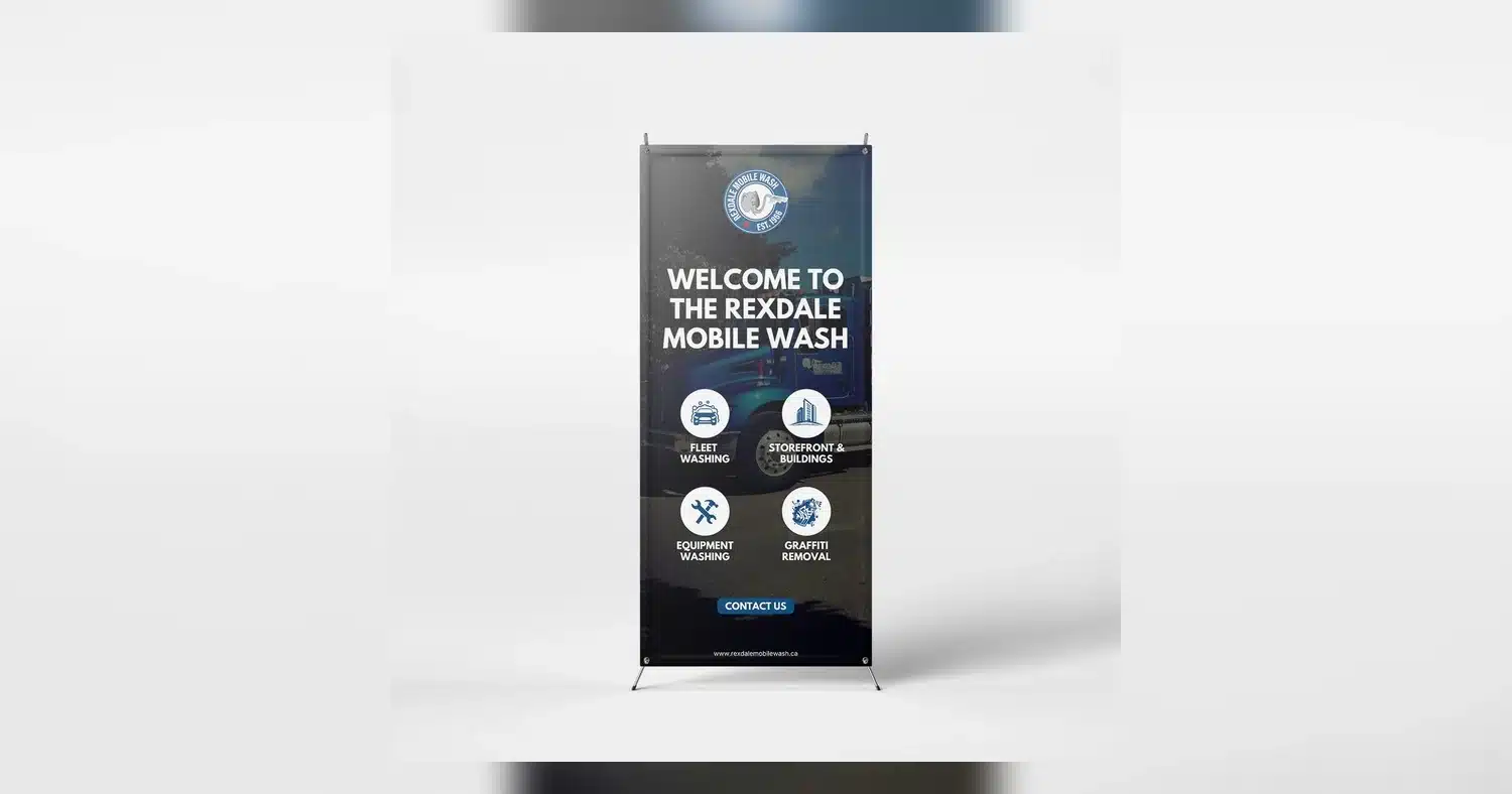
For event organizers, sponsors, and exhibitors, the best-performing setups usually combine clear venue placement, consistent branding, and practical print choices. A lobby banner can direct arrivals, a booth display can reinforce the offer, and a flyer or sales sheet can carry the message after attendees leave the hall. If you are comparing formats, start with portable roll-up banner displays, then align them with handout messaging using this conference flyer guide near Toronto Congress Centre so every printed piece feels coordinated and credible.
Event banners Toronto Congress Centre: why handouts and sponsor signage should be planned together
At Toronto Congress Centre, the strongest event banners, sponsor signage, and handouts for trade shows are planned as one system, not as separate print items. When the visual message matches from the lobby to the booth to the take-home piece, attendees move more smoothly, remember sponsors longer, and scan more often.
Use the same visual logic across the venue
A banner near registration can direct traffic, a sponsor sign can reinforce who supported the session, and a handout can capture the contact after the conversation ends. If the colors, logos, and call to action line up, the attendee sees one consistent path instead of disconnected ads. That consistency matters in a large venue where visitors are trying to find the right hall, room, or exhibitor fast.
For example, a lobby banner can promote a keynote sponsor, while the booth version repeats the same offer and QR code in a smaller format. The handout then carries the same headline, sponsor tier, and next-step message, so the lead does not fade once the person leaves the aisle.
Why coordination improves traffic flow and recall
- Traffic flow: wayfinding banners reduce hesitation at entrances, escalators, and registration desks.
- Booth recall: matching sponsor signage and handouts makes the booth easier to remember after the show.
- Lead capture: repeated QR codes and offers give attendees a quick reason to scan, save, or follow up.
- Brand credibility: coordinated print pieces look planned, which matters to sponsors evaluating event quality.
Organizers working on event banners toronto congress centre should also think about turnaround. If sponsor names change late, handouts and signs need a layout that can be updated quickly without breaking the design system. That is where a single production plan helps: one logo package, one font set, one QR destination, and one approval process.
Before approving files, compare the banner message, sponsor placement, and printed handout side by side. If they answer different questions, the event loses momentum. If they reinforce the same promise, every print touchpoint works harder.
Best banner formats for booths, lobbies, and registration areas
The best banner format depends on where it will sit, how often it will be moved, and how much visual space you need. For Toronto Congress Centre events, portability and setup speed often matter as much as print quality, especially when teams are arriving on the same day as load-in.
| Banner format | Setup speed | Best location | Visibility | Why it works |
|---|---|---|---|---|
| Roll-up banner | Very fast | Booths, registration, hallway corners | Strong at eye level | Compact, easy to transport, and ideal for repeated reuse |
| X-frame banner | Fast | Booths, sponsor areas, secondary signage | Good for medium-distance viewing | Lightweight and budget-friendly for short-term events |
| Step-and-repeat style backdrop | Moderate | Photo walls, press zones, sponsor activation | High in photos and social content | Works when logo repetition is part of the branding goal |
| Rigid foam board sign | Moderate | Registration desks, menu boards, sponsor tables | Clean and sharp up close | Best when the message is short and the sign must look polished |
| Hanging or oversized directional banner | Slower | Large lobbies, entrances, wayfinding points | Excellent from a distance | Useful for helping attendees locate rooms or sponsor zones quickly |
How to choose the right format
- Choose roll-up banners when one person needs to carry, set up, and remove the display quickly.
- Choose x-frame banners when you want a light structure for repeat use and simple graphic swaps. See x-frame banners for a practical option.
- Choose rigid signs for desks, counters, and areas where people will stand close enough to read small details.
- Choose larger directional pieces when the goal is wayfinding across a busy lobby or concourse.
For most booths, a roll-up banner is the easiest starting point because it balances speed, portability, and visibility. If your team needs a quick-reference budget check, the signage ROI calculator can help compare banner investment against expected booth traffic or lead value.
If the event is one-day and the message changes often, fast-setup formats usually win. If the display must anchor a sponsor area or photograph well, a larger or more structured option is the better fit.
How to align handouts for trade shows with sponsor signage and conference branding
Handouts for trade shows should look like they belong to the same campaign as the sponsor signs and conference graphics. The simplest way to do that is to standardize the logo treatment, sponsor tier hierarchy, QR code behavior, and call to action before design starts.
Match the brand system, not just the colors
Consistent conference branding goes beyond using the same blue or placing a logo at the top. Use the same spacing, font family, icon style, and footer structure on the banner, sponsor sign, and handout so every piece feels approved and professional. If one piece uses a stacked logo and another uses a cropped version, the event can look pieced together even when the content is accurate.
Keep sponsor tiers clear. If a platinum sponsor receives larger logo placement on signage, the handout should reflect that same hierarchy in a small but readable way. That helps sponsors feel represented fairly and avoids confusion among attendees who saw the sign but received a different printed piece.
Build one QR code strategy
QR codes should point to a useful next step, not just a homepage. A session sign can send attendees to a speaker profile, while a booth handout can go to a demo booking form or downloadable brochure. Use the same visual style for each code, but tailor the destination to the context so the action feels intentional.
- Use one primary CTA per piece.
- Place the QR code where it can be scanned quickly without covering key copy.
- Add a short benefit line, such as “Scan to book a demo” or “Scan for the full program.”
- Test the code on multiple phones before printing.
Keep offers and messaging aligned
If the sponsor signage promotes a giveaway, discount, or meeting offer, the handout must repeat the same terms. Mixed messages create friction at the booth and make follow-up feel less credible. A simple rule works well: the banner attracts attention, the handout explains the offer, and the QR code completes the action.
For events near Toronto Congress Centre, that alignment also helps with fast pickup and same-day reprints when something changes late. A clean layout with locked brand elements makes it easier to update a sponsor name, room number, or offer without rebuilding the entire piece. When the design system is consistent, the printed materials stay credible even under tight deadlines.
Before final approval, review these items together:
- Logo sizes and clear space
- Sponsor tier placement
- QR code destination and scan test
- Headline, offer, and CTA consistency
- Contact details and booth number accuracy
Print specs that protect readability, from file setup to finish choice
The safest way to keep event banners easy to read at Toronto Congress Centre is to set up the file for the viewing distance, choose the right material, and avoid finishes that create glare or softness. For most event banners toronto congress centre use cases, clarity matters more than dense design detail, especially when people are moving through lobbies, aisles, and registration lines.
Match size and resolution to how far away people will stand
Large banners do not need the same image density as a flyer, but they still need enough resolution to stay sharp. A common production target is 150 dpi at final size for close viewing and 100 dpi or less for very large graphics seen from a distance. If the banner will hang above a booth or across a hallway, readable type and clean vector logos matter more than ultra-high image resolution.
- Keep body copy large and simple.
- Use vector logos whenever possible.
- Avoid thin fonts on oversized backgrounds.
- Test legibility at a reduced thumbnail size before approving.
Build bleed, safe margins, and finishing space into the file
Leave bleed around the edges so trimming does not cut into graphics. For most banner production, 0.125 in to 0.25 in bleed is typical, with safe margins wide enough to keep text away from hems, grommets, pole pockets, or hardware edges. If you are using a retractable display, design with hidden lower areas in mind so critical text is not lost inside the cassette. For roll-up banner hardware, the bottom portion of the file should be set up with extra care because not all of the graphic is visible once installed.
Choose matte when glare is a risk
Finish affects readability as much as resolution does. Matte and satin surfaces reduce glare under bright trade show lighting and are usually the better choice for sponsor signage, stage backdrops, and hall displays. Gloss can make colors pop, but it may reflect overhead lights and wash out details from certain angles. If the banner will be photographed often, a non-reflective finish usually produces cleaner images and keeps logos easier to read in person.
Do not overlook production details
Ask for proof files that show scale, crop lines, and color expectations. Keep brand colors in the correct profile, and avoid sending low-resolution images pulled from websites or social media. If the banner needs repeated setup, consider reinforced hems, grommets, or pole pockets so the material stays flat and readable throughout the event. For freestanding displays, products like X-frame banners can be a practical option when you need a clean front face and quick assembly.
Timeline planning for same-day, next-day, and pre-event pickup in Toronto
The right ordering window depends on how much proofing, revision, and pickup flexibility you need. For busy event weeks in Toronto, the best plan is to order as early as possible, but same-day and next-day service can still work when artwork is ready and pickup is coordinated in advance.
Use same-day only when artwork is final
Same-day production is best for simple banner jobs with print-ready files, no custom finishing surprises, and no design revisions. It works well for emergency sponsor signage, replacement handouts, or a last-minute directional banner. If your file still needs logo cleanup, size changes, or copy approval, same-day usually becomes stressful fast.
Next-day gives you room for a proof
Next-day pickup is often the best balance for event teams. It usually allows time for a proof check, one round of edits, and finishing such as hemming or grommets. If you are organizing same-day brochures near Toronto Congress Centre, the same urgency applies to banners: send final artwork early in the day and confirm file specs before approval.
Pre-event pickup reduces event-day pressure
For larger installs and multi-piece conference branding, pick up materials one to three business days before the event whenever possible. That gives you time to inspect color, verify sizing, and sort out backup copies if needed. It also helps if you are coordinating multiple items like booth graphics, registration signage, and handouts for trade shows, since one delayed piece should not hold up the full setup.
- Same-day: final art only, simple finishing, immediate pickup.
- Next-day: proof review, light revisions, standard hardware options.
- Pre-event pickup: best for large orders, multi-piece branding, and contingency planning.
If you are deciding whether the timing is worth the cost, a quick review of the expected return can help. The signage ROI calculator is useful for comparing rushed production against the value of a cleaner, more visible display.
What affects pricing and when higher-quality signage is worth it
Banner pricing is driven mainly by size, material, finishing, quantity, and turnaround speed. The more durable the hardware and the more specialized the finish, the higher the price tends to be. For event organizers at Toronto Congress Centre, the real question is not only what costs less, but what gives you better visibility, easier setup, and reusable value across the full event schedule.
Main cost drivers to watch
- Size: larger banners use more material and printing time.
- Material: premium vinyl, mesh, or fabric options can raise cost.
- Hardware: retractable stands, frames, and base systems add expense but improve usability.
- Finishing: hems, grommets, pole pockets, and reinforced edges increase durability.
- Rush timing: same-day and next-day jobs often cost more than standard production.
- Quantity: larger runs often reduce unit cost.
When paying more makes sense
Higher-quality signage is worth it when the banner will be reused, handled frequently, or viewed in a premium area such as a stage backdrop, sponsor wall, or main entrance. Durable hardware can save money over several events because it replaces repeated rental or reprint costs. Better finishes also matter when lighting is strong or photos will be shared widely, since a crisp banner supports sponsor recognition and conference branding more effectively than a flimsy display.
Choose value, not just the lowest quote
For one-time directional signs, a simple economy option may be enough. For anchor placements, invest in stronger construction and better print quality so the sign stays straight, looks professional, and survives the full event. If you need frequent setup and teardown, product styles like roll-up banners can deliver better long-term value than single-use prints. In short, spend more where visibility, durability, and reuse will protect the event experience and the sponsor investment.
Common setup mistakes that weaken sponsor visibility at busy trade shows
The biggest reason sponsor signage underperforms is not print quality. It is setup. At the Toronto Congress Centre, where aisles move fast and sightlines change from lobby to booth to registration area, even well-designed event banners toronto congress centre displays can disappear if the layout, message, and placement are wrong.
Crowded designs make sponsors harder to notice
A sponsor banner should be understood in two to three seconds. If it tries to carry a full paragraph, five logos, a QR code, social icons, and a product list, most attendees will not read any of it. This is especially common when exhibitors try to make one banner do the job of a backdrop, ad, and directional sign at the same time.
Keep the hierarchy simple:
- One main headline
- One sponsor or brand mark
- One clear visual
- One action, such as visit booth 412 or scan to book a demo
Weak CTAs waste valuable floor traffic
Many sponsor signage setups look polished but never tell attendees what to do next. “Innovative solutions” is not a call to action. “Pick up the product sheet,” “Scan for pricing,” or “Meet us at booth 218” is. If your handouts for trade shows are part of the conversion path, the CTA on the banner should match the flyer headline and offer. Trade show flyer planning near Toronto Congress Centre works better when handouts support the same booth message.
Poor placement cancels out good design
One of the most common mistakes is placing banners behind a table, beside a pillar, or too close to competing graphics. A 33 x 80 inch banner can work for a booth edge, but it may be visually lost in a high-ceiling pre-function area. In larger spaces, taller roll-up banners or wider displays are often easier to spot from a distance.
Watch for these placement errors:
- Banner blocked by people queuing at registration
- CTA facing sideways to the main aisle
- Important text below table height
- Gloss finish under harsh lighting causing glare
Mismatched branding reduces trust
When conference branding, sponsor signage, and handouts use different colors, taglines, or offer language, attendees hesitate. They are not sure whether the materials belong together. This happens often when sponsors bring older hardware, swap in a last-minute insert, or use small X-frame banners in spaces better suited to larger branded pieces.
A quick pre-show review helps. Compare banner size to venue scale, confirm logo clear space, check CTA consistency, and estimate visibility by traffic angle. If several sponsors are sharing a footprint, use a simple signage ROI calculator to decide which placements justify larger-format graphics.
Before you approve artwork, confirm three practical details: where each banner will stand, which sponsor message belongs in each zone, and what action the handout should drive after the event. That quick check helps avoid weak placement, mismatched branding, and wasted print spend.
If your event date at Toronto Congress Centre is approaching, build a simple list of banner sizes, handout quantities, pickup timing, and sponsor assets now, then request a quote once the plan is clear. A coordinated order is usually the fastest path to signage that looks polished and performs well on event day.
Related Products and Services
If you are planning a similar project, these related options may help.
- Roll Up Banner (Hardware
- X Frame Banners
- Signage Roi Calculator
- Roll Up Banners
Helpful External Resources
These sources provide supporting background and additional context.
What banner sizes work best at Toronto Congress Centre?
For event banners Toronto Congress Centre setups, the most practical sizes are usually 33″ x 80″ retractable banners, 24″ x 63″ x-frame banners, and table-top or poster-sized graphics for counters and registration. The best choice depends on booth size, sightlines, and how close attendees will be to the display.
How fast can event banners and handouts be ready before a trade show?
If your files are print-ready, event banners and handouts can often be produced quickly, sometimes same day or next day depending on quantity and finishing. For the best turnaround, send final artwork early, approve the proof fast, and choose local pickup or nearby delivery when timing is tight.
Should sponsor signage use roll-up banners or x-frame banners?
Roll-up banners are usually better for a polished sponsor display, repeated use, and quick setup. X-frame banners work well for lighter, lower-cost indoor signage when you need a simple stand and easy replacement graphics. For Toronto Congress Centre events, roll-ups are often the stronger choice for premium sponsor areas.
How do I keep handouts and banners consistent across multiple sponsors?
Use one shared design system with the same logo placement, fonts, colors, and image style across every banner and handout. A master template helps each sponsor fit the same layout, which keeps branding consistent while still allowing partner logos and messaging to vary.
What file prep helps avoid delays and extra print costs?
Send high-resolution PDFs in CMYK with outlined fonts, correct bleed, and linked images embedded. For handouts, make sure trim, margins, and logo spacing are checked before submission. Clean files reduce proof changes, speed up production, and help keep event printing on budget.
Get a Free Quote Today
Contact us at +1-(416) 288-8661 or Email us at info@Brandingcentres.com and let's get started.