The thickest card is not automatically the best card. For most GTA buyers, business card paper weight only matters after you match thickness to finish, budget, and the way the card needs to represent your brand.
Last updated: August 2026
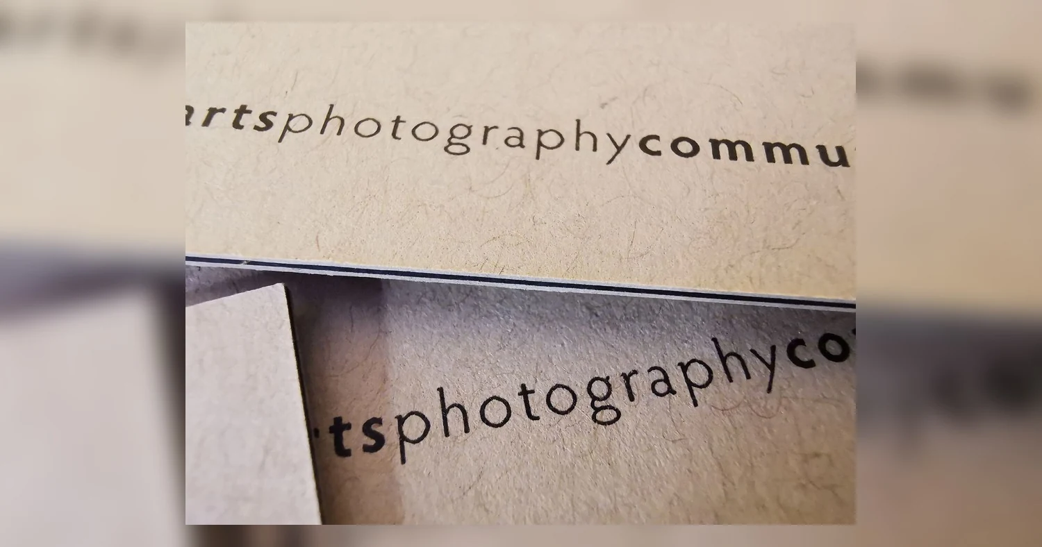
The short answer is simple: 14pt is a practical everyday choice for startups and high-volume handouts, 16pt is the safest premium pick for most professionals and rebrands, and 19pt is best when you want a noticeably heavier, more upscale feel. Across Toronto, Mississauga, Brampton, Markham, and Vaughan, the right choice is usually the card that fits your sales setting, not the highest number on the quote. A thicker sheet can feel sturdier in hand, but paper type and finish also change how substantial the card feels.
Business card paper weight: 14pt, 16pt, and 19pt compared
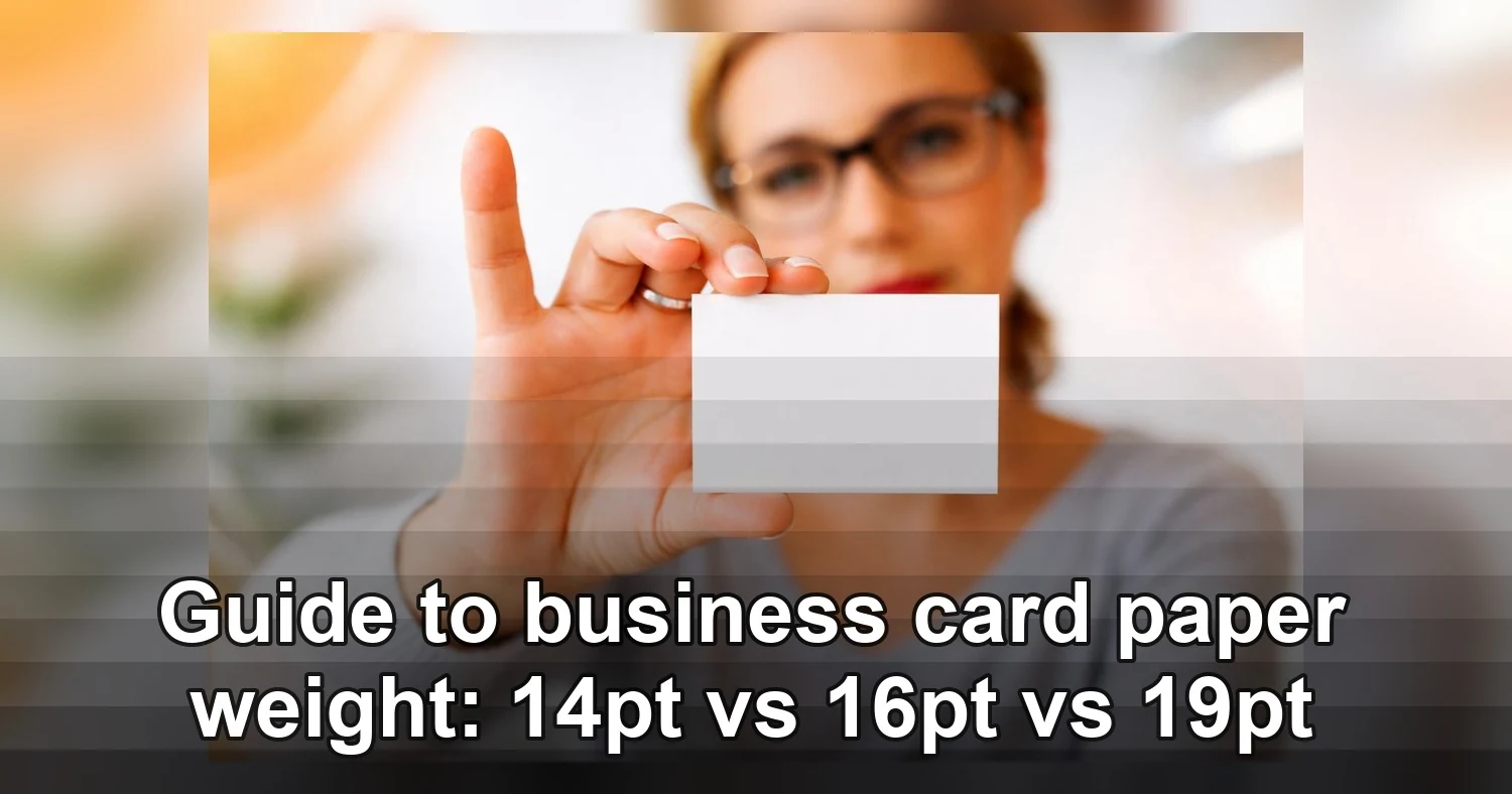
The quickest way to understand business card paper weight is to think about feel. 14pt feels standard and professional, 16pt feels sturdier and more premium, and 19pt feels noticeably thick in the hand. For most buyers, 14pt matches the baseline expectation for a good business card, 16pt feels like an upgrade, and 19pt makes a stronger first impression.
In print specs, pt measures thickness, so 14pt, 16pt, and 19pt mean roughly 0.014, 0.016, and 0.019 inches thick. That is a small difference on paper, but people can usually feel it right away, especially between 14pt and 19pt.
| Decision factor | 14pt | 16pt | 19pt |
|---|---|---|---|
| Approximate thickness | 0.014 inch | 0.016 inch | 0.019 inch |
| How it feels in hand | Standard, flexible, familiar | Firm, solid, slightly more substantial | Thick, weighty, premium feel first |
| Typical buyer expectation | Good everyday business card | Professional upgrade without going overboard | Luxury or high-impact presentation |
| Best use cases | Startups, events, large quantity handouts | Consultants, realtors, clinics, office teams | Creative leads, executives, boutique brands |
| Common mistake | Choosing it when you want a heavy premium feel | Expecting it to look different without changing finish | Using it for every staff member when budget and speed matter more |
What 14pt feels like to most buyers
14pt is the standard most people know. It is not flimsy, but it does bend a bit more than heavier stocks. If you are ordering for a launch, trade show, or high-volume networking, 14pt usually meets expectations without pushing cost up. Buyers comparing 14pt vs 16pt business cards often choose 14pt when quantity matters more than making each card feel extra heavy.
It is a good fit when your team hands out a lot of cards in a short time. If the card is mainly there to share contact details, 14pt often does the job well. It can also be a smart choice for businesses still refining their brand identity, because it keeps the order affordable while you test the design in real use.
Why 16pt is often the safest upgrade
16pt sits in the sweet spot for many businesses. It feels more substantial than 14pt without becoming bulky in a wallet or card holder. If someone wants premium business cards but still needs a practical everyday card, 16pt is usually the right starting point. It is also easier to recommend when several people on a team need the same spec.
For many buyers, 16pt feels like the point where a card starts to signal intention. It looks professional, travels well, and usually gives a better first touch than entry-level stock. If you are unsure what to pick, 16pt is often the safest answer because it works for a wide range of industries and audiences.
When 19pt helps shoppers choose faster
19pt works best when the card itself is part of the brand impression. Think luxury services, design studios, high-end sales, and owner-led businesses that hand out fewer cards but want each one to land. A comparison table helps shoppers choose fast because it removes guesswork. Instead of reading general descriptions, they can scan feel, use case, and expectation side by side and match thickness to budget, audience, and purpose in a minute or two.
That is especially useful when the buyer is not a print expert. Many people can tell when a card feels weak or impressive, but they cannot always translate that into a thickness number. A direct comparison makes the decision easier and reduces the chance of ordering a stock that does not match the brand.
Which paper weight fits your brand type in the GTA?
If you are buying in Toronto or nearby cities, the right paper weight usually comes down to how often you hand cards out, who receives them, and whether the card represents one person or a whole team. In the GTA, 14pt is often the practical choice for new businesses, 16pt is the most balanced option for professionals and multi-person brands, and 19pt is best when perception matters more than volume.
Best match by business type
- New businesses: Start with 14pt if you need quantity for openings, networking events, pop-ups, and door-to-door outreach in Toronto, Mississauga, or Brampton. Move to 16pt if your service is appointment-based and your card needs to feel a bit more established from day one.
- Professionals rebranding: 16pt is usually the strongest fit for lawyers, mortgage brokers, realtors, consultants, and clinic owners in Vaughan, Markham, Richmond Hill, and downtown Toronto. It signals an upgrade without feeling flashy or overbuilt.
- Agencies and creative teams: Use 16pt for general staff cards and 19pt for founders, account directors, or business development roles where the card is part of the pitch. Agencies often need a clean middle ground between premium feel and easy reordering.
- Franchise owners and multi-location brands: 16pt is often the safest standard because it balances consistency, professional feel, and repeat ordering. 14pt can work for large staff sets or promotional runs. 19pt is usually better reserved for ownership, regional managers, or top sales roles.
Local buying context for Toronto and nearby cities
GTA buyers usually care about two practical things besides feel: turnaround and consistency. If you are opening a new location in Scarborough, onboarding agents in Mississauga, or updating staff cards across several franchise units, a standard like 16pt reduces approval friction because most stakeholders agree it feels strong without overspending.
Toronto businesses also tend to hand cards out in mixed settings: condo lobby meetings, trade shows, client site visits, and coffee meetings. That is why thick business cards Toronto buyers ask for are not always 19pt. Often they want a card that feels polished, durable, and current, which 16pt delivers well. Save 19pt for brands where tactile impact is central to the sales conversation.
How finish changes the feel of the same cardstock
The same thickness can feel very different once you change the finish. A 16pt card with matte coating will not feel the same as a 16pt uncoated or pearl card. Finish affects surface texture, color appearance, perceived stiffness, and whether the card reads as practical, bold, natural, or premium.
Matte and gloss: smooth finish, different personality
Matte tends to feel soft, smooth, and controlled. It usually gives colors a calmer, flatter look and is a strong fit for modern corporate branding. Gloss feels slicker and brighter, and it makes photos and saturated colors pop more. On the same cardstock, gloss can feel a bit more rigid because of the coated surface, while matte often feels more understated. If you want a balanced everyday option, 14pt and 16pt matte finish business cards are usually the easiest place to start.
Matte is also the safer choice if people need to write on the card. Notes, appointment times, and follow-up details usually show up better on a non-glare surface. Gloss can work for vivid branding or image-heavy designs, but it is less forgiving if the card has to function like a mini appointment slip.
Uncoated and kraft: more texture, warmer tone
Uncoated stock has more paper texture and is easier to write on, which makes it useful for appointment cards, notes, or service businesses that add details by hand. It can feel a bit less snappy than coated stock even at the same pt because there is no slick surface layer. Kraft takes that natural feel further. It has a fibrous texture, an earthy brown base, and a more handmade look. That changes color output too, especially for light inks and white space. Brands that want a natural, artisanal, or eco-minded impression often choose kraft paper business cards.
This kind of stock works best when the design is simple and deliberate. Dark type, strong spacing, and limited color coverage usually look the most polished on kraft. If the design relies on soft pastels or very fine details, the result may not be as crisp as it would be on a brighter sheet.
Pearl stock: visual lift without changing the core size
Pearl stock adds shimmer and a dressier surface, so the card often feels more upscale even if the thickness stays the same. It works especially well for beauty, events, boutique retail, wedding services, and premium personal brands where light reflection helps the design stand out. It also shifts color perception, making some tones appear softer or more luminous. If your goal is premium business cards with a more refined finish rather than a heavier sheet, pearl paper business cards are worth comparing beside matte or kraft before you order.
Pearl can create a very different impression from matte even at the same thickness. If your goal is elegance, polish, or a more memorable tactile finish, it is often the better choice than simply moving up one paper weight.

What affects price, minimums, and turnaround on business cards?
The biggest price drivers are stock, finish, quantity, and deadline. For most GTA buyers, the fastest way to control cost is to choose a standard cardstock, order enough to lower the per-card rate, and avoid rush production unless you truly need it.
Stock and finish change the quote first
Paper choice usually moves pricing more than people expect. Standard coated or matte stocks are the most efficient to print, while thicker boards, coloured stocks, textured papers, kraft, pearl, soft-touch, spot UV, and edge painting all add material cost or extra production steps. In general, standard business card stocks are commonly produced in the 14pt to 16pt range, which is why those options are usually the most budget-friendly.
Finish also affects drying and handling time. A simple matte or gloss run can move quickly. A specialty coating may need another pass, extra curing time, or more careful packaging to avoid marking. That is one reason specialty cards can cost more even when the finished size is the same.
Quantity and minimums affect unit cost
Minimums vary by press setup. A short run of 100 or 250 cards can make sense for a realtor, consultant, or startup still refining its branding, but the unit cost is usually higher. Once you move to 500 or 1,000 cards, setup costs are spread across more pieces, so the price per card often drops noticeably.
If you have multiple staff members, ask whether names can be versioned in one batch. Grouping cards for a team or franchise location can be cheaper than placing separate small orders. It also makes reordering simpler because the print setup stays more consistent from run to run.
Rush timing and local production matter
Rush jobs cost more because they interrupt normal production flow, limit finishing options, and may require same-day or next-day handling. In Toronto, local print runs can also quote differently from online-only sellers for practical reasons:
- Local shops may include file checks, live proofing, and pickup-ready packaging.
- Short-run local jobs are often produced faster, but not always as cheaply as large-volume web printers.
- Online quotes may look lower until shipping, reprint risk, or missed delivery dates are factored in.
- Specialty stocks may have local availability limits, which can affect both minimums and lead times.
If you need cards for an event, sales meeting, or opening date, ask for both standard and rush turnaround before approving the job. That is the simplest way to avoid paying extra for speed you may not need.
Common mistakes when choosing thick business cards
Thicker is not automatically better. The most common mistake is buying the heaviest card available without thinking about how it will be carried, written on, coated, or printed.
Choosing thickness just to sound premium
Many buyers assume that a thicker card always creates a stronger first impression. Sometimes it does, but only when it fits the brand and the design. A lawyer, consultant, or mortgage broker may get a cleaner result from a refined mid-range stock than from an ultra-thick card with oversized type and too much ink coverage.
Another issue is overbuying. If you hand out cards constantly at trade shows, networking events, or condo lobbies, ultra-thick stock adds weight, bulk, and cost fast. For many everyday use cases, a well-designed standard premium card is the better business decision.
Ignoring wallet fit and real-world handling
Very thick cards can feel impressive in hand, but they do not always behave well after the handoff. They may fit tightly in wallets, card holders, and reception desk organizers. If your audience is likely to keep your card in a standard wallet slot, extreme thickness can become a small annoyance, which is not the memory you want attached to your brand.
- Test one sample in a wallet before placing a full order.
- Consider how many cards your staff carries each day.
- Think about mailing costs if cards go into presentation kits or direct mail.
Using the wrong coating or an overdesigned layout
A thick card still needs the right surface. Gloss can make colors pop, but it can also create glare and make handwriting difficult. Uncoated or matte stocks are often better when people need to write appointment times, notes, or follow-up dates.
Design is another failure point. Premium-looking concepts can print poorly when they rely on tiny reversed text, soft grey type, fine hairlines, or dark background floods that show scratches or fingerprints more easily. Before approving artwork, check these basics:
- Keep small text dark and readable.
- Avoid placing important details too close to the trim.
- Do not assume metallic-looking colours will print like foil unless foil is actually specified.
- Match the coating to the use case, especially if the card needs to be writable.
Best business card cardstock options by budget and style
The best choice is usually a practical match between budget, brand image, and how the card will be used. For most businesses, there is no need to chase the heaviest stock. A smart combination of cardstock and finish usually delivers a better result than thickness alone.
Best value: clean, versatile, easy to reorder
If you want a professional card without overspending, start with 14pt or 16pt matte. It works well for startups, trades, clinics, agencies, and multi-location teams that need a reliable standard across staff names and titles. Matte is also a safe choice when clients may write on the card.
For everyday ordering, 14pt or 16pt matte finish business cards are usually the most balanced option for price, readability, and turnaround. They look polished without pushing your budget into specialty territory.
Best premium: elevated without becoming impractical
For professionals who want a more distinctive feel, choose a heavier standard stock or a specialty sheet that supports the brand story. This works well for designers, realtors, boutique consultants, wellness brands, and hospitality businesses that want more personality but still need a card that travels well.
Two strong style-driven options are natural and shimmer-based stocks. Kraft paper business cards suit earthy, handmade, sustainable, and artisanal branding. They are especially effective when the design uses dark ink, simple layouts, and minimal coverage. For a cleaner upscale look with visual lift, pearl paper business cards add a subtle sheen that works nicely for beauty, events, luxury services, and premium retail.
If your brand sits between practical and premium, these specialty stocks can be more memorable than simply moving up one thickness. They change the look and feel of the card in a way clients notice right away.
Best luxury: use sparingly and design carefully
If your goal is a true luxury impression, focus on restraint. Luxury cards perform best when the design is simple, the typography is confident, and the production features are intentional. Heavy stock, specialty coatings, metallic details, or unique paper surfaces can all work, but they should support the brand instead of competing for attention.
- Choose value-focused matte when you need consistency, speed, and easy reorders.
- Choose specialty textured or shimmer stocks when brand feel matters at the first touch.
- Choose luxury builds for appointment-driven, referral-driven, or high-ticket businesses where a smaller number of cards carries more value.
If you are ordering for a GTA team, ask for one standard option and one elevated option side by side. That comparison usually makes the right budget and style level obvious very quickly.
Quick answers before you order premium business cards
If you want the short answer, 16pt matte is the safest first order for most GTA businesses. It feels clearly premium without being overly rigid, works well for handouts, meetings, and front-desk use, and gives you fewer surprises than jumping straight into ultra-thick stock or specialty finishes.
As a quick rule, 14pt is usually treated as standard stock, 16pt as sturdier premium stock, and 19pt as extra-thick. That makes business card paper weight less about right or wrong and more about how you want the card to feel in a client’s hand.
Which thickness is the safest for a first order?
For a first run, choose 16pt if you want a polished, low-risk option. It is thick enough to feel intentional, but still practical for everyday networking across Toronto, Mississauga, Vaughan, and the rest of the GTA.
- Choose 14pt if budget matters most or you hand out cards in high volume.
- Choose 16pt if you want the most balanced premium feel.
- Choose 19pt if brand impression is the priority and you already know you want a heavier card.
If you want a safe, popular option, 14pt and 16pt matte finish business cards are usually the easiest place to start.
Will a thicker card last longer?
Usually yes, but not in a dramatic way for every use case. A 16pt or 19pt card resists bending better in a pocket, wallet, or trade show badge holder. That said, finish matters too. A matte card can hide fingerprints better, while glossy surfaces can show wear differently over time. For most professionals, the jump from 14pt to 16pt is the most noticeable durability upgrade for the money.
Which finish is least risky if I do not want surprises?
Matte is the safest choice if you want clean readability, easy writing with a pen, and a professional feel that suits most industries. Gloss can make colors pop, but it is not ideal if people need to jot notes on the card. Specialty finishes are best when they match the brand.
- Kraft works well for natural, handmade, or eco-positioned brands.
- Pearl is better for beauty, hospitality, event, or luxury-focused brands that benefit from a subtle shimmer.
- If you are unsure, avoid combining a heavy stock with a specialty finish on your very first order unless you have already seen samples in person.
If you want the safest first order, start with 16pt for a balanced premium feel, move to 14pt for budget-conscious volume, and choose 19pt only when the heavier hand-feel clearly supports the brand. To compare a reliable everyday option before you commit, review 14pt and 16pt matte business cards and then confirm the finish, quantity, and turnaround that fit your rollout across the GTA.
Related Products and Services
If you are planning a similar project, these related options may help.
Helpful External Resources
These sources provide supporting background and additional context.
-
Is 16pt thicker than 14pt for business cards?
Yes. In business card paper weight terms, 16pt is noticeably thicker and more rigid than 14pt, so it usually feels more substantial in hand and holds up better to frequent handling.
-
Is 19pt too thick for everyday business card use?
Not necessarily, but 19pt is a very heavy stock and can feel rigid or bulky for large networking events, wallet carry, or standard card holders. It is a strong choice if you care more about premium feel than maximum practicality.
-
Which business card paper weight looks most premium?
19pt usually looks and feels the most premium because of its thicker, more luxurious feel. That said, 16pt is often the best balance of premium appearance, durability, and everyday usability.
-
What is the best business card paper weight for Toronto businesses?
For most Toronto businesses, 16pt is the safest all-around choice because it presents well in client meetings, networking events, and day-to-day use. If your brand is high-end, 19pt can make a stronger impression, while 14pt works well for higher-volume, budget-friendly runs.
-
How should I prepare files for a business card order?
Use a print-ready PDF with 0.125 inch bleed, crop marks if requested, and images at 300 DPI. Keep text inside the safe area so nothing important gets trimmed when the cards are cut.
-
Does thicker business card paper weight cost more and affect turnaround?
Usually yes. Heavier stocks can cost more, and specialty finishes or rush production may add time. If you need a fast, cost-effective order, 14pt or 16pt is often easier to print and ship quickly than very thick stock.
Get a Free Quote Today
Contact us at +1-(416) 288-8661 or Email us at info@Brandingcentres.com and let's get started.