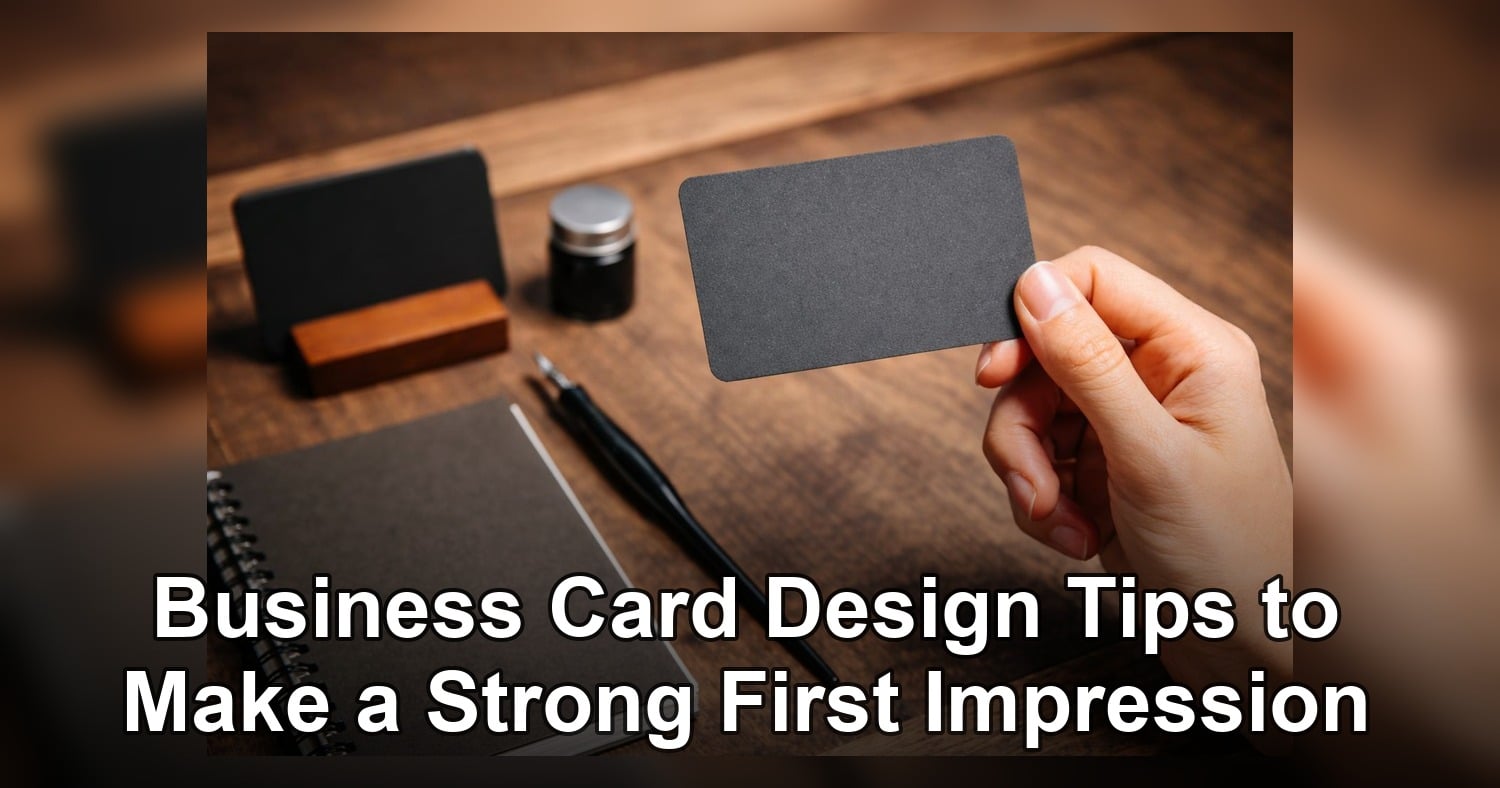
Your business card is often the first piece of your brand a potential customer can hold, review, and remember, which is why smart Business Card Design Tips can make such a big difference for small business owners. A well-designed card does more than share your phone number or email address. It signals professionalism, builds credibility, and helps people recall your business after a meeting, event, or quick introduction. In a competitive market, even a small detail like layout, paper quality, or font choice can shape how seriously someone takes your company.
In this guide, you will learn practical ways to create a business card that looks polished, feels on-brand, and supports your sales efforts. We will cover the essential information every card needs, how to organize that information for quick scanning, and which design choices improve readability and brand recognition. You will also see how material and printing options affect perception, why consistency with your branding matters, and which common mistakes can weaken your first impression. Whether you are creating your first card or updating an outdated design, these tips will help you turn a small marketing tool into a strong business asset.
Business Card Design Tips for a Strong First Impression
Your business card is often the first physical piece of your brand that someone takes away. In one small format, it has to communicate credibility, professionalism, and personality. For small business owners, that makes smart Business Card Design Tips more than a style choice. It is a practical marketing tool that can help people remember you, trust you, and contact you.
A great Business card does not need to be flashy to be effective. It needs to be clear, intentional, and easy to understand in seconds. When someone receives your card at a meeting, event, or sales visit, they should immediately know who you are, what you do, and how to reach you. If the design feels cluttered, outdated, or hard to read, the first impression can weaken before the conversation even continues.
The best Business Card design ideas balance visual appeal with function. Strong layout, clean typography, and on-brand color choices help your card feel polished and memorable. Just as important, the card should support your larger business branding so it matches your website, signage, packaging, and social presence.
What these tips will help you improve
- Make your card look more professional at first glance
- Highlight the most important details clearly
- Strengthen brand recognition with consistent design
- Increase the chances that prospects keep and use your card
In the sections below, you will learn how to choose the essential information, organize it with a strong visual hierarchy, and use design principles that support readability and trust. These Business Card Design Tips are meant to help you create a card that works harder for your business every time you hand it out.
If you want more inspiration before finalizing your layout, visit this guide on business card design tips for additional ideas you can apply to your brand.
Essential elements every business card needs
A business card should not try to say everything about your company. It should say the right things in the right order. The most effective cards focus on essential details and present them in a way that feels simple and easy to scan.
Start with your brand identity
Your logo is usually the first visual anchor on the card. It helps build familiarity and supports business branding across your marketing materials. Place it where it can stand out without overwhelming the rest of the design.
Next, include your business name clearly. If your logo already contains the business name, make sure it is still readable at card size.
Identify the person and role
- Your full name
- Your job title or role
- An optional short descriptor if your service needs clarity
This information helps the recipient connect the card to the conversation they had with you. For small business owners, using a title that explains your role can also reinforce authority.
Include only the most useful contact details
Prioritize contact methods your audience is most likely to use. In most cases, that includes:
- Phone number
- Email address
- Website
- Business address if relevant
If social media is important to your business, add only the platform most connected to your sales process. Too many icons can make the card feel crowded.
Create a clear information hierarchy
- Logo or brand name
- Person’s name
- Title or service focus
- Primary contact information
- Simple call to action
A simple CTA can be highly effective. Examples include “Call for a quote,” “Book a consultation,” or “Visit our website.” This small prompt gives the card a purpose beyond basic contact sharing.
If you want a clean, classic format for these essentials, a standard option like AQ business cards can deliver a professional look while keeping your information easy to read.
Design principles: layout, typography, and color
Good design helps people absorb information quickly. When your business card is well organized, easy to read, and visually consistent with your brand, it becomes more memorable and more persuasive. That is why the strongest Business Card Design Tips always come back to three fundamentals: layout, typography, and color.
Use layout to guide the eye
Your layout should lead the reader naturally from the most important detail to the next. Avoid filling every inch of space. White space gives each element room to breathe and makes the card feel more premium.
- Keep the logo and business name prominent
- Group related information together
- Leave margins so text does not feel cramped
- Limit design elements that compete for attention
A clean structure improves both appearance and usability. If someone has to search for your phone number, the layout is not doing its job.
Choose typography for clarity first
Fonts should reflect your brand, but readability comes first. A stylish typeface may look impressive on screen and fail in print at a smaller size. Use no more than two font families and create contrast with size and weight rather than too many styles.
Make your name or company name the most visually prominent text. Secondary details such as title and contact information should be smaller but still comfortably legible.
Use color to support business branding
Color plays a big role in recognition. Your card should match your wider business branding so customers connect it with your website, packaging, and other materials. Stick to a focused palette that aligns with your brand personality.
Contrast is essential. Dark text on a light background is usually the easiest to read. If you prefer a bold or dark background, make sure the text remains crisp and high contrast.
For a polished finish that supports clean typography and balanced color, many businesses choose matte finish business cards. If your card will be handled often, durable business cards can help maintain that strong first impression over time.
Material, finish, and printing choices that influence perception
Your Business card says a lot before anyone reads a single word. The feel, thickness, and finish all shape how people judge your professionalism. If you want practical Business Card Design Tips that improve first impressions fast, start with the physical card itself.
Paper weight matters because a flimsy card can make your brand feel forgettable. Heavier stocks usually feel more premium and more intentional in the hand. For many small business owners, a standard premium stock offers the best balance of cost and quality, while thicker cards work well when you want to signal confidence and durability.
Choose the right finish for your brand
Matte finishes create a clean, modern, and refined look. They are excellent for cards with minimal layouts, elegant typography, or a softer brand personality. They also reduce glare, which helps readability.
Gloss finishes make colors appear richer and images more vibrant. If your brand uses bold visuals or bright color, gloss can add energy. However, too much shine can sometimes make text harder to read under certain lighting.
If you want a reliable middle ground, premium matte options such as matte finish business cards are a smart choice for many industries.
When specialty materials make sense
Special stocks can support strong business branding when they match your offer. Textured paper can feel artisanal and personal. Uncoated stock can feel natural and understated. Extra-thick or synthetic cards can suggest strength, precision, and long-term value.
For businesses that attend events, travel often, or work in hands-on environments, durable business cards can be a practical investment. They hold up better, look newer for longer, and keep your brand presentation consistent.
Use specialty finishes with purpose
Foil, spot UV, embossing, and rounded corners can elevate your card, but only when used strategically. A specialty finish should highlight one key element, such as your logo or business name, not compete with every detail on the card.
- Use foil for luxury, premium, or executive positioning.
- Use spot UV to draw attention to a logo or headline.
- Use embossing for texture and memorability.
- Use durable or waterproof stocks for active industries.
Among the most effective Business Card design ideas, choosing the right material and finish is one of the simplest ways to reinforce quality without overcomplicating the design.
Branding strategies: align your card with your business branding
A great card does more than share contact details. It should instantly connect with the rest of your visual identity. One of the most important Business Card Design Tips is to make sure your card looks and feels like the same brand customers see on your website, storefront, packaging, and social media.
Consistency builds recognition. Recognition builds trust. For small business owners, that trust can turn a quick introduction into a call, meeting, or sale.
Match the card to your brand identity
Start with your core brand elements. Your logo, brand colors, font style, and tone of voice should all be reflected in the card design. If your business is modern and streamlined, keep the layout clean and minimal. If your brand is creative and expressive, you can use stronger color, custom shapes, or more distinctive design accents.
Your card should feel like a natural extension of your company, not a separate piece of marketing.
Use visual consistency to strengthen recall
- Use the same logo version found on your website and signage.
- Stick to your primary and secondary brand colors.
- Choose typography that matches your established brand style.
- Keep messaging consistent with your brand voice.
- Include a tagline only if it is already part of your brand identity.
These details may seem small, but together they shape how memorable your Business card feels.
Design for your audience and market position
Good business branding is not only about aesthetics. It is also about fit. A law firm, home services business, boutique bakery, and marketing consultant should not all use the same style of card. Think about what your customers expect and what would reassure them that you are professional, capable, and easy to work with.
If your brand promise is reliability, choose a polished, readable layout. If your brand promise is creativity, make room for personality without sacrificing clarity. If you need inspiration, review more Business Card Design Tips and compare them to your wider brand assets.
The best Business Card design ideas are not random trends. They are brand decisions that help people recognize, remember, and trust your business faster.
Common mistakes to avoid and a final pre-print checklist
Even a strong concept can lose impact if the final card is hard to read or filled with errors. One of the most valuable Business Card Design Tips for small business owners is simple: avoid design choices that get in the way of clarity.
Your card should make it easy for someone to know who you are, what you do, and how to reach you. If that takes effort, the design is not doing its job.
Common business card mistakes
- Tiny text: Small fonts may look neat on screen but become difficult to read in print.
- Too much clutter: Trying to include every detail can make the card feel crowded and confusing.
- Incorrect contact information: A wrong phone number, email, or website can cost real opportunities.
- Poor contrast: Light text on a light background or dark text on a busy design reduces readability.
- Weak hierarchy: If the business name, person’s name, and contact details all compete equally, nothing stands out.
- Inconsistent branding: Mismatched fonts, colors, or logos make your business branding feel less professional.
Keep it clean and purposeful
A polished Business card does not need to say everything. Focus on the most important information and leave enough space for the design to breathe. In many cases, fewer elements create a stronger and more confident impression.
If you want a premium result, choose a proven format such as AQ business cards or another finish that supports readability and a professional look.
Final pre-print checklist
- Confirm the spelling of all names, titles, and company details.
- Test every phone number, email address, website URL, and QR code.
- Check that text is readable at actual print size.
- Review color contrast for easy reading.
- Make sure logos and images are high resolution.
- Leave proper margins so nothing is cut off.
- Print a sample proof before placing a large order.
The smartest Business Card design ideas combine style with accuracy. A card that looks sharp, reads clearly, and reflects your brand well gives you a much better chance of making a strong first impression.
A strong business card combines clear information, smart design, and brand consistency to leave a lasting impression. When you apply these Business Card Design Tips, your card becomes more than a handout, it becomes a simple but effective sales tool. If you are ready to refresh your image, now is a great time to review your current card and make a few strategic improvements before your next print order.
Related Products and Services
If you are planning a similar project, these related options may help.
Helpful External Resources
These sources provide supporting background and additional context.
How do I choose the right information to include on my business card?
Use these Business Card Design Tips: prioritize essentials—full name, job title, company name and logo, a direct phone or mobile, professional email, and one primary link (website or social handle) or QR code for more details; include a short tagline only if it adds clarity. Keep hierarchy clear and avoid cluttering with every contact method or long addresses.
What paper weight and finish make the best impression for small business owners?
Aim for sturdy stock around 300–400 gsm (roughly 14–16 pt) for a substantial feel without excessive bulk. Matte or soft-touch finishes feel professional and improve legibility; use spot UV, gloss, foil, or textured stocks sparingly for accents. Heavier or specialty papers increase perceived quality but also cost and mailing considerations.
How can my business card reflect my overall business branding effectively?
Match your brand’s color palette, typography, logo placement, and visual tone so the card reads as part of the same system as your website and marketing. Use a clear visual hierarchy, consistent imagery or iconography, and complementary finishes (e.g., matte card with glossy logo) to reinforce recognition while keeping text legible at small scale.
Are non-standard sizes or special finishes worth the extra cost?
They can make your card memorable—die-cuts, thicker stock, rounded corners, embossing, or foil add distinction—but only when aligned with your brand and audience. Balance impact against practicality: higher cost, storage/holder fit, and production time; for many small businesses, selective finishes (spot UV or foil accents) deliver strong ROI without full custom sizes.