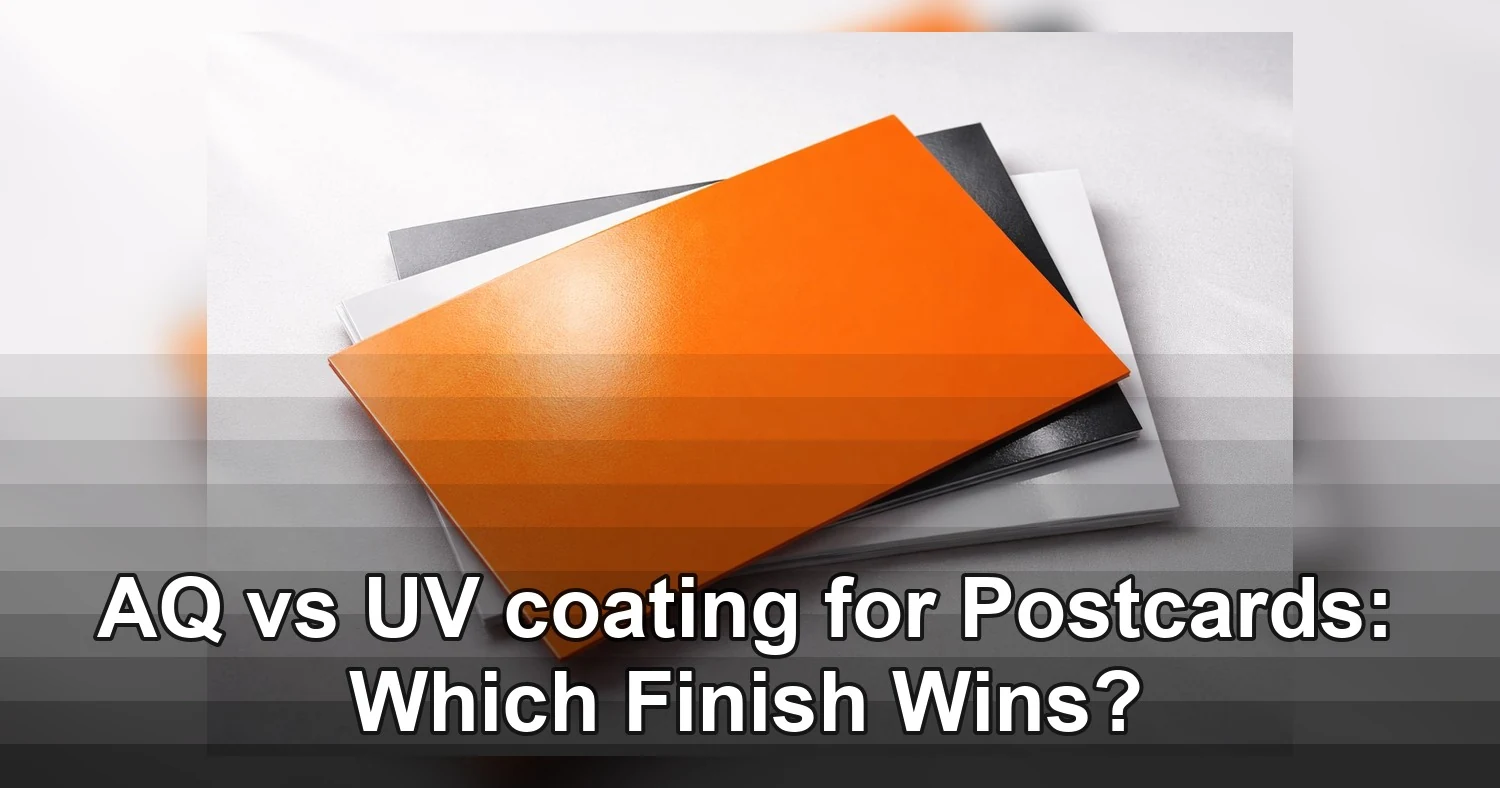
If you are choosing a postcard finish and the decision comes down to AQ vs UV coating, the plain version is this: AQ is the practical all-purpose choice, UV is the glossy attention grabber, and matte is the better pick when the card needs to be written on or feel softer and more refined. The finish changes more than shine. It affects how the postcard looks in the mailbox, how it feels in the hand, how fast it moves through production, and whether someone can add a note, signature, or code after printing.
Last updated: August 2026
Ready to print postcard printing?
Send your artwork, quantity, and deadline to Branding Centres. We will help confirm specs, turnaround, and the best production option.
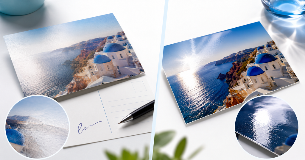
Short answer: choose AQ when you want a coated postcard that dries quickly, handles well, and looks polished without heavy glare. Choose UV when the design depends on glossy photo impact and strong color pop. Choose matte when function matters as much as presentation, especially for appointment reminders, thank-you notes, reply cards, and any mail piece that needs handwriting space. Match the finish to the job, and the postcard works better in the real world.
AQ vs UV coating at a glance
Both AQ and UV coatings protect printed postcards and improve presentation, but they do it in different ways. AQ, short for aqueous coating, is water-based and usually produces a satin or low-shine finish. UV coating is cured under ultraviolet light and creates a much glossier, more reflective surface. That difference affects appearance, writability, and turnaround.
| Feature | AQ coating | UV coating | Matte finish |
|---|---|---|---|
| Appearance | Soft sheen, satin look | Bright, high-gloss finish | Low glare, subdued and elegant |
| Feel | Smooth but still paper-like | Slick and harder to the touch | Dry, smooth, and less reflective |
| Writability | Usually usable with many pens | Poor for writing and signatures | Best for writing, notes, and stamps |
| Image pop | Good color enhancement | Strongest color contrast and shine | More restrained, less reflective |
| Handling | Good scuff resistance and clean stacking | High visual impact but fingerprints and glare are more noticeable | Easy to read and handle, fewer reflections |
| Best use | Everyday marketing mail and practical postcard campaigns | Promotional pieces that need maximum mailbox impact | Writable postcards, premium branding, and text-heavy designs |
That is the main tradeoff in AQ vs UV coating. AQ gives you dependable production performance and a clean finish. UV gives you the biggest visual punch. Matte steps in when the postcard has to be functional, not just attractive.
What AQ coating is and when it makes sense
AQ coating is a water-based protective finish applied after printing. It helps the ink dry, reduces rub marks, and gives the postcard a finished look without pushing the surface into heavy gloss territory. In a print shop, AQ is the finish many teams choose when they need a good-looking postcard that moves efficiently through production and still feels professional in the mailbox.
Why printers like AQ coating
AQ coating is popular because it is efficient. It dries quickly, which helps prevent setoff when printed sheets are stacked. It also handles well during trimming, scoring, bundling, and mailing prep. For larger postcard runs, that efficiency matters because it keeps the job moving and lowers the chance of production delays.
- Fast drying helps production stay on schedule
- Good protection against light scuffs and rub
- Clean handling for trimming and stacking
- Balanced finish that looks polished without overpowering the design
Where AQ is the best fit
AQ works well for everyday direct mail where the card needs to look professional but not overly glossy. It is a strong option for service businesses, seasonal promotions, event reminders, appointment notices, local offers, and general marketing mail. It also suits postcards that mix photos and text, because it improves the overall look without making the piece hard to read.
If the design includes offer details, contact information, dates, or a short call to action, AQ usually keeps the layout readable while still protecting the printed surface. That is why many businesses treat it as the middle-ground choice between plain stock and high-gloss UV.
What UV coating adds to a postcard
UV coating is made for impact. The coating is applied as a liquid and then cured with ultraviolet light, creating a harder, glossier surface. The result is a postcard that reflects more light, increases contrast, and makes photos and bold colors look more intense. When someone pulls a UV-coated postcard from a mailbox or retail display, the shine often gets noticed right away.
Why UV creates stronger image pop
If your design depends on photography, saturated brand colors, or high-energy visuals, UV can make the artwork look more vivid. It works especially well when the postcard uses large image areas, dramatic color, or a simple headline that needs to stand out fast. In those cases, UV acts like a spotlight for the design.
That makes UV a common choice for retail promotions, restaurant mailers, salon specials, event announcements, grand openings, and real estate postcards featuring property photography. The finish helps the card read as bold and premium at first glance.
Where UV is weaker
UV is not the best option when the postcard needs to be written on. The slick surface can make ink bead, skip, or dry slowly, depending on the pen. It can also show glare under bright lighting, which is not ideal for pieces that will be displayed, annotated, or handled often.
In other words, UV is a visual finish first. If the card needs notes, signatures, or readable handwriting, UV usually works against the goal instead of supporting it.

Why matte finish postcards are often the better functional choice
Matte finish postcards are the best option when the postcard must be written on, signed, stamped, or read comfortably without glare. Matte reduces reflection and gives the surface a softer, more understated look. It does not compete with the message, which is why it works so well for cards that need both presentation and practicality.
Matte is better for handwriting
If the postcard needs a handwritten message, promo code, signature line, appointment time, or return note, matte usually performs better than AQ or UV. Pens and markers tend to grip the surface more naturally, and the card feels easier to annotate without waiting for ink to dry or worrying about smudges.
That makes matte a strong choice for thank-you cards, RSVP cards, appointment reminders, referral offers, and internal mail pieces where staff members personalize the card before it goes out. It is also helpful when postcards are used as reply cards or coupon mailers with handwritten fields.
Matte gives a quieter premium feel
Matte can feel more refined than glossy finishes because it removes visual noise. There is less glare, less shine, and more emphasis on typography, spacing, and brand voice. That makes matte a strong match for professional services, boutique brands, healthcare offices, real estate teams, and invitation-style postcards.
If your campaign uses a restrained color palette, elegant fonts, or a lot of white space, matte often looks more intentional than gloss. It presents the brand as polished without pushing for attention.
When matte beats AQ and UV
- The postcard needs notes, signatures, or handwritten offers
- Readability matters more than shine
- You want a more subtle, premium look
- The card will be handled in bright light or displayed in a rack
For anything that depends on usability, matte usually outperforms both AQ and UV. If the postcard has to work as a communication tool, not just an ad, matte is often the safest answer.
Price, turnaround, and stock choices can change the decision
Comparing AQ vs UV coating is not only about appearance. The coating changes how the job is produced, which can affect price, scheduling, and the feel of the final postcard. Stock thickness, ink coverage, and quantity also play a major role in which finish makes the most sense.
What affects price
AQ coating is often the more economical finish for standard postcard runs because it is efficient in production and commonly used on direct mail pieces. UV can cost more because of the curing process and the extra attention required to achieve the glossy surface. Matte pricing depends on the stock and print method, but it is often selected because the campaign needs function or a specific look rather than because it is the cheapest option.
Paper stock also matters. A thicker stock tends to feel sturdier in the hand, but it can increase material costs. A lighter stock may be more budget-friendly, but it may not provide the same premium feel or durability in transit. For a postcard campaign, finish and stock should be selected together, not separately.
How turnaround can change
AQ coating usually supports faster production because it dries quickly and stacks well. That can make it a practical choice for larger direct mail jobs or jobs with tight mail dates. UV can require more curing and handling care, especially if the job has heavy coverage or needs to move quickly through finishing. Matte pieces are often predictable in production, but the exact turnaround still depends on the stock, quantity, and bindery process.
If your timeline is tight, ask the printer how the finish affects drying, trimming, packing, and mailing prep before approving the final spec. A finish that looks simple online can add hours or even days if the production method is not a match.
Artwork and coverage matter too
Dark photos, dense backgrounds, and rich color areas can behave differently depending on the finish. UV tends to make deep colors look richer and more dramatic, but it can also show glare and fingerprints more easily. AQ gives a softer presentation that still improves color. Matte reduces reflections, which helps readability, but it will not create the same visual intensity as UV.
- Heavy image areas usually benefit from UV if the goal is maximum pop
- Text-heavy layouts often look cleaner on matte or AQ
- Writable areas should be checked carefully before selecting a finish
- Thicker stock generally improves the tactile quality of the postcard
Common postcard finish mistakes
The most common finish mistake is choosing based on appearance alone. A glossy card can look great in a proof and still perform poorly if the campaign needs handwriting space. A softer finish can look elegant and still miss the mark if the goal is to sell a photo-heavy offer from across the room.
Using UV when the card needs to be written on
This is the biggest problem. If the postcard includes a signature line, handwritten note, appointment time, or coupon code, UV can make the surface too slick. People may struggle to write on it cleanly, which hurts usability and can lower response rates.
Choosing matte when the design depends on drama
Matte is excellent for readability and writing, but it will not create the same bright pop as UV. If the campaign depends on a bold retail image, a high-gloss finish may make a stronger first impression.
Ignoring glare and handling conditions
A card that looks great under soft studio lighting may become hard to read under office lights or in a retail display. Glare can change the feel of the whole design. If the postcard will be handed out in person, displayed in a rack, or read quickly at a glance, reduce the chance of visual distractions.
Skipping proof checks on finish and stock
Many finish problems are really proofing problems. Color, contrast, and texture can all shift once the coating is added. Before approving a large run, confirm that the finish works with the paper stock, the ink coverage, and the intended writing area. That is especially important for any postcard that will be personalized after printing.
How to choose the right finish for your campaign
The easiest way to decide is to start with the postcard’s job. What should happen when the recipient picks it up? If the piece needs to stop traffic visually, UV is usually the strongest option. If it needs to be written on or feel more refined, matte is the better choice. If you want a dependable coated finish that looks clean and practical without too much shine, AQ is the middle ground.
Use this simple decision guide
- Choose UV if your postcard is image-heavy, promotional, and built for maximum visual impact
- Choose matte if your postcard needs notes, signatures, handwriting, or a softer premium look
- Choose AQ if you want a polished finish that supports fast production and everyday direct mail
- Choose matte if your design is text-heavy and glare would reduce readability
- Choose AQ if you want a balanced finish that feels professional without the intensity of gloss
Another practical way to think about AQ vs UV coating is this: UV sells the image, AQ supports the piece, and matte supports the action. That framing usually makes the decision clearer than comparing shine alone.
If you are still deciding, look closely at three things before ordering: whether the card needs handwriting, how much of the layout is image versus text, and how quickly the job has to move through production. Those factors usually point to the right finish faster than any general rule of thumb.
For most postcard campaigns, AQ coating is the safe, efficient choice, UV is the high-impact choice, and matte is the functional choice. If you match the finish to the message, the postcard will look better and work better.
Related Products and Services
If you are planning a similar project, these related options may help.
Helpful External Resources
These sources provide supporting background and additional context.
-
Is AQ coating the same as aqueous coating?
Yes. AQ is short for aqueous coating. It is a water-based finish that adds light protection and a soft sheen to printed postcards.
-
Can you write on AQ-coated postcards?
Usually yes, depending on the pen and stock. AQ is generally easier to write on than UV, but matte or uncoated stock is still the safest choice when handwriting is important.
-
How do I choose between AQ vs UV coating for postcards?
Choose AQ if you want a practical coated finish with quick drying and moderate shine. Choose UV if you want the brightest color pop and a high-gloss look that stands out fast.
-
When is matte better than AQ or UV?
Matte is better when the postcard needs signatures, notes, mailing labels, or other handwriting. It is also the better choice when glare reduction and a softer premium feel matter.
-
Which postcard finish is best for bulk mail?
AQ coating is often the most practical finish for bulk postcard mailers because it dries quickly, handles well in production, and usually offers a good balance of cost and appearance.
Get a Free Quote Today
Contact us at +1-(416) 288-8661 or Email us at info@Brandingcentres.com and let's get started.