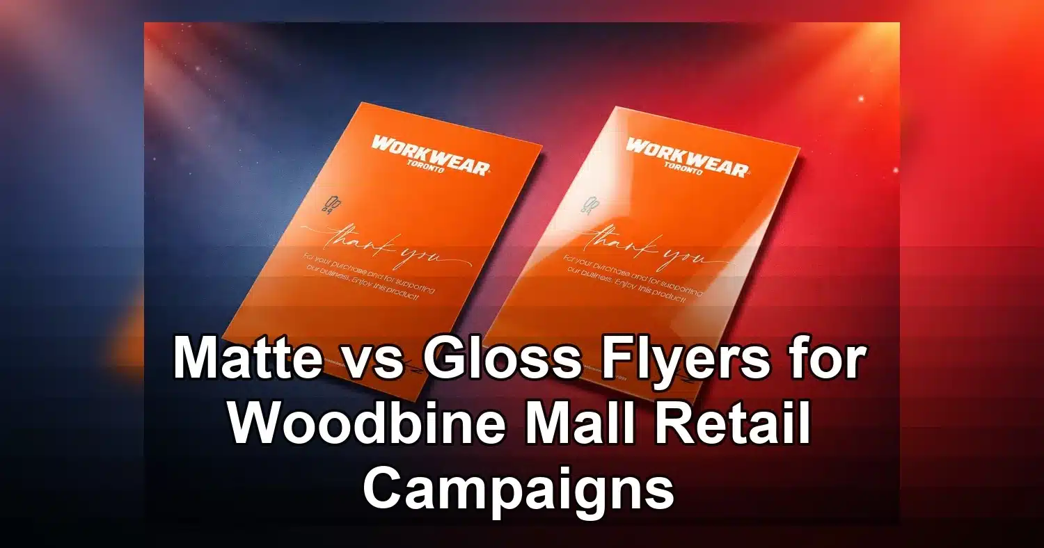
For Woodbine Mall retailers deciding between matte vs gloss flyers, the best finish depends on how the flyer will be seen, handled, and acted on. If your campaign relies on bold product photos, bright sale graphics, and a quick visual hit from shoppers passing by, gloss usually creates the stronger first impression. If you need easier reading under mall lighting, a more polished feel, or a surface that staff can write on, matte is often the smarter choice. For local business owners, retail marketers, and store managers planning storefront handouts, in-centre promotions, coupon drops, or opening-week ads, flyer finish is not a minor detail. It affects readability, perceived quality, and response.
Last updated: April 2026
Ready to print flyer printing?
Send your artwork, quantity, and deadline to Branding Centres. We will help confirm specs, turnaround, and the best production option.
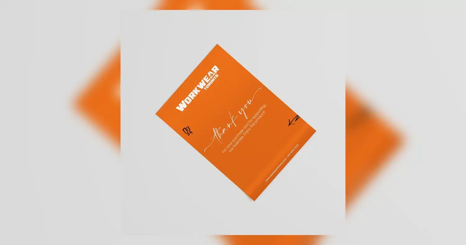
In a busy indoor retail setting like Woodbine Mall, flyers are usually viewed fast and often under overhead lights that can create glare. That is why finish should be chosen based on the campaign, not just personal preference. Matte reduces reflections and supports readability. Gloss increases colour saturation and shine. If your promotion needs a softer, more premium presentation, matte finish flyers are often a strong starting point. If your design is image-led and built around bold visuals, gloss finish flyers can make the message feel louder and more immediate.
Matte vs gloss flyers for Woodbine Mall retail campaigns
The right finish depends on where the flyer will be seen, how long someone will hold it, and whether you want a premium feel or maximum visual punch. For Woodbine Mall retail campaigns, matte vs gloss flyers is not just a style decision. It changes how your offer reads under bright mall lighting, how your branding looks from a few feet away, and whether the piece feels easy to keep, scan, or hand back to staff.
For storefront handouts and in-centre promotions, gloss finish flyers usually create the stronger first impression. The coated surface reflects more light, which helps photos, product shots, and bold colours look brighter. That can be useful for fashion promos, beauty launches, electronics sales, holiday deals, and any retail campaign built around eye-catching visuals. If your design uses large images and short copy, gloss can help the piece stand out quickly in a busy corridor.
Matte finish flyers are often the better fit when the message matters more than the shine. A non-reflective surface is easier to read at a glance, especially when shoppers are moving through the mall or holding the flyer at an angle. Matte also tends to feel more refined and can support a higher-end brand image. For service offers, membership drives, appointment bookings, or flyers with QR codes and detailed instructions, matte often performs better because the text stays readable from more angles.
One practical way to choose is to match the finish to the job. If the flyer is designed to catch attention fast, promote a sale, or support a high-energy retail campaign, gloss may be the better option. If the goal is to communicate detail, reduce glare, or create a cleaner premium look, matte is usually the safer choice. Many Woodbine Mall retailers compare both by ordering a short run first, then testing them with staff at the entrance, during kiosk giveaways, or at a weekend activation.
The finish matters because shoppers form an opinion in seconds. A flyer that looks clean, readable, and on-brand is more likely to be kept, scanned, or taken to the counter. A flyer that flashes too much under light or feels hard to read may get ignored, even if the offer is strong.
How mall lighting, glare, and viewing distance change flyer performance
Woodbine Mall lighting can make matte vs gloss flyers perform very differently because visibility is shaped by glare, distance, and how quickly a shopper moves past your display. In a mall setting, people often have only a few seconds to notice a flyer, read the offer, and decide whether it is worth keeping.
Bright overhead fixtures, reflective flooring, glass storefronts, and nearby digital screens can create hotspots on glossy paper. That extra shine may help colour pop, but it can also hide smaller text and QR codes if the flyer is viewed at an angle. Matte stock reduces reflections, so the message remains easier to scan in areas with strong ambient light or changing foot traffic.
Viewing distance matters too. A flyer held at arm’s length, handed out in a corridor, or displayed near a store entrance needs a clear hierarchy: headline first, offer second, details last. Gloss finish flyers can be effective when the main message is large and image-driven. Matte works better when shoppers need to read terms, dates, locations, or multiple calls to action without squinting.
There is also a scan-rate factor. If your flyer includes a QR code, coupon code, or event registration link, glare can interfere with fast scanning on a phone. Matte finish flyers usually reduce that risk. That is one reason many retailers use matte for directions, loyalty sign-ups, and appointment-based promotions, while reserving gloss for hero visuals and seasonal ads. For a deeper product comparison, many print buyers review sample sheets before ordering a full run so they can see how each finish behaves under real light.
For Woodbine Mall campaigns, the practical takeaway is simple: the busier and brighter the environment, the more important anti-glare readability becomes. If the piece will be read while walking, held near storefront glass, or passed out in a crowd, matte often gives you a better chance of keeping the message legible.
Matte finish flyers vs gloss finish flyers: a side-by-side comparison
The easiest way to compare matte vs gloss flyers is to look at how each finish performs in real retail conditions. The table below focuses on the factors Woodbine Mall marketers care about most: readability, visual impact, handling, and budget.
| Comparison factor | Matte finish flyers | Gloss finish flyers | Best fit for Woodbine Mall retail use |
|---|---|---|---|
| Readability | Low glare and easier to read under bright lighting and angled views | Can reflect light, which may obscure small type or fine details | Matte for text-heavy offers, terms, and QR codes |
| Colour pop | Soft, muted, and more subdued in appearance | Brighter contrast and stronger visual impact for photos and bold graphics | Gloss for seasonal sales, fashion, beauty, and image-led promotions |
| Fingerprints and smudges | Less likely to show marks during handouts and browsing | More likely to show fingerprints, especially on dark or coated areas | Matte for high-touch retail distribution |
| Writing surface | Better for notes, appointment times, or staff writing directly on the flyer | Writing may smear or look less clean on the coated surface | Matte for coupons, booking reminders, and sign-up forms |
| Durability in handling | Holds up well for frequent handling without obvious shine wear | Can stay crisp, but scuffs and marks may be more visible | Matte for flyers shoppers will keep in a bag or pocket |
| Pricing drivers | Cost depends on paper weight, quantity, size, and whether premium uncoated stock is used | Cost depends on coating type, ink coverage, and whether a high-gloss option is selected | Both can be cost-effective in bulk; gloss may be chosen when visual impact is the priority |
Practical buying notes for retail teams
Start with the campaign goal. If you are promoting a flash sale, gloss finish flyers can help the design feel louder and more dynamic. If you are handing out a flyer that needs to be read in motion, matte usually wins on usability. That is especially true for mall activations where customers are walking, carrying shopping bags, or glancing at multiple offers at once.
Paper weight also changes the result. A heavier stock can make either finish feel more premium, but it will not solve glare on its own. The design still needs contrast, clear typography, and enough white space to survive real-world viewing. Retailers often pair matte with a cleaner layout and gloss with larger imagery so the finish supports the message instead of competing with it.
If your team needs to write on flyers, stamp them, or use them as redeemable coupons at the counter, matte is the safer choice. If your priority is shelf appeal or attention at the point of distribution, gloss may deliver a better first glance. For a polished branded handout, some businesses also compare specialty options such as UV-coated flyers when they want extra shine and a stronger presentation on display.
From a purchasing standpoint, the biggest pricing drivers are quantity, size, paper stock, and turnaround. Short runs and rush orders cost more per piece, while larger quantities lower the unit price. Finish itself can influence cost, but the real decision is whether the finish supports the campaign goal well enough to justify it. For Woodbine Mall retail campaigns, that usually means choosing matte for clarity and gloss for visual impact.
Which flyer finish works best for sales events, coupons, and store openings
The best flyer finish depends on the campaign goal. For fast-moving sales, coupons, and grand openings, gloss finish flyers usually help the message pop. Matte finish flyers feel more premium and are easier to read under mixed indoor lighting. In practice, retail campaigns at Woodbine Mall often perform best when the finish matches the offer type instead of being chosen by habit.
Sales events and clearance drops
For clearance, flash sales, and weekend promotions, gloss tends to work well because it adds punch to bold prices, percentage-off callouts, and product imagery. Shiny flyers can make reds, yellows, and black price blocks feel more aggressive and attention-grabbing, which is useful when the goal is quick response.
If the sale is crowded with details, matte can be better because small print, stacked offer tiers, and terms stay easier to read. That matters when you have multiple SKUs, coupon codes, or date restrictions.
Coupons and loyalty offers
Coupons often convert better on matte finish flyers when the offer needs to be clipped, scanned, or kept for a later visit. The flatter surface reduces glare and makes barcodes, QR codes, and fine text easier to capture. Matte also tends to feel more practical and trustworthy for ongoing loyalty offers, member discounts, and repeat-visit promotions.
If you want the coupon to feel more exclusive, such as a VIP redemption offer or a spend-and-save reward, matte gives the piece a calmer and more upscale tone.
Store openings and luxury promos
For store openings, the choice depends on the brand position. A fashion boutique, beauty counter, or jewelry opening may prefer matte because it feels polished and elevated. A high-energy opening with giveaways, balloons, and big savings can benefit from gloss, especially when the flyer will be handed out in the mall or pinned near entrances.
Luxury promos often pair better with matte finish flyers because the texture supports a refined look. If the campaign relies on strong photography and dramatic colour, gloss can still be the better fit.
Quick rule of thumb
- Choose gloss for bold discounts, product-heavy promotions, and short-term urgency.
- Choose matte for premium branding, readable details, and coupon-heavy layouts.
- Choose the finish that matches how long shoppers will hold and read the flyer.
If you are comparing matte vs gloss flyers for a local retail campaign, the offer itself should drive the decision more than preference alone.
Design changes that make either finish convert better
The right design can improve response on both matte and gloss flyers, but the biggest gains usually come from simplifying the message and making the action obvious. Finish helps, yet the layout, typography, and paper choice often determine whether people actually use the offer.
Use stronger hierarchy in the headline and price
Lead with one offer, one result, and one action. Large discount numbers, event dates, and store names should be the most visible elements. On gloss finish flyers, keep type heavier and spacing cleaner so reflections do not compete with dense copy. On matte finish flyers, you can use slightly finer type, but avoid overloading the page with too many fonts.
Increase contrast where it matters
High contrast improves readability on both finishes. Dark text on light backgrounds is safest for coupons and event details. If the flyer uses a dark background, use larger white type and avoid thin weights. This matters especially in mall settings where lighting can shift from bright common areas to softer storefront interiors.
Make QR codes and coupons easy to scan
QR codes should be large enough to scan quickly, with enough white space around them. Matte finish flyers usually scan more reliably because there is less glare, but gloss can still work if the code is placed away from heavy highlights. For best results, test the code on a phone before printing the full run.
Choose images that support the offer
Use product photos, store interiors, or opening-night imagery only if they reinforce the campaign. Gloss finish flyers often make colour-rich photography feel more vibrant, while matte can make portraits, lifestyle images, and luxury product shots look softer and more refined. If the image does not help sell the offer, remove it.
For a design built around high-impact visuals, some retailers pair flyer artwork with a matching display board in-store to keep the same visual energy across print pieces.
Write a direct call to action
Use a simple instruction such as, “Show this flyer at checkout,” “Scan for 20% off,” or “Visit us this weekend.” Avoid vague brand language. People should understand the reward in one glance.
Paper weight still matters
For handouts and street-level distribution, 100 lb text or similar lightweight stock can work for short campaigns. For coupons, openings, and premium promos, thicker stock feels more durable and keeps the piece from curling. A slightly heavier matte stock is often easier to write on, stamp, or redeem manually, while gloss works well when visual impact is the priority.
The strongest flyer is usually the one that combines the right finish with the right layout, not just the prettiest artwork.
Ordering specs, turnaround, and budget factors for local print runs
The fastest way to stay on schedule is to lock your quantity, stock, and finish before the artwork is finalized. For local retail campaigns, especially time-sensitive mall promotions, ordering decisions affect both unit cost and launch date. Matte and gloss flyer options are usually available in similar sizes, but the paper stock and coating choice can change proof timing and press availability.
Plan quantity around distribution, not just store traffic
Estimate how many flyers will actually be handed out, inserted, or posted. A small in-mall activation may only need a few hundred pieces, while a full weekend promo or multi-location campaign may need a larger run to avoid running out mid-event. It is usually more cost-effective to print a little extra than to reorder after launch.
Pick the right stock before comparing price
Heavier paper usually costs more, but it can improve perception and durability. Thin stock may be fine for short, high-volume handouts, while thicker matte finish flyers are better for premium offers, loyalty cards, and longer shelf life. Gloss stock can add visual punch but may require more careful handling because fingerprints and scuffs show more easily.
If you are deciding between coating styles, review the product details for matte finish flyers and compare them with the look of high-shine alternatives when you are setting your budget and campaign tone.
Allow time for proofing and corrections
Proofing is where many local print jobs get delayed. Check spelling, prices, coupon codes, date windows, store hours, and QR destinations before approval. If the flyer includes a limited-time offer for a Woodbine Mall store opening or seasonal sale, one wrong digit can make the whole run unusable.
Budget for rush timing carefully
Rush printing can be useful when launch dates move, but it usually reduces flexibility and can increase cost. If the campaign depends on a mall event date, build in enough lead time for design revisions, proof approval, and delivery. A clean two-step schedule is often safer: approve design first, then release the print order.
Simple pre-order checklist
- Confirm finished size and quantity.
- Choose matte or gloss based on the campaign goal.
- Verify paper weight and coating.
- Proof all dates, prices, and codes.
- Leave time for delivery before the event starts.
When retailers plan matte vs gloss flyers with turnaround in mind, they protect both the budget and the launch date.
Common finish mistakes retail marketers should avoid
The biggest mistake in matte vs gloss flyers decisions is treating finish as a last-minute print detail instead of a performance choice. For Woodbine Mall retail campaigns, the wrong finish can make product photos look flat, coupon text harder to read, and rush-printed flyers inconsistent from one batch to the next.
Choosing sheen based on preference instead of the artwork
Many store teams pick a finish because it feels premium without checking whether it fits the flyer’s job. If your layout depends on bold product imagery, beauty shots, or food photography, gloss finish flyers usually support stronger visual pop. If the piece is text-heavy, includes maps, promo terms, or needs staff to write notes on it, matte finish flyers is often the safer call.
A useful rule is this: do not choose gloss for every photo-driven campaign by default, and do not choose matte just because it feels understated. Gloss often makes images look more vibrant, while matte is easier to read with less reflection, so the artwork and use case should decide.
Overloading small type and fine details
Another common error is squeezing too much onto a flyer and assuming the finish will rescue it. It will not. Small legal copy, thin fonts, pale gray text, and low-contrast coupon codes become risky fast, especially when shoppers are scanning while walking between stores.
- Keep core offer text comfortably readable, usually 11 pt to 14 pt for body copy in handout flyers.
- Avoid light text on glossy photo backgrounds.
- Do not place QR codes over reflective or busy image areas.
- Use stronger contrast for expiry dates, promo conditions, and redemption instructions.
Skipping physical sample checks before launch
One of the most expensive avoidable mistakes is approving a digital proof and going straight to a full run. At minimum, check one printed sample before a weekend sale, seasonal promotion, or new store push inside Woodbine Mall. Review it under real conditions, not just in the office.
- Hold the sample at normal browsing distance, about 2 to 4 feet.
- Check whether product photos still look clean under bright retail lighting.
- Verify barcodes, QR codes, and coupon codes scan properly.
- Confirm brand colours and skin tones do not shift more than expected.
- Build in time for a correction cycle instead of printing the full quantity immediately.
Even a 24-hour sample check can prevent a full campaign from going out with the wrong sheen, unreadable details, or disappointing image quality.
Choosing the right flyer finish for a Woodbine Mall campaign is really about matching the material to the shopper experience. Use matte when readability, reduced glare, and a refined feel matter most. Use gloss when you want stronger visual pop for product-driven promotions and high-energy sales messages. Before you place a full order, confirm viewing distance, lighting conditions, paper weight, and whether staff need to write on the piece.
If you are planning a store opening, coupon run, or seasonal promotion, the safest next step is to review a printed sample before committing to quantity. A quick proof check can prevent wasted budget and help your flyers look sharper where it counts most.
Related Products and Services
If you are planning a similar project, these related options may help.
- Gloss Text Flyers
- Matte Finish Flyers
- Uv (High Gloss
- Gloss Display Board
Helpful External Resources
These sources provide supporting background and additional context.
Which is better for Woodbine Mall flyers, matte or gloss?
For most retail campaigns at Woodbine Mall, matte vs gloss flyers comes down to the goal. Choose gloss if you want vivid colour and a polished, attention grabbing look. Choose matte if you want easier readability under store lighting and a softer, more upscale finish.
Are gloss finish flyers harder to read under bright mall lighting?
Yes, they can be. Gloss flyers may reflect overhead lights and create glare, which can make small text harder to read. If your flyer includes pricing, terms, QR codes, or event details, matte is usually the safer choice for readability.
Can matte finish flyers still look premium and colourful?
Absolutely. Matte flyers can look modern, professional, and high end, especially for fashion, beauty, and lifestyle promotions. They may be less shiny than gloss, but strong design and quality printing still deliver rich colour and a premium feel.
What flyer paper weight should I choose for retail campaigns?
For handouts and in-mall distribution, 100 lb text and similar lightweight stocks are common. If you want a sturdier feel for coupons, openings, or premium promos, thicker stock can help the flyer last longer and feel more substantial in hand.
How should I prepare files for matte vs gloss flyer printing?
Use a print ready PDF with bleed, high resolution images, and embedded fonts. Keep important text away from the trim edge, use CMYK colours, and check that QR codes and barcodes scan properly before you approve the full run.
Should I order a sample before printing a large flyer run?
Yes. A sample lets you see how the finish looks under real light and how readable the layout is at normal viewing distance. That is especially useful for mall campaigns where glare, foot traffic, and fast decisions affect flyer performance.
Get a Free Quote Today
Contact us at +1-(416) 288-8661 or Email us at info@Brandingcentres.com and let's get started.