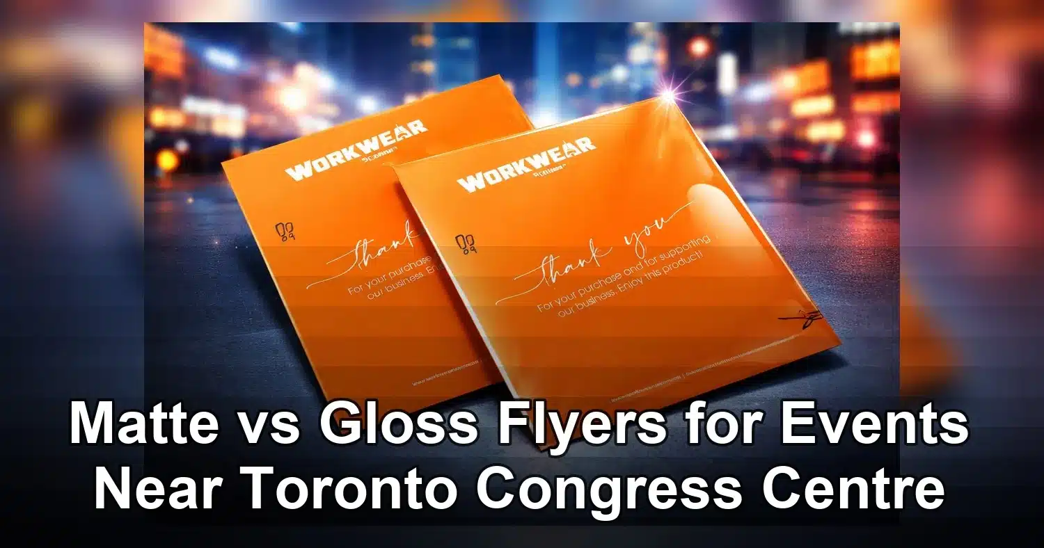
For events near Toronto Congress Centre, choosing between matte vs gloss flyers usually comes down to how the piece will be used, not just how it looks on screen. Matte is usually the better choice for schedules, menus, maps, price lists, QR code handouts, and any flyer with a lot of copy. Gloss is often the better choice for image-led promotions that need to grab attention quickly from people moving past a booth, registration desk, or networking table.
Last updated: April 2026
Ready to print flyer printing?
Send your artwork, quantity, and deadline to Branding Centres. We will help confirm specs, turnaround, and the best production option.
In bright convention spaces, the biggest differences are glare, readability, color intensity, fingerprints, and how the flyer feels when it is handed out. If your goal is easy reading and a more understated premium look, matte finish flyers are often the safer buy. If your goal is bold photography and vivid brand color, gloss can create a stronger first impression. The best choice depends on the message, the lighting, and the way attendees will receive the flyer.
As a simple rule, use matte when the flyer must be read, kept, or marked up. Use gloss when the flyer must catch the eye fast. That one decision affects not only appearance, but also how well the piece works in a busy event environment.
Quick answer for buyers comparing matte vs gloss flyers
If you need the shortest possible answer, here it is. Matte is usually the better option for readability and practical handouts. Gloss is usually the better option for visual impact and photo-heavy designs.
- Choose matte for agendas, speaker lists, maps, schedules, sponsor sheets, and QR code flyers.
- Choose gloss for product launches, brand promotions, lifestyle imagery, and giveaways that need instant attention.
- Choose matte when your flyer will be handled a lot or passed around under bright indoor lights.
- Choose gloss when your design uses strong images, vivid colors, and a large headline.
For many event teams, the best strategy is to split the job. A glossy flyer can work well as the eye-catching promo piece, while a matte version can serve as the readable handout. That approach is common when a campaign has to do two things at once, attract attention and communicate details clearly.
How venue lighting changes the result
At Toronto Congress Centre and similar event venues, flyers are not read in calm, controlled conditions. They are usually viewed under strong overhead LEDs, at an angle, while someone is walking, or while the person holding the flyer is balancing a bag, badge, or coffee. Those real-world conditions make the finish matter more than many buyers expect.
Glossy paper reflects more light. That reflection can make photos look richer and colors look more energetic, but it can also create glare across small text, schedules, and QR codes. Matte paper reflects less light. That helps text stay readable and gives the flyer a softer, more refined look.
This is why so many buyers compare matte finish flyers and gloss options before they place an order. The venue changes what works best, especially when the handout is being used in a fast-moving trade show or conference setting.
What matters most in busy event spaces
- Lighting: Bright lights increase glare on gloss and can reduce readability.
- Viewing distance: Gloss helps headline graphics pop from across a room.
- Foot traffic: Matte is more forgiving when pieces are stacked, carried, or handled repeatedly.
- Handoff style: A one-to-one brand conversation supports a more premium finish, while mass distribution needs a flyer that stays legible and clean.
The practical takeaway is simple. If your audience only gives the flyer a few seconds, the finish should support that scan time. Matte helps the message survive glare. Gloss helps the message stand out at a distance.
When matte finish flyers are the better buy
Matte finish flyers work best when the flyer needs to be read, trusted, or kept after the event. They are especially strong for information-heavy pieces and brands that want a clean, controlled, more upscale look. Many buyers choose matte because it feels less flashy and more deliberate, which suits corporate events, educational sessions, wellness brands, professional services, and delegate materials.
If your flyer has a schedule, a list of speakers, room directions, service details, or a QR code, matte is usually the safer choice. The finish reduces glare, which makes type easier to scan under overhead lights and makes the paper easier to use in a busy booth area.
Best use cases for matte
- Text-heavy handouts: Long copy stays easier to read.
- Schedules and agendas: Times, room numbers, and session details remain clear.
- QR code flyers: Lower glare helps phones scan codes more reliably indoors.
- Premium brands: Matte gives a soft, modern, understated feel.
- Repeated handling: Fingerprints and scuffs are less visible.
Matte also works well when the flyer will be placed into a welcome kit, laid out on a registration table, or handed out in a stack. In those cases, the audience is more likely to value clarity and durability than shine.
If you want the flyer to feel informative rather than salesy, matte usually supports that goal better than a reflective finish. For that reason, many event marketers use gloss text flyers for promotional pieces and keep matte for details-heavy handouts.
Where matte usually beats gloss
Choose matte when the piece will be read up close, viewed under bright lights, or handled by many people in a short time. It is also a strong choice when your design uses fine typography, dark backgrounds, or a layout with lots of white space that should feel calm and clean.
Matte is often the best flyer paper choice when the goal is usability. If an attendee needs to scan the flyer quickly, note a booth number, or photograph a QR code, a low-glare finish tends to perform better in the real world.
When gloss flyers deliver the strongest first impression
Gloss flyers are the stronger option when the design depends on image quality, vibrant color, and quick visual impact. The reflective finish makes photos look brighter and can make a flyer feel more energetic in the hand. That is useful in crowded event spaces where people make fast decisions about what to pick up, keep, or ignore.
Gloss is especially effective for product launches, entertainment promotions, food and beverage brands, beauty campaigns, and any handout built around a dramatic hero image. In those settings, the goal is often to catch attention before the viewer has time to read every detail.
Best uses for gloss
- Product launches: Strong visuals help new offerings stand out.
- Photography-led campaigns: Gloss deepens color and contrast.
- Entertainment and nightlife promotions: The finish feels bold and lively.
- Booth giveaways: A shiny finish can create a stronger pickup rate.
- Limited-time offers: Gloss helps the headline and imagery pop fast.
For a flyer that needs to be noticed from across an aisle, gloss usually wins the attention battle. It gives logos, product shots, and large headlines a more vivid look, especially when the artwork already has strong contrast and polished photography.
Where gloss is less effective
Gloss is not ideal when the flyer has a lot of text, when people need to write on it, or when lighting is especially harsh. The same shine that makes images pop can also create reflections that interfere with reading. That matters in convention halls, conference foyers, and registration areas where overhead lights are strong and movement is constant.
For more detail-heavy materials, a matte finish flyers option is usually easier to work with. If your audience must read fast, matte tends to be the more reliable finish.
Best flyer paper and coating specs for event handouts
Finish is only part of the buying decision. The paper weight, coating, and print layout also affect how the flyer performs, how much it costs, and how durable it feels. The right combination depends on whether you need a lightweight handout, a premium leave-behind, or a high-volume booth stack.
Paper weight choices that matter
For light, high-volume distribution, 80 lb to 100 lb text stock is common because it is affordable and easy to hand out in bulk. For a sturdier flyer that feels more substantial, many buyers step up to 80 lb to 100 lb cover stock or a 12 pt to 14 pt equivalent. Heavier paper usually costs more, but it also feels less disposable and stands up better to handling.
If you are comparing gloss text flyers against heavier stock options, think about how the flyer will be used. A lightweight stack may be fine for quick distribution, while a premium handout may need a thicker sheet to support the brand experience.
Coating options and what they change
Coating changes both appearance and usability. UV and high-gloss coatings create the strongest shine and the most color pop. Matte coatings reduce glare and feel more restrained. Uncoated paper absorbs ink more naturally and is easier to write on, which is useful for appointment notes, feedback forms, or event handouts that need manual marking.
If you need a writable surface, enviro uncoated flyers can be a practical choice. If the flyer must look polished and vibrant, a coated option is usually better.
UV and high-gloss finishes often require an extra production step, which can affect turnaround time. Matte coatings are usually simpler, and that can help when the event deadline is tight.
Single-sided or double-sided printing
Single-sided flyers are often enough for a simple offer, a simple headline, or a handout where the front carries the entire message. They can also reduce cost and production complexity. Double-sided printing gives you more room for schedules, maps, sponsor logos, QR codes, and legal details, but it adds ink coverage and can slightly increase production time.
If the flyer is meant for a booth table or registration counter, double-sided printing is often worth it because it gives the viewer more useful information without making the layout crowded. If the flyer is being handed out in large numbers, single-sided artwork can help keep the budget under control.
Practical buying rule
Choose the lightest stock that still feels credible, then add coating only when it supports the design or the way the piece will be handled. That approach keeps the order efficient without sacrificing quality where it matters.
| Factor | Matte flyers | Gloss flyers | Best fit |
|---|---|---|---|
| Glare under bright lights | Low glare | Higher glare | Matte for convention halls and indoor events |
| Color intensity | Soft and refined | Bright and vivid | Gloss for visuals, matte for calm branding |
| Readability | Usually stronger for text | Can reflect light across copy | Matte for agendas, directions, and QR codes |
| Fingerprints and marks | Hides handling better | Shows marks more easily | Matte for heavy foot traffic |
| Visual impact | Quiet and premium | Bold and promotional | Gloss for quick attention |
Design mistakes that weaken matte and gloss flyer results
The finish can help or hurt, but the artwork still has to do the heavy lifting. Many flyer problems come from layout decisions, not the paper itself. Weak contrast, too much copy, low-resolution photos, and missing bleed can make both matte and gloss flyers underperform.
Poor contrast on the wrong finish
Light gray text on a pale background may look elegant on a monitor, but it can disappear in print, especially on matte stock. On gloss stock, dark backgrounds can pick up reflections that make small type harder to read. The best test is to view the design at actual size and imagine it under strong venue lighting.
Keep the hierarchy simple. One headline, one main message, one clear action usually works better than a page full of competing details.
Too much copy for a fast-moving audience
Event flyers are usually scanned, not studied. Long paragraphs and multiple offers reduce the chance that the viewer will remember the main point. If the flyer needs more detail, send people to a landing page or QR code instead of crowding the design.
The best event flyers tell the viewer what the offer is, why it matters, and what to do next in just a few seconds.
Photos that are soft or low resolution
Gloss tends to make image quality issues more visible because it sharpens the overall look of the page. That is useful when the photo is strong, but not when the image is blurry or compressed. Matte is slightly more forgiving, but it will not fix poor source files. Use high-resolution photography and clean cropping whenever possible.
Missing bleed and weak edge safety
Trim lines are more noticeable on full-bleed artwork and solid color backgrounds. Always include bleed so the trim does not leave a white edge. Keep important text, logos, and QR codes inside safe margins so they do not get cut off during finishing.
QR codes that do not scan reliably
QR codes can fail when they are too small, too close to the edge, or placed over a busy image. Gloss can also create glare around the code under bright lights. Use a strong contrast ratio, leave enough quiet space around the code, and test the printed flyer on a phone before approving the full run.
When comparing matte vs gloss flyers, the finish should support the layout, not compete with it. A clean file will make either option look stronger.
Ordering timeline, quantity planning, and pickup tips for Toronto events
If you are ordering flyers for an event near Toronto Congress Centre, the safest plan is to approve artwork 5 to 7 business days before move-in. That leaves enough time for proofing, printing, and pickup or delivery without relying on a last-minute rush.
Simple event print timeline
- 7 to 10 business days out: Finalize quantity, size, finish, and the exact message the flyer needs to carry.
- 5 to 7 business days out: Review the proof carefully. Check dates, booth number, hall number, phone number, and QR code destination.
- 3 to 4 business days out: Confirm production approval and ask whether the job is standard or rush turnaround.
- 1 to 2 business days out: Arrange pickup or delivery with a real time window, not a vague end-of-day estimate.
Plan quantity based on traffic, not guesswork
For smaller booths, 250 to 500 flyers may be enough. For busier lead-generation campaigns, 500 to 1,000 is often a better starting point. If your team is distributing flyers in aisles, lobbies, or networking spaces, 1,500 or more may be appropriate. Always add extra copies for setup, staff use, and damage in transit.
- Low distribution: One flyer per meaningful conversation.
- Medium distribution: One flyer for each person who stops at the booth.
- High distribution: A main stack plus a backup stack for peak hours.
Pickup or delivery
Pickup is useful when your team wants to check color in person before heading to the venue. It also lowers the risk of a missed receiving window. Delivery is better when your team is arriving from out of town or working on a tight setup schedule.
If the flyer needs a polished look, order UV high gloss flyers early, since coating and drying can add time. If the flyer is meant to be written on or annotated during the event, matte finish flyers are usually easier for staff and attendees to use on site.
Final pre-event checklist
- Save a press-ready PDF with fonts embedded
- Check bleed, trim, and safe margins
- Test the QR code on a phone
- Pack flyers flat in weather-safe boxes
- Bring 25 to 50 extra copies for backup
- Keep one approved proof with the shipment
Final recommendation
If you are buying flyers for a Toronto Congress Centre event, choose matte when readability, writing, and low glare matter most. Choose gloss when visual impact, vivid color, and fast attention matter most. The right finish depends on what the flyer has to do in the hands of your audience, not just which version looks better on a screen.
Before you order, confirm your stock weight, coating, quantity, QR code performance, and turnaround time. If you compare those details against the venue conditions and the way the flyer will be distributed, the finish choice becomes much easier and the final result is far more effective.
Related Products and Services
If you are planning a similar project, these related options may help.
Helpful External Resources
These sources provide supporting background and additional context.
Are matte or gloss flyers better for events near Toronto Congress Centre?
Matte is usually the better choice for event handouts that need to be read quickly under bright indoor lighting. Gloss is better when the flyer is mainly visual and needs to create a strong first impression. For most schedules, maps, and QR code handouts, matte performs better.
Do gloss flyers create too much glare in convention spaces?
They can. Gloss finishes reflect more light, which may make small text and QR codes harder to read under strong LEDs or spotlights. If the flyer will be viewed at close range in a bright hall, matte is usually the safer finish.
What is the best flyer paper for text-heavy event promotions?
A matte coated stock is usually the best choice for text-heavy flyers because it reduces glare and keeps body copy easier to scan. If the flyer needs to feel more durable, choose a heavier matte stock so it holds up better during handling.
How far in advance should I order flyers for a Toronto event?
Order 7 to 10 business days before the event whenever possible. That gives you time for proofing, printing, finishing, and pickup or delivery. Rush orders may be possible, but they leave less room for corrections.
What file setup should I use for flyer printing?
Send a print-ready PDF in CMYK at 300 DPI with bleed included, usually 0.125 inches on all sides. Keep important text inside the safe area, and test QR codes before approving the final file.
Get a Free Quote Today
Contact us at +1-(416) 288-8661 or Email us at info@Brandingcentres.com and let's get started.