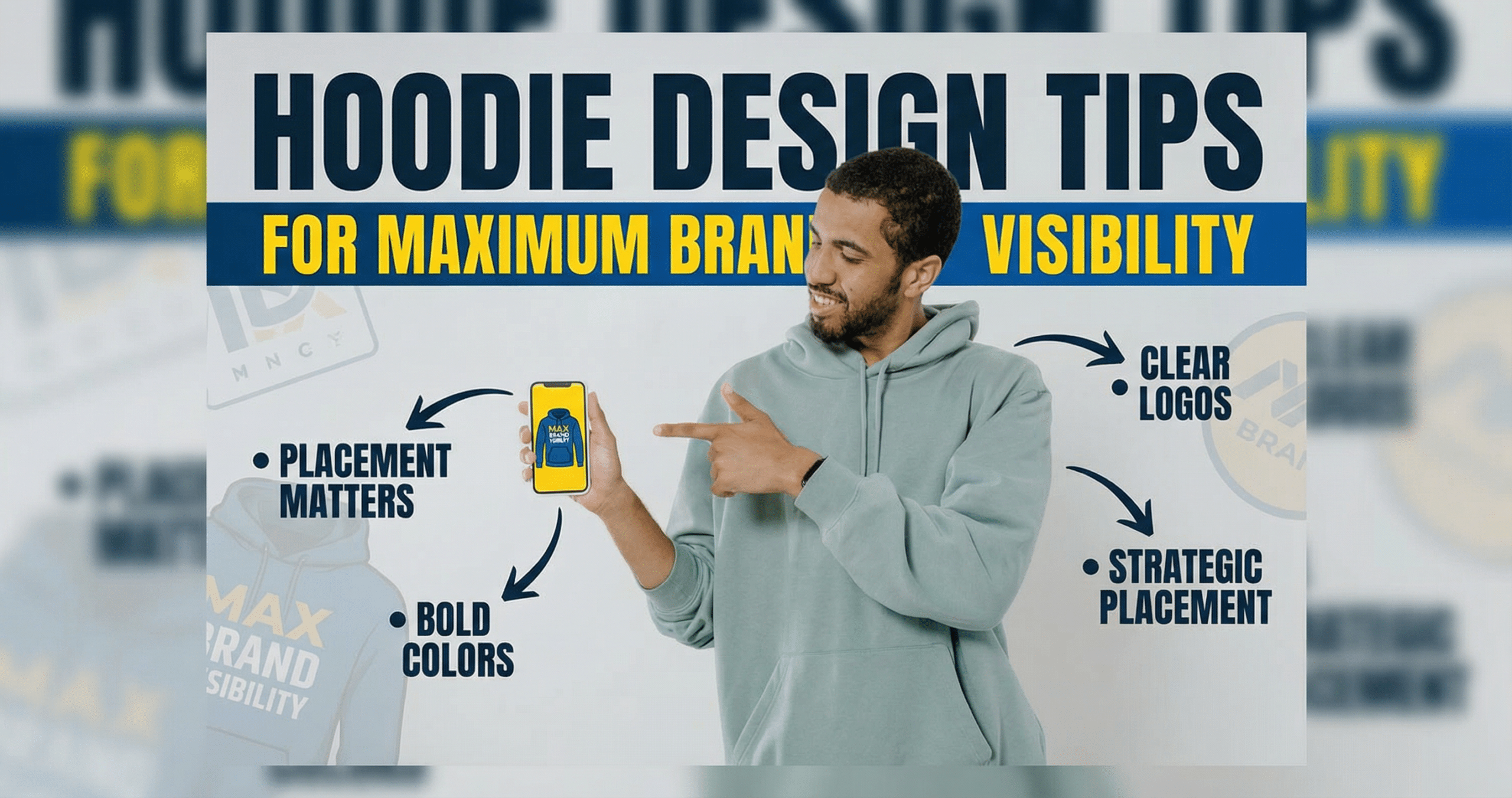
Hoodie Design Tips that improve brand visibility start with one simple rule: make the message readable in under a second. For business owners, the most effective custom hoodies are rarely the busiest ones. They use one clear focal point, strong contrast, and a decoration method that stays sharp after repeated wear, so employees, customers, and event teams keep promoting your brand in offices, at trade shows, on job sites, and across social content.
Last updated: March 2026
If you are planning branded apparel for staff uniforms, client gifts, retail merch, or campaign giveaways, the smartest move is to match the design to the hoodie blank, print method, and use case before you order. That means simplifying artwork, choosing placements that stay visible when the hood is down, and setting up files correctly from the start. You can cross-check your artwork prep against this custom apparel design guide. It also helps to plan for back placement carefully because the hood can cover part of the print, a point reinforced in these hoodie back placement tips.
Why Hoodie Designs Travel Further Than Most Brand Touchpoints
Hoodies are powerful brand assets because they are worn repeatedly, in public, and in places where people actually notice them. Unlike a one-time ad impression, a well-made hoodie can circulate for months or even years through commutes, school runs, airport terminals, cafés, job sites, weekend errands, and team events.
Why hoodies create repeat visibility
A hoodie is comfortable enough to become part of a regular rotation, especially in fall, winter, and air-conditioned environments year-round. That makes it one of the most practical forms of branded apparel for businesses that want steady exposure without constantly spending on media. A clean design on a hoodie can be seen from several feet away, but it also holds up in closer conversations, where details like a logo, slogan, or website can be remembered.
Compared with many promotional items, hoodies usually have a longer useful life because they are functional garments, not disposable swag. If the fit is comfortable and the design feels wearable, employees and customers will keep reaching for it.
Where your hoodie gets seen
Visibility does not stop when the hoodie leaves your office. It travels into:
- Retail and hospitality settings, where staff uniforms create a consistent look
- Events, conferences, and pop-up booths, where teams need easy identification
- Client meetings, shipping pickups, and local delivery routes
- Social media photos, videos, and casual team posts
- Schools, gyms, and community spaces where customers wear it off-duty
That mix of internal visibility and organic public exposure makes Custom Hoodies especially valuable for brands that want recognition and practicality at the same time.
Best business use cases for maximum reach
The highest visibility usually comes from hoodies used as:
- Employee uniforms for front-facing teams
- Client gifts that people actually wear
- Event merchandise tied to launches, conferences, or sponsorships
- Limited-edition retail products for loyal customers
- Safety or fieldwear for crews working outdoors or in transit
For businesses comparing styles, a unisex fleece hoodie is often a versatile choice because it balances comfort, fit range, and broad wearability. If the goal is everyday visibility, choose something people will want to wear beyond the event itself.
Hoodie Design Tips for Logos, Typography, and Layout Hierarchy
The best Hoodie Design Tips keep the message simple enough to read quickly and strong enough to remember later. If a hoodie tries to say too much, it loses impact. Aim for one clear idea, one main visual, and a layout that makes the brand recognizable at a glance.
Start with one message, not five
Business owners often overload hoodie artwork with too many elements: logo, tagline, phone number, website, social handle, and a secondary graphic. That creates visual clutter and weakens brand recall. Instead, decide what the hoodie should do first. Is it meant to identify staff, promote an event, or sell a lifestyle brand? The answer determines the hierarchy.
A strong layout usually prioritizes:
- Brand name or primary logo
- Short supporting phrase, if needed
- Small secondary detail, such as a location or URL
Make typography readable at a distance
Choose fonts that stay legible on fleece, ribbing, and curved seams. Avoid overly thin scripts, crowded letter spacing, and decorative typefaces that disappear in print or embroidery. For most custom apparel, bold sans serif fonts and clean serif fonts are easier to read on the chest, back, and sleeve.
As a practical rule, if a message cannot be understood quickly from across a room, it is too complicated. Keep letterforms large enough to survive fabric texture and movement. For back prints, many brands also benefit from a simple centered arrangement because it reads more naturally when someone is standing behind the wearer. A useful reference for placement planning is this guide to printing the back of hoodies.
Use hierarchy to guide the eye
Good layout hierarchy makes the design work instantly. The eye should know where to look first, second, and third. That usually means:
- Largest element: brand logo or campaign message
- Medium element: supporting line or event detail
- Smallest element: website, city, or social handle
Keep plenty of negative space around the main artwork. A centered chest logo, a clean back graphic, or a left-chest plus back combo often performs better than placing artwork everywhere. If you need a style reference, a fleece ladies hoodie can help you think through how the design sits on different fits and body shapes.
Pick the Right Hoodie Blank and Decoration Method for Your Budget
The right hoodie blank and print method should match your budget, expected wear, and brand goals. A lower-cost hoodie can work for short-term promotions, but if the garment needs to be worn often, it usually pays to invest in better fabric, fit, and decoration quality.
| Option | Typical Use | Strengths | Tradeoffs | Best Budget Fit |
|---|---|---|---|---|
| Cotton or cotton-blend fleece hoodie | Staff wear, client gifts, retail | Soft hand-feel, comfortable, strong everyday appeal | Can shrink if poorly cared for, may cost more than basic poly | Mid-range to premium |
| 100% polyester hoodie | Outdoor crews, active use, safety programs | Durable, moisture-wicking, color stable, good for performance use | Less natural feel, can be less cozy than fleece | Budget to mid-range |
| Unisex fleece hoodie | General branding, giveaways, team uniforms | Broad fit range, reliable warmth, versatile for most audiences | Not as tailored as specialty cuts | Mid-range |
| Embroidery | Left chest logos, premium uniforms | Durable, polished, strong perceived value | Best for simpler artwork, higher setup cost | Mid-range to premium |
| Screen printing | Bulk orders, bold graphics, event merch | Cost-effective in volume, strong color impact | Less ideal for very small runs or highly detailed artwork | Budget to mid-range |
| Heat transfer or DTF | Short runs, multicolor art, faster turnaround | Good detail, flexible order sizes, quick production | Durability varies by material and wash care | Budget-friendly for small runs |
Choose fabric based on how the hoodie will be used
For comfort-first branding, cotton-rich fleece usually feels best and encourages repeat wear. For field teams, logistics, or outdoor work, a 100% polyester hoodie can be a smarter choice because it handles movement, weather, and frequent washing more reliably. If you want something that works across departments or demographics, a unisex fleece option gives you a safer all-around balance.
Fabric weight matters too. Midweight hoodies around 7 to 9 ounces are often versatile for most businesses, while heavier fleece can feel more premium but cost more and run warmer. Light hoodies may save money, but they can feel less substantial and may not support the same brand impression.
Match decoration method to artwork and order size
Embroidery is best when you want a professional, long-lasting logo on the chest or sleeve. Screen printing is usually the best value for larger quantities and bold art with fewer colors. Heat transfer or DTF can be a good fit for smaller runs, personalized names, and more detailed graphics.
If you are comparing custom apparel options, ask three questions before ordering:
- Will people wear this often enough to justify a better blank?
- Does the logo need fine detail or just a clean identifier?
- Is the priority low cost, fast turnaround, or long-term brand impact?
The best result comes from matching the hoodie blank, fit, and decoration method to how the garment will actually be used, not just the lowest upfront price.
Placement That Gets Seen in Office, Events, and Social Content
Front placement usually delivers the fastest brand recognition, but the best spot depends on where the hoodie will be worn and photographed. For office uniforms, trade shows, and walk-up interactions, chest and left-chest placements are easy to read at conversational distance. For social content, back prints and oversized center graphics often get more attention because they stay visible in group photos, video clips, and candid shots.
Front, chest, and left-chest placement
A centered front logo works well when the goal is immediate identification. It is the safest choice for smaller teams, retail staff, and company outings because it stays readable even when the wearer is moving. Left-chest placement feels more professional and pairs well with embroidery or minimal branding, especially on a unisex fleece hoodie. The tradeoff is distance. Small chest marks can disappear in wide photos, so they are not ideal if the hoodie is meant to promote a launch or sponsorship.
Back prints for events and social reach
Back placement is one of the strongest options for visibility at conferences, festivals, and team events because people naturally view others from behind in crowds. It also performs well in reels and group photos, where large typography or a bold logo can fill the frame. If you use a back print, keep the message short and the lines thick. Overly detailed back designs become hard to read when the wearer is walking, seated, or partly blocked by bags and lanyards. A useful reference for hoodie back layout is this guide to printing the back of hoodies.
Sleeves and hoods
Sleeve prints are best for secondary branding, campaign dates, sponsor names, or a short web address. They add value without competing with the main logo. Hood printing can create a premium look, but it is easy to lose clarity because seams, folds, and drawcords interrupt the artwork. If the hood will be folded inward during wear, avoid tiny type and intricate details. For custom apparel design tips, think of sleeves and hoods as supporting real estate, not the primary message.
When placement hurts readability
- Too close to seams, pockets, zippers, or drawcord channels
- Designs that are too small for the fabric texture or print method
- Low-contrast artwork on heather, dark, or patterned hoodie blanks
- Long text blocks placed where folds will break the line
The simplest rule is to place the most important message where the eye lands first, then use secondary placements to extend reach without clutter.
Color, Contrast, and File Specs That Keep the Artwork Sharp
Sharp hoodie artwork starts with contrast. If the design does not separate clearly from the hoodie color, it will lose impact on the rack, in photos, and after repeated washes. High-contrast pairings such as white on navy, black on heather gray, or bright brand colors on dark fleece usually perform best. On lighter blanks, darker outlines and strong typography help preserve legibility. A detailed overview of print and fabric considerations is available in this complete guide to hoodie printing techniques, fabrics, and durability.
File setup that protects quality
For the cleanest results, submit vector artwork whenever possible, such as AI, EPS, or PDF files with outlined fonts. Vector files scale without becoming blurry, which is especially important for large back prints and sleeve graphics. If the artwork must be raster-based, use PNG or TIFF at actual print size with a minimum of 300 DPI. Avoid low-resolution JPGs pulled from websites or social posts, because compression artifacts often show up in text and fine edges.
Minimum line thickness and detail
Fine lines and tiny text are common failure points in custom hoodies. As a practical rule, keep the smallest line weight strong enough to survive the print process and fabric texture. Thin elements that look crisp on a monitor can fill in or break apart when printed on fleece or textured cotton blends. Small text should be reserved for contact details only when absolutely necessary, and even then it should be tested at actual size.
- Use bold type for anything below headline size
- Avoid hairline strokes and micro-details in logos
- Keep spacing generous around text and icon edges
- Check artwork at 100 percent zoom and actual print size
Proofing details that prevent reprints
Before production, request a digital proof or mockup showing placement, size, and color approximations on the selected hoodie blank. This is where problems get caught early, such as a logo that is too low on the chest, text that sits in a seam, or a color that disappears on the garment. If the campaign uses multiple hoodie colors, proof each version separately because contrast can change dramatically from one blank to another. Strong custom apparel design tips always include a proofing step that checks readability from both close range and room distance.
Pricing, Minimum Orders, and Turnaround Time: What Business Buyers Should Plan For
Custom hoodie pricing depends on blank quality, print method, number of decoration locations, and order quantity. The main cost drivers are the hoodie itself, setup or screen fees, color count, and whether the artwork needs special finishing such as embroidery or oversized print placement. Premium fleece, safety colors, and specialty fabrics can raise unit cost quickly, while standard unisex blanks tend to keep campaigns more affordable, especially when ordered in volume.
How minimums affect campaign planning
Minimum orders vary by decorator and method. Screen printing often becomes more efficient at higher quantities, while digital methods may allow smaller runs with less setup. Business buyers should think beyond unit price and calculate total campaign cost, including sampling, artwork cleanup, and shipping. If you are planning multiple sizes and department splits, consolidating the order usually improves pricing and simplifies inventory management.
- Low quantity orders are easier to test but usually cost more per piece
- Bulk orders reduce the price per hoodie, especially with one-color artwork
- Multiple print locations increase cost even when the design is simple
- Specialty blanks, such as high-visibility styles, can shift the budget
Turnaround time and rush planning
Standard turnaround often includes artwork approval, production, and shipping time, so the real timeline is longer than the press time alone. Rush orders may be possible, but they can limit blank choices, decoration methods, and proof revisions. If the hoodies are needed for an event, launch, or seasonal promotion, build in extra time for sample review and size exchanges. A delayed approval is one of the fastest ways to lose a rush window.
For teams comparing options, a 100% polyester hoodie may be a better fit for certain work environments, while a more classic fleece option can suit general corporate wear. In either case, it helps to align the decoration method with the deadline. Embroidery and multi-color screen work may take longer than a simpler print, especially when the order needs multiple approval stages.
Production choices that change cost and speed
To keep budgets predictable, ask whether the order will use one placement or several, whether the art can stay one color, and whether the garment color will require a separate proof. Clear specifications reduce surprises. If the campaign is tied to a launch date, choose a production path that protects the schedule first, then optimize for decoration complexity second. That approach usually delivers better results than chasing the cheapest unit price and risking a missed deadline.
Approval Checklist: Proofs, Samples, and Mistakes to Avoid Before Production
The final proof is where hoodie ROI is protected or lost. Before you approve production, confirm the artwork, garment, sizing mix, and wash performance together, not as separate decisions. That is one of the most practical Hoodie Design Tips for business buyers ordering custom hoodies for staff, events, or client giveaways.
Review the proof like a buyer, not just a designer
A digital mockup should answer operational questions, not only aesthetic ones. Use your proof review to confirm:
- Exact logo size in inches, not just visual scale
- Placement from collar, seam, or pocket so prints do not sit too high or too low
- Print colors match approved brand values as closely as the decoration method allows
- Spelling, taglines, URLs, and social handles are correct
- Artwork format and resolution follow a solid design guide before files are released to production
If the hoodie has front and back decoration, ask for both views on the same approval. A common missed issue is approving the front logo but not noticing that the back print is too large for everyday wear.
Check fit and size ratios before you lock quantities
Do not approve art without confirming the garment mix. A great design on the wrong blank still underperforms. For mixed teams, compare specs for a unisex fleece hoodie and a fleece ladies hoodie rather than assuming one cut works for everyone.
- Review chest width, body length, and sleeve length
- Confirm whether the fit runs retail, relaxed, or oversized
- Validate your size curve before ordering high quantities of M and L by default
- For field teams, test whether layering over uniforms changes sizing needs
Approve a real sample when visibility and longevity matter
For larger orders, request a pre-production sample or press proof, especially if the hoodie will be used at trade shows, on job sites, or in social content. Durability depends on fabric and print method, so ask how the decoration holds up after repeated washing, heat drying, and daily wear.
- Wash the sample at least once using normal care instructions
- Check for cracking, fading, shrinking, and color shift
- Look at readability from 6 to 10 feet away, not just up close
Mistakes that reduce ROI before production even starts
- Approving art without measuring print size on the actual garment size range
- Skipping sample review on first-time orders or new decoration methods
- Using a low-cost blank that pills, shrinks, or feels too thin for staff retention use
- Ordering only by price and missing in-hands dates for onboarding, events, or seasonal campaigns
- Choosing a trendy oversized graphic that employees will not wear after the event
If the goal is repeat brand exposure, the best hoodie design tips are practical: approve what people will wear often, what survives washing, and what still looks on-brand after the first month.
Before approving production, narrow your decision to three essentials: the audience, the main viewing distance, and the budget-friendly decoration method that will hold up over time. Then request a proof, confirm garment sizing and color contrast, and review one physical sample if the order matters to a launch, event, or staff rollout.
Use the checklist and design tips above to brief your designer or supplier clearly, reduce revisions, and order hoodies that keep your brand visible long after day one.
Related Products and Services
If you are planning a similar project, these related options may help.
Helpful External Resources
These sources provide supporting background and additional context.
What makes a hoodie design more visible for a business brand?
Use a simple layout, strong color contrast, and a print size that is easy to read from a few feet away. Bold typography, one clear focal point, and placement on the chest or back usually create the strongest brand visibility.
Which decoration method works best for custom hoodies?
Screen printing is often the best fit for bold logos and larger orders. Embroidery works well for a polished left-chest look, while heat transfer or DTF can be a smart choice for detailed art, short runs, or personalized names.
How should I choose placement for a logo on a hoodie?
Choose placement based on how the hoodie will be worn and seen. Left chest feels professional, centered chest is easy to notice, back prints create the most visibility in crowds and photos, and sleeve prints are useful for secondary branding.
What should I review before approving a custom hoodie proof?
Check logo size, placement, spelling, colors, garment color, and print method before approving. It also helps to confirm seam placement, the exact print area, and whether the design still looks balanced on the hoodie size you ordered.
What artwork files should I submit for the best print quality?
Vector files such as AI, EPS, or PDF are best because they stay sharp at any size. If you submit a PNG or TIFF, make sure it is high resolution, sized correctly for production, and clean enough to print without visible compression issues.
Get a Free Quote Today
Contact us at +1-(416) 288-8661 or Email us at info@Brandingcentres.com and let's get started.